Chapter 7 Exploratory Data Analysis
7.1 Introduction
In this last chapter we’ll step back from the data mangling and have a look at an activity called Exploratory Data Analysis, EDA in short. All theory that is presented in previous chapters will be applied to two datasets
In statistics, exploratory data analysis (EDA) is an approach to analyzing data sets to summarize their main characteristics, often with visual methods. A statistical model can be used or not, but primarily EDA is for seeing what the data can tell us beyond the formal modeling or hypothesis testing task. s. (Wikipedia)
7.1.0.1 The Cervical Cancer dataset
The UCI machine learning public dataset “Cervical cancer (Risk Factors) Data Set”:
“… collected at ‘Hospital Universitario de Caracas’ in Caracas, Venezuela. The dataset comprises demographic information, habits, and historic medical records of 858 patients. Several patients decided not to answer some of the questions because of privacy concerns.”
This dataset contains more than thirty variables of 858 subjects who participated in this research. The goal was to identify variables that could possibly be related to cervical cancer. Typically in this type of research there is one dependent variable - the variable you want to “explain.” However in this dataset the last four variables are all markers for cervical cancer.
7.1.0.2 Libraries
These are the packages used in this EDA:
library(tidyr)
library(dplyr)
library(ggplot2)
library(gridExtra)
library(stringr)
7.2 Getting to know the dataset
7.2.1 The codebook
A codebook describes the contents, structure, and layout of a dataset. A well-documented codebook contains information intended to be complete and self-explanatory for each variable in a data file.
You should always create a file called Codebook.txt to store names, descriptions and types of variables, if it is not yet present alongside the dataset you received.
This makes it so much easier to add human-readable labels to plots, and column headers of tables that are supposed to be integrated in a report. The label Hormonal Contraceptives (years) is so much better than Hormonal.Contraceptives..years.
Is the following -part of the original codebook downloaded with the data- a good codebook?
(int) Age
(int) Number of sexual partners
(int) First sexual intercourse (age)
(int) Num of pregnancies
(int) Hormonal Contraceptives (years)
(int) IUD (years)
(bool) STDs
(int) STDs (number)
...
(bool) Hinselmann: target variable
(bool) Schiller: target variable
(bool) Cytology: target variable
(bool) Biopsy: target variable
7.2.1.1 Elements of a good codebook entry
- Name the column name (num.sex.partner)
- Full name what it abbreviates (“Number of sexual partners”)
- (optionally) Label the label you want to use in graphs and above tables.
- Data type One of the R data (derived) data types: int/numeric/Date/factor/boolean…
- Unit the unit of measurement (e.g. “mg/l plasma”)
- Description A full description of what is measured, and the way its value was collected (e.g. questionnaire, lab protocol xxxx).
Now look again at the codebook above and answer again: is this a good codebook?
What if the codebook is not present or not complete? There are several ways to try and fix this:
- read the original publication
- see whether this publication has (online) supplements
- contact the primary investigators.
- as a last resort: try to deduce from context and domain knowledge
I have cleaned it up a bit and came to this. It is still not perfect; how would you improve on this?
codebook <- read.csv("data/cerv_cancer_codebook.csv",
                     as.is = 1:3)
head(codebook)
## abbreviation class full.name
## 1 age int Age
## 2 num.partners int Number of sexual partners
## 3 first.sex int First sexual intercourse (age)
## 4 num.preg int Num of pregnancies
## 5 smoker logical Smokes
## 6 smoke.years int Smokes (years)7.2.2 Load and inspect the data
Load the data and check the data type of the columns. Always beware of unusual encodings for missing data! This is one of the most common causes of erroneous analyses, besides data entry errors and sample swaps.
You should get data loading right in an iterative process, using several functions to inspect the result each time you have adjusted a parameter. Use head() and -especially- str() to do this. Tibbles print their data type automatically so that gives an advantage over data.frame.
Here is a first attempt:
datafile <- "data/risk_factors_cervical_cancer.csv"
data <- read.table(datafile,
                   sep=",",
                   header = TRUE)
str(data)
## 'data.frame': 858 obs. of 36 variables:
## $ Age : int 18 15 34 52 46 42 51 26 45 44 ...
## $ Number.of.sexual.partners : chr "4.0" "1.0" "1.0" "5.0" ...
## $ First.sexual.intercourse : chr "15.0" "14.0" "?" "16.0" ...
## $ Num.of.pregnancies : chr "1.0" "1.0" "1.0" "4.0" ...
## $ Smokes : chr "0.0" "0.0" "0.0" "1.0" ...
## $ Smokes..years. : chr "0.0" "0.0" "0.0" "37.0" ...
## $ Smokes..packs.year. : chr "0.0" "0.0" "0.0" "37.0" ...
## $ Hormonal.Contraceptives : chr "0.0" "0.0" "0.0" "1.0" ...
## $ Hormonal.Contraceptives..years. : chr "0.0" "0.0" "0.0" "3.0" ...
## $ IUD : chr "0.0" "0.0" "0.0" "0.0" ...
## $ IUD..years. : chr "0.0" "0.0" "0.0" "0.0" ...
## $ STDs : chr "0.0" "0.0" "0.0" "0.0" ...
## $ STDs..number. : chr "0.0" "0.0" "0.0" "0.0" ...
## $ STDs.condylomatosis : chr "0.0" "0.0" "0.0" "0.0" ...
## $ STDs.cervical.condylomatosis : chr "0.0" "0.0" "0.0" "0.0" ...
## $ STDs.vaginal.condylomatosis : chr "0.0" "0.0" "0.0" "0.0" ...
## $ STDs.vulvo.perineal.condylomatosis: chr "0.0" "0.0" "0.0" "0.0" ...
## $ STDs.syphilis : chr "0.0" "0.0" "0.0" "0.0" ...
## $ STDs.pelvic.inflammatory.disease : chr "0.0" "0.0" "0.0" "0.0" ...
## $ STDs.genital.herpes : chr "0.0" "0.0" "0.0" "0.0" ...
## $ STDs.molluscum.contagiosum : chr "0.0" "0.0" "0.0" "0.0" ...
## $ STDs.AIDS : chr "0.0" "0.0" "0.0" "0.0" ...
## $ STDs.HIV : chr "0.0" "0.0" "0.0" "0.0" ...
## $ STDs.Hepatitis.B : chr "0.0" "0.0" "0.0" "0.0" ...
## $ STDs.HPV : chr "0.0" "0.0" "0.0" "0.0" ...
## $ STDs..Number.of.diagnosis : int 0 0 0 0 0 0 0 0 0 0 ...
## $ STDs..Time.since.first.diagnosis : chr "?" "?" "?" "?" ...
## $ STDs..Time.since.last.diagnosis : chr "?" "?" "?" "?" ...
## $ Dx.Cancer : int 0 0 0 1 0 0 0 0 1 0 ...
## $ Dx.CIN : int 0 0 0 0 0 0 0 0 0 0 ...
## $ Dx.HPV : int 0 0 0 1 0 0 0 0 1 0 ...
## $ Dx : int 0 0 0 0 0 0 0 0 1 0 ...
## $ Hinselmann : int 0 0 0 0 0 0 1 0 0 0 ...
## $ Schiller : int 0 0 0 0 0 0 1 0 0 0 ...
## $ Citology : int 0 0 0 0 0 0 0 0 0 0 ...
## $ Biopsy : int 0 0 0 0 0 0 1 0 0 0 ...As you can see, many of the variables have been read incorrectly. These can be recognized by the fact that they have been read as Factor instead of the expected int. A closer look at the output also tells me why: missing values are apparently encoded with a question mark.
This is fixed in iteration two:
data <- read.table(datafile,
                   sep=",",
                   header = TRUE,
                   na.strings = "?")
str(data)
## 'data.frame': 858 obs. of 36 variables:
## $ Age : int 18 15 34 52 46 42 51 26 45 44 ...
## $ Number.of.sexual.partners : num 4 1 1 5 3 3 3 1 1 3 ...
## $ First.sexual.intercourse : num 15 14 NA 16 21 23 17 26 20 15 ...
## $ Num.of.pregnancies : num 1 1 1 4 4 2 6 3 5 NA ...
## $ Smokes : num 0 0 0 1 0 0 1 0 0 1 ...
## $ Smokes..years. : num 0 0 0 37 0 ...
## $ Smokes..packs.year. : num 0 0 0 37 0 0 3.4 0 0 2.8 ...
## $ Hormonal.Contraceptives : num 0 0 0 1 1 0 0 1 0 0 ...
## $ Hormonal.Contraceptives..years. : num 0 0 0 3 15 0 0 2 0 0 ...
## $ IUD : num 0 0 0 0 0 0 1 1 0 NA ...
## $ IUD..years. : num 0 0 0 0 0 0 7 7 0 NA ...
## $ STDs : num 0 0 0 0 0 0 0 0 0 0 ...
## $ STDs..number. : num 0 0 0 0 0 0 0 0 0 0 ...
## $ STDs.condylomatosis : num 0 0 0 0 0 0 0 0 0 0 ...
## $ STDs.cervical.condylomatosis : num 0 0 0 0 0 0 0 0 0 0 ...
## $ STDs.vaginal.condylomatosis : num 0 0 0 0 0 0 0 0 0 0 ...
## $ STDs.vulvo.perineal.condylomatosis: num 0 0 0 0 0 0 0 0 0 0 ...
## $ STDs.syphilis : num 0 0 0 0 0 0 0 0 0 0 ...
## $ STDs.pelvic.inflammatory.disease : num 0 0 0 0 0 0 0 0 0 0 ...
## $ STDs.genital.herpes : num 0 0 0 0 0 0 0 0 0 0 ...
## $ STDs.molluscum.contagiosum : num 0 0 0 0 0 0 0 0 0 0 ...
## $ STDs.AIDS : num 0 0 0 0 0 0 0 0 0 0 ...
## $ STDs.HIV : num 0 0 0 0 0 0 0 0 0 0 ...
## $ STDs.Hepatitis.B : num 0 0 0 0 0 0 0 0 0 0 ...
## $ STDs.HPV : num 0 0 0 0 0 0 0 0 0 0 ...
## $ STDs..Number.of.diagnosis : int 0 0 0 0 0 0 0 0 0 0 ...
## $ STDs..Time.since.first.diagnosis : num NA NA NA NA NA NA NA NA NA NA ...
## $ STDs..Time.since.last.diagnosis : num NA NA NA NA NA NA NA NA NA NA ...
## $ Dx.Cancer : int 0 0 0 1 0 0 0 0 1 0 ...
## $ Dx.CIN : int 0 0 0 0 0 0 0 0 0 0 ...
## $ Dx.HPV : int 0 0 0 1 0 0 0 0 1 0 ...
## $ Dx : int 0 0 0 0 0 0 0 0 1 0 ...
## $ Hinselmann : int 0 0 0 0 0 0 1 0 0 0 ...
## $ Schiller : int 0 0 0 0 0 0 1 0 0 0 ...
## $ Citology : int 0 0 0 0 0 0 0 0 0 0 ...
## $ Biopsy : int 0 0 0 0 0 0 1 0 0 0 ...This looks pretty OK to me. Be alert for surprises down the line, though!
7.2.2.1 Should you correct typos?
What do you think about this - it was taken from the Attribute Information on the website:
(bool) Smokes (years)
(bool) Smokes (packs/year)
They are advertised as a boolean, but are they?
This kind of inspection should make you aware of possible problems that are going to arise later on. Booleans are very different from numbers after all. What is even more dangerous is that they can be treated interchangeably - in R you can treat a logical as an integer and an integer in a boolean context.
This kind of discrepancy is the first thing you should address after loading your data. We’ll get back to this shortly.
I will now first change the column names to something shorter, using the codebook. Also, the data will be converted into a tibble because this is really a nicer data structure:
names(data) <- codebook[,1]
data <- as_tibble(data)
data
## # A tibble: 858 x 36
## age num.partners first.sex num.preg smoker smoke.years smokes.packs.year
## <int> <dbl> <dbl> <dbl> <dbl> <dbl> <dbl>
## 1 18 4 15 1 0 0 0
## 2 15 1 14 1 0 0 0
## 3 34 1 NA 1 0 0 0
## 4 52 5 16 4 1 37 37
## 5 46 3 21 4 0 0 0
## 6 42 3 23 2 0 0 0
## 7 51 3 17 6 1 34 3.4
## 8 26 1 26 3 0 0 0
## 9 45 1 20 5 0 0 0
## 10 44 3 15 NA 1 1.27 2.8
## # … with 848 more rows, and 29 more variables: horm.contracept.ever <dbl>,
## # horm.contracept.years <dbl>, IUD.ever <dbl>, IUD.years <dbl>,
## # STD.ever <dbl>, STDs.number <dbl>, STD_condylomatosis <dbl>,
## # STD_cervical.cond <dbl>, STD_vaginal.cond <dbl>, STD_vulvo.per.cond <dbl>,
## # STD_syph <dbl>, STD_pid <dbl>, STD_gen.herpes <dbl>, STD_moll.cont <dbl>,
## # STD_aids <dbl>, STD_hiv <dbl>, STD_hepB <dbl>, STD_HPV <dbl>,
## # STD.num.diagn <int>, STD.time.since.first <dbl>, STD.time.since.last <dbl>,
## # Dx.cancer <int>, Dx.cin <int>, Dx.hpv <int>, Dx <int>,
## # target.hinselman <int>, target.schiller <int>, target.cytology <int>,
## # target.biopsy <int>Now let’s have a look at the smoke.years variable:
ggplot(data, aes(x=smoke.years)) +
    geom_histogram(binwidth = 4, na.rm = T) +
    ylim(0, 50)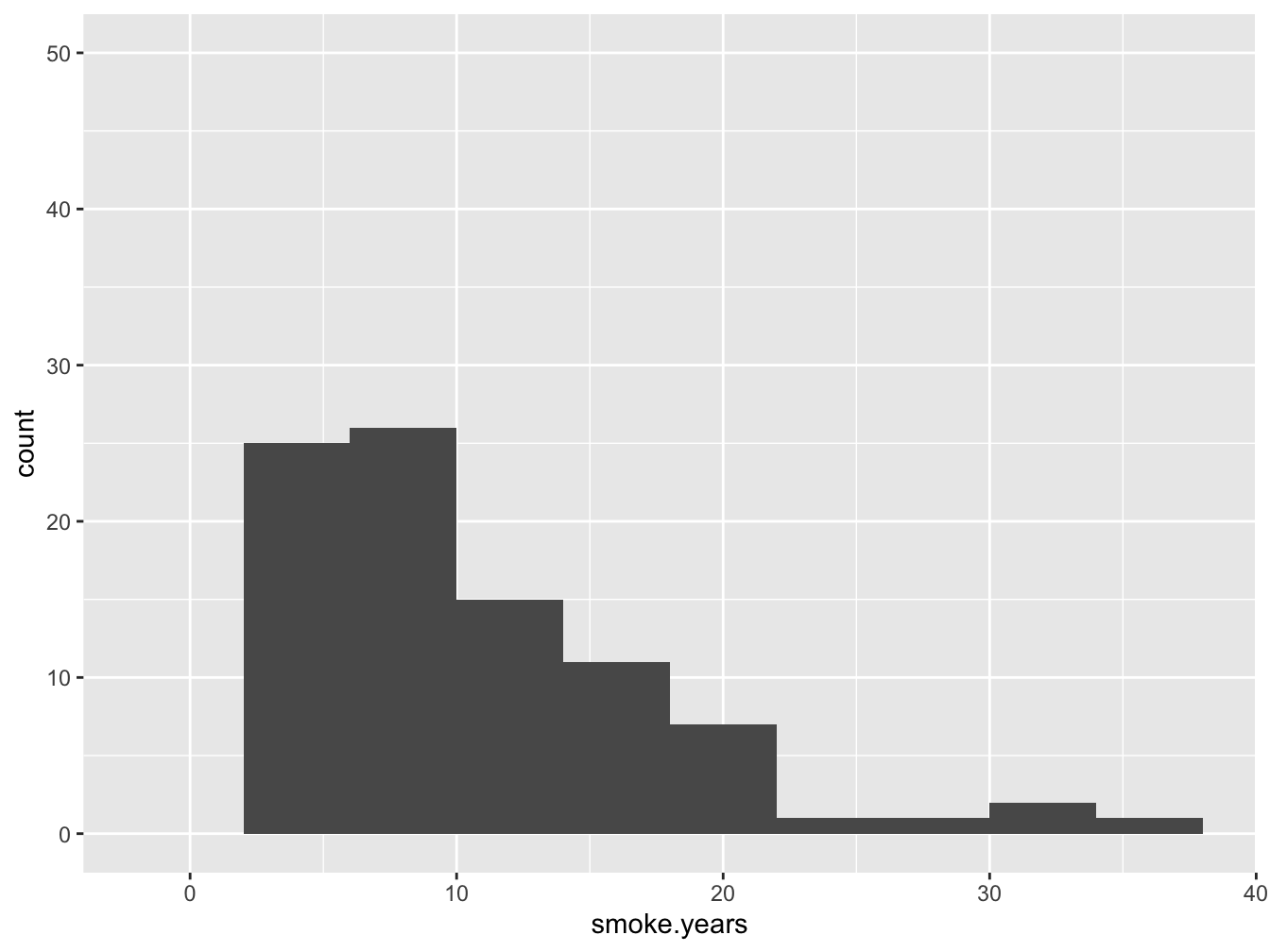
Figure 7.1: A histogram of the ‘smoke.years’ attribute
From the figure it is obvious that this attribute is really the number of years that the subject has smoked. As you can see, the zero-years smoking is absent - this data is only relevant for subjects where smoker == 1. Where 1 is actually not a logical (did you spot that already in the data?).
Obviously, smoke.years should be an int . The same counts for variable smokes.packs.year.
7.2.2.2 Getting it right in the end
Here, for demonstration purposes I use a wrapper function read.csv() instead of read.table(). The tidyverse has data reading facilities as well of course, but these were not dealt with in this course.
data <- read.csv(datafile, na.strings = "?")
names(data) <- codebook[,1]
for(i in 1:nrow(codebook)) {
  if(codebook[i, 2] == "logical"){
    data[,i] <- as.logical(data[,i])
  }
}
(data <- as_tibble(data))
## # A tibble: 858 x 36
## age num.partners first.sex num.preg smoker smoke.years smokes.packs.year
## <int> <dbl> <dbl> <dbl> <lgl> <dbl> <dbl>
## 1 18 4 15 1 FALSE 0 0
## 2 15 1 14 1 FALSE 0 0
## 3 34 1 NA 1 FALSE 0 0
## 4 52 5 16 4 TRUE 37 37
## 5 46 3 21 4 FALSE 0 0
## 6 42 3 23 2 FALSE 0 0
## 7 51 3 17 6 TRUE 34 3.4
## 8 26 1 26 3 FALSE 0 0
## 9 45 1 20 5 FALSE 0 0
## 10 44 3 15 NA TRUE 1.27 2.8
## # … with 848 more rows, and 29 more variables: horm.contracept.ever <lgl>,
## # horm.contracept.years <dbl>, IUD.ever <lgl>, IUD.years <dbl>,
## # STD.ever <lgl>, STDs.number <dbl>, STD_condylomatosis <lgl>,
## # STD_cervical.cond <lgl>, STD_vaginal.cond <lgl>, STD_vulvo.per.cond <lgl>,
## # STD_syph <lgl>, STD_pid <lgl>, STD_gen.herpes <lgl>, STD_moll.cont <lgl>,
## # STD_aids <lgl>, STD_hiv <lgl>, STD_hepB <lgl>, STD_HPV <lgl>,
## # STD.num.diagn <int>, STD.time.since.first <dbl>, STD.time.since.last <dbl>,
## # Dx.cancer <lgl>, Dx.cin <lgl>, Dx.hpv <lgl>, Dx <lgl>,
## # target.hinselman <lgl>, target.schiller <lgl>, target.cytology <lgl>,
## # target.biopsy <lgl>7.2.2.3 Why such a hassle?
It makes it so much easier to run analyses from here on! Also, the code will be more readable making your research more transparent and reproducible. Two very important aspects of any analysis! Besides this, it will make adding labels to plots a breeze.
7.3 Exploring variables
7.3.1 First steps
The first phase of any analysis should be to inspect all variables with respect to data distribution and datacorruption. You should also take special care to notice outliers, skewed data and the amount of missing data.
These functions and visualizations are used most often for this purpose:
summary()quantile()- histogram
- boxplot (or jitter, stripchart)
- density plot
- (contingency) tables
As you can see, in this phase only univariate analyses and visualizations are employed.
7.3.1.1 Inspecting some columns
Here, I will only inspect some columns since this entire process is for demonstration purposes only. I will start with columns 2 and three.
summary(data[, 2:3])## num.partners first.sex
## Min. : 1.00 Min. :10
## 1st Qu.: 2.00 1st Qu.:15
## Median : 2.00 Median :17
## Mean : 2.53 Mean :17
## 3rd Qu.: 3.00 3rd Qu.:18
## Max. :28.00 Max. :32
## NA's :26 NA's :7Here is a visualization. I used grid.arrange() from the gridExtra package for arranging two plots in a single panel.
tmp <- data %>% select(2:3) %>% drop_na()
p1 <- ggplot(tmp, mapping = aes(x = "", y = num.partners)) +
    geom_boxplot() +
    geom_jitter(width = 0.2, height = 0.1, alpha = 0.4, color = "blue") +
    ylab("number of partners") +
    xlab(NULL)

p2 <- ggplot(tmp, mapping = aes(x = "", y = first.sex)) +
    geom_boxplot() +
    geom_jitter(width = 0.2, height = 0.1, alpha = 0.4, color = "blue") +
    ylab("age of first sex") +
    xlab(NULL)

grid.arrange(p1, p2, nrow = 1)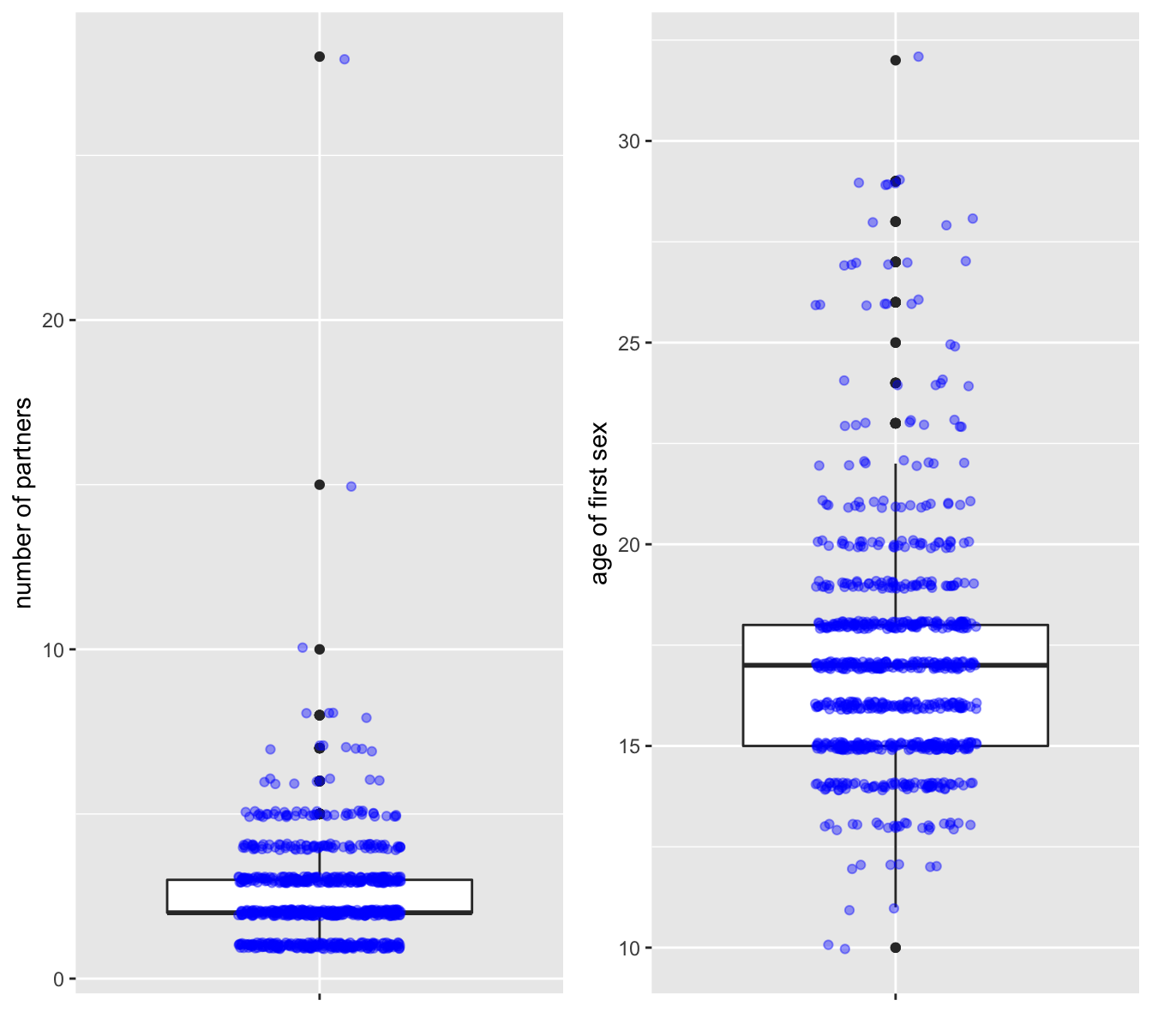
Figure 7.2: The ‘num.partners’ (left) and ‘first.sex’ (right) attributes
Now look at these results and ask yourself:
- Are these summaries and distributions you would expect?
- Do you see (hints of) outliers? Are these outliers “real data” or - for instance- data entry errors?
- Do you think the questions were answered truthfully?
Here is another boxplot, the workhorse of data visualization. The problem with discrete data is that they overlap 100% in plots, as is the case with the outliers here. Instead of overlaying with all jittered data you could apply this trick to only jitter the outliers. The trick there is to provide a data = function(x) dplyr::filter(x, outlier) argument in geom_jitter() where only the rows with outliers are selected.
Note that I already moved away from univeriate analysis.
##define outlier function
my_outlier <- function(x) {
    x > median(x) + IQR(x) * 1.5
}

tmp <- data %>%
    select(c(horm.contracept.years, target.biopsy)) %>%
    drop_na() %>%
    mutate(outlier = my_outlier(horm.contracept.years)) %>%
    ungroup()

ggplot(tmp, mapping = aes(x=target.biopsy, y=horm.contracept.years)) +
    geom_boxplot(outlier.shape = NA) + ##no outliers plotted here
    geom_jitter(data = function(x) dplyr::filter(x, outlier),
                width = 0.2, height = 0.1, alpha = 0.5)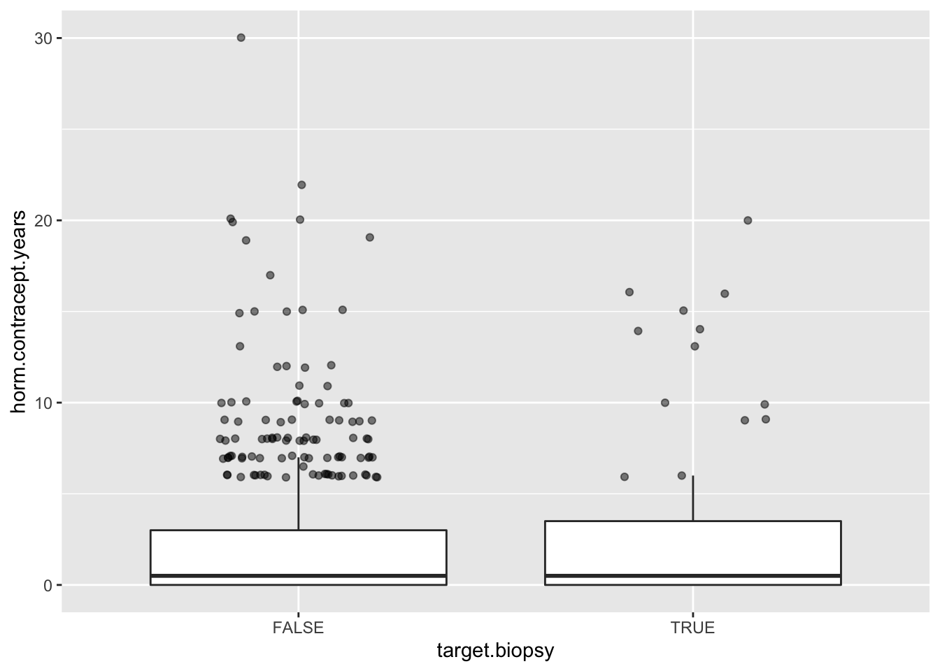
Let’s also look at the STDs.
summary(data$STDs.number)## Min. 1st Qu. Median Mean 3rd Qu. Max. NA's
## 0.0 0.0 0.0 0.2 0.0 4.0 105These are strange numbers! Many missing values and many outliers apparently. A simple table view may help get insight here.
data %>% group_by(STDs.number) %>% tally()## # A tibble: 6 x 2
## STDs.number n
## <dbl> <int>
## 1 0 674
## 2 1 34
## 3 2 37
## 4 3 7
## 5 4 1
## 6 NA 105Why would there be o many missing values? I think people don’t like to admit they’ve had an STD.
7.3.2 Smoking data corrupted?
summary(data[, 5:7])## smoker smoke.years smokes.packs.year
## Mode :logical Min. : 0.0 Min. : 0.0
## FALSE:722 1st Qu.: 0.0 1st Qu.: 0.0
## TRUE :123 Median : 0.0 Median : 0.0
## NA's :13 Mean : 1.2 Mean : 0.5
## 3rd Qu.: 0.0 3rd Qu.: 0.0
## Max. :37.0 Max. :37.0
## NA's :13 NA's :13Obviously, these three variables describe the exact same thing: smoking behavior. But there is something funny going on. Let’s investigate this further and deal with it.
data %>% group_by(smoker) %>% tally()## # A tibble: 3 x 2
## smoker n
## <lgl> <int>
## 1 FALSE 722
## 2 TRUE 123
## 3 NA 13perc <- length(data$smoker) / sum(data$smoker, na.rm = T)So 6.98% of the subjects in this study is smoker.
Verify the number of smokers via another route:
sum(data$smoker & data$smoke.years > 0 & data$smokes.packs.year > 0, na.rm=T)## [1] 123So is the smoker data corrupted? Probably not, but row 4 is dodgy at the least, and worth further investigation:
data[4, c(1, 5, 6, 7)]## # A tibble: 1 x 4
## age smoker smoke.years smokes.packs.year
## <int> <lgl> <dbl> <dbl>
## 1 52 TRUE 37 37Let’s look at the values in the the smoker columns in another way:
data %>%
    select(smoker, smoke.years, smokes.packs.year) %>%
    drop_na() %>%
    filter(smoke.years > 0 & smoke.years == smokes.packs.year)
## # A tibble: 14 x 3
## smoker smoke.years smokes.packs.year
## <lgl> <dbl> <dbl>
## 1 TRUE 37 37
## 2 TRUE 19 19
## 3 TRUE 21 21
## 4 TRUE 15 15
## 5 TRUE 12 12
## 6 TRUE 5 5
## 7 TRUE 3 3
## 8 TRUE 3 3
## 9 TRUE 5 5
## 10 TRUE 5 5
## 11 TRUE 9 9
## 12 TRUE 6 6
## 13 TRUE 3 3
## 14 TRUE 22 22As reminder, here is the equivalent base R code - which do you prefer?
data[!is.na(data$smoke.years)
     & data$smoke.years > 0
     & data$smoke.years == data$smokes.packs.year, c(5,6,7)]
What do you think happened here?
I personally think there was a sleepy person doing data entry in the wrong column, or something like that.
Now the packs per year attribute.
data %>% filter(smokes.packs.year > 0) %>%
    ggplot(aes(x = smokes.packs.year)) +
        geom_histogram(bins = 25)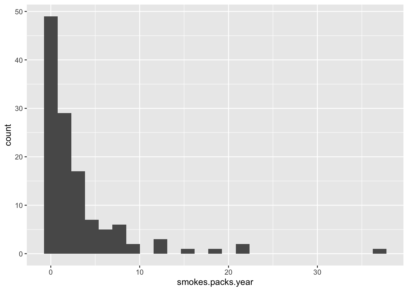
Do you know any smoker? Do they smoke at most 37 packs per year? I think not! This cannot be packs per year! Most smokers smoke 1-7 packs per week! This is exactly what this histogram shows.
7.3.2.1 Dealing with data corruption
Two options remain for the smokes.packs.year column. the first is to adjust the units manually as I think is correct. The other is to simply discard the column.
Since the smoking data is redundant, I will choose the latter. if you have this kind of problems with crucial data columns, you should probably try to contact the authors/data collection team before changing the units yourself.
7.4 Variable engineering
7.4.1 Recoding strategies
Often you will have to recode (or transform) some or all of your variables. This can be to be able to compare groups instead of numbers on a continuous scale (factorization), to make them comparable (normalization) or to get them in a more linear distribution (log transformation).
Several techniques exist for different challenges:
- Factorization: convert to factor
- seen with Smoking data
- Normalization
- min-max normalization
- scaling normalization
- Log transformation (log2, log10)
- Dummy coding: when numeric attributes are required instead of factor data
7.4.1.1 min-max normalization
All data is scaled from 0 to 1, where the lowest value in your data is mapped to zero and the highest to one. This method is easy and transparent, but the danger lies in unseen data. When new data is encountered with a wider distribution analyses with this approach may break.
This is how to do it in R
scale_min_max <- function(x) {
     (x - min(x)) / (max(x) - min(x))
}
Here is a demo of min-max normalization.
x <- c(2, -1, 3, 5, 0, 4)
scale_min_max(x)
## [1] 0.500 0.000 0.667 1.000 0.167 0.8337.4.1.2 scaling normalization
A slightly more used normalization technique is scaling normalization. It scales all variable to a mean of zero and with the same standard deviation.
\[x' = \frac{x-\bar{x}}{\sigma}\]
It is built right into R:
x <- c(2, -1, 3, 5, 0, 4)
scale(x)
## [,1]
## [1,] -0.0719
## [2,] -1.3669
## [3,] 0.3597
## [4,] 1.2231
## [5,] -0.9353
## [6,] 0.7914
## attr(,"scaled:center")
## [1] 2.17
## attr(,"scaled:scale")
## [1] 2.327.4.1.3 dummy encoding
How to change this factor in a numeric representation usable for techniques that require numeric input such as clustering, linear modelling or regression?
This is done with a technique called dummy coding and the essence is binary splitting. Here is a small data set:
pet_favour <- tibble(subject = c("Mike", "Roger", "Rose", "Megan", "Caitlin"),
                    favour = factor(c("dog", "cat", "cat", "dog", "rat")))
pet_favour
## # A tibble: 5 x 2
## subject favour
## <chr> <fct>
## 1 Mike dog
## 2 Roger cat
## 3 Rose cat
## 4 Megan dog
## 5 Caitlin ratWhat we need here is three columns with 0 or 1 values for
- dog/not dog
- cat/not cat
- rat/not rat
Below you can see an approach to this using some techniques from base R.
encode_dummy <- function(x) {
    lvls <- levels(x)
    tmp <- as.data.frame(sapply(lvls, function(y) as.integer(x == y)))
    names(tmp) <- paste0(lvls, "_y")
    tmp
}
bind_cols(subject = pet_favour$subject, encode_dummy(pet_favour$favour))
## subject cat_y dog_y rat_y
## 1 Mike 0 1 0
## 2 Roger 1 0 0
## 3 Rose 1 0 0
## 4 Megan 0 1 0
## 5 Caitlin 0 0 1There are of course also packages that can do this; e.g. have a look at dummies.
7.4.2 “factorization”
Especially for visualization purposes, it can be more convenient to have a variable in a factor form instead of numeric form. For instance, this is the case with the smoking-related data in the current dataset.
I will reduce all three ‘smoking’ variables to one variable and start building a ‘clean’ dataset.
Here, the new variable smoking is the result of cutting the smoke.years variable into factor levels.
smoking_f <- cut(data$smoke.years,
               breaks = c(0, 1, 5, 12, 100),
               labels = c("never", "short", "medium", "long"),
               ordered_result = T,
               right = F)

clean_data <- data %>%
    mutate(smoking = smoking_f) %>%
    select(age:num.preg, smoking, horm.contracept.ever:target.biopsy)
table(clean_data$smoking, useNA = "always")
##
## never short medium long <NA>
## 726 42 44 33 137.4.3 Data redundancy in STD variables
There are many variables related to STDs:
(std_columns <- codebook %>%
    select(abbreviation) %>%
    filter(str_detect(abbreviation, "STD_")))
## abbreviation
## 1 STD_condylomatosis
## 2 STD_cervical.cond
## 3 STD_vaginal.cond
## 4 STD_vulvo.per.cond
## 5 STD_syph
## 6 STD_pid
## 7 STD_gen.herpes
## 8 STD_moll.cont
## 9 STD_aids
## 10 STD_hiv
## 11 STD_hepB
## 12 STD_HPVstd_columns <- std_columns$abbreviation
##alternative with base R:
#codebook[grep(pattern = "STD_", x = codebook$abbreviation), 1]Some of these are almost completely redundant, and most with extremely low -and thus useless- counts. Seen in absolute numbers, not many have multiple STDs, but statistically seen they are highly over represented - there are even more with two than with one STD:
table(data$STDs.number, useNA = "always")##
## 0 1 2 3 4 <NA>
## 674 34 37 7 1 105Only 79 subjects have STDs (luckily!).
These are the counts of occurrences of individual STDs:
They are listed below. You can see a nice application of the gather() function to put the results in long format instead of wide.
clean_data %>%
    summarise_at(std_columns, function(x) sum(x, na.rm = T)) %>%
    gather(key = "disease", value = "count", everything())
## # A tibble: 12 x 2
## disease count
## <chr> <int>
## 1 STD_condylomatosis 44
## 2 STD_cervical.cond 0
## 3 STD_vaginal.cond 4
## 4 STD_vulvo.per.cond 43
## 5 STD_syph 18
## 6 STD_pid 1
## 7 STD_gen.herpes 1
## 8 STD_moll.cont 1
## 9 STD_aids 0
## 10 STD_hiv 18
## 11 STD_hepB 1
## 12 STD_HPV 2This is the same in base R using apply():
apply(data[ ,std_columns], MARGIN = 2, FUN = function(x) sum(x>0, na.rm=T))7.5 The dependent variable
In many datasets there is a single dependent variable, the variable you try to explain or model using all the other variables (hence the name “target” used here. In this case it is the question whether the subject has cervical cancer yes or no.
Unfortunately there are four dependent variables:
last <- length(names(data))
(target_vars <- names(data)[(last-3):last])
## [1] "target.hinselman" "target.schiller" "target.cytology" "target.biopsy"Which one(s) are you going to use?
Let’s investigate the pairwise correlations between them.
target_names <- c("Hinselman", "Schiller", "cytology", "biopsy")
cor_matrix <- cor(data[, 33:36])
colnames(cor_matrix) <- target_names
(cor_matrix <- as_tibble(cor_matrix))
## # A tibble: 4 x 4
## Hinselman Schiller cytology biopsy
## <dbl> <dbl> <dbl> <dbl>
## 1 1 0.650 0.192 0.547
## 2 0.650 1 0.361 0.733
## 3 0.192 0.361 1 0.327
## 4 0.547 0.733 0.327 1cor_matrix <- cor_matrix %>% mutate(target_name = target_names) %>% select(5, 1:4)A
map is a nice visualization for this type of data. Of course, ggplot really likes the long format so that needs to be done first with gather() (try to do this with pivot_longer() as an exercise):
map, fig.asp=.9, out.width='70%', fig.align='center', fig.cap="A correlation
map of the four explanatory variables"}
cor_matrix_long <- gather(cor_matrix, key = "method", value = "correlation", target_names)
ggplot(data = cor_matrix_long, aes(x=target_name, y=method, fill=correlation)) +
    geom_tile() +
    labs(x=NULL, y=NULL) +
    scale_fill_gradient(high = "red", low = "white" )
This shows the correlation between the four target variables.
Another way to explore this is a contingency table.
## TO BE DONE7.6 Exploring relationships between variables
Typically, relationships between variables are visualized using scatterplots, but other strategies exist. Several are explored here.
7.6.1 The scatterplot
A simple scatterplot looking at the relationship between first.sex and num.partners.
baseplot_sp <- ggplot(clean_data, aes(x=first.sex, y=num.partners)) +
   labs(x="Age of first sex", y="Number of sexual partners")
baseplot_sp + geom_point(na.rm=T)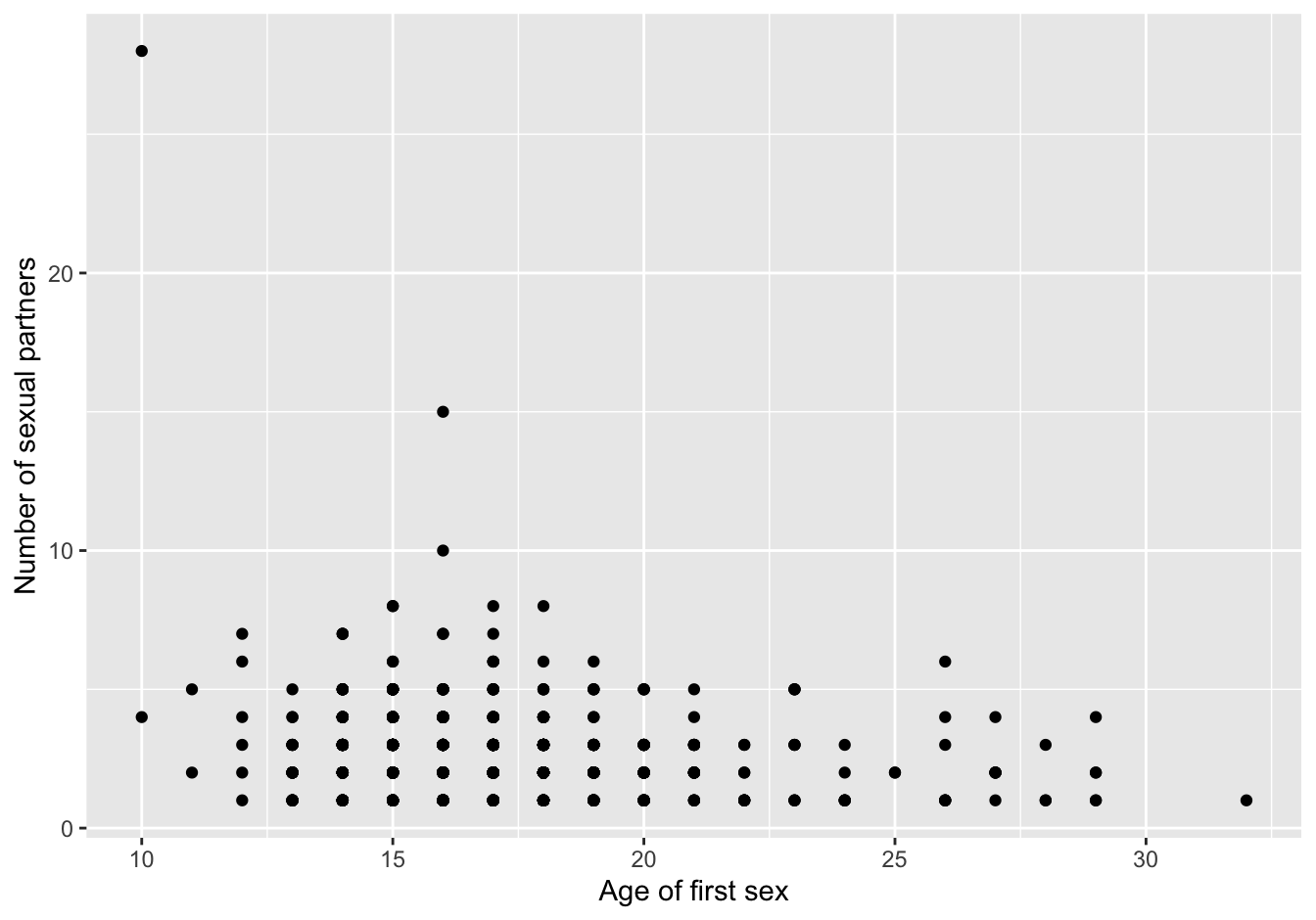
Figure 7.3: scatterplot first version
Do you notice the strange “outlier,” a subject who had first sex at ten and had 29 sexual partners?
More importantly, this is not showing the correct picture: there is a limited number of discrete values for each variable. Only around 100 points are visible where {r nrow(data)} are expected, so apparently many points overlap. This can be improved with alpha parameter to geom_point. Another strategy to improve is by using the geom_jitter() function, and combined with the alpha parameter.
Omitting outliers could improve the picture, but will of course not show the complete picture anymore.
Here, I choose the transparency option together with a bit of jitter (but not too much to still show the discreteness of the measurements). I also added a trend line in the form of a smoother. The trend line is an addition that is a great visual help to guide your reader. My question to you is: look at the trend line and decide whether it is showing a false pattern.
baseplot_sp +
    geom_jitter(na.rm=T, alpha=0.2,
                shape=16, size=2,
                width = 0.2, height = 0.2,
                color = "darkgreen") +
    geom_smooth(method="loess", na.rm=T)
## `geom_smooth()` using formula 'y ~ x'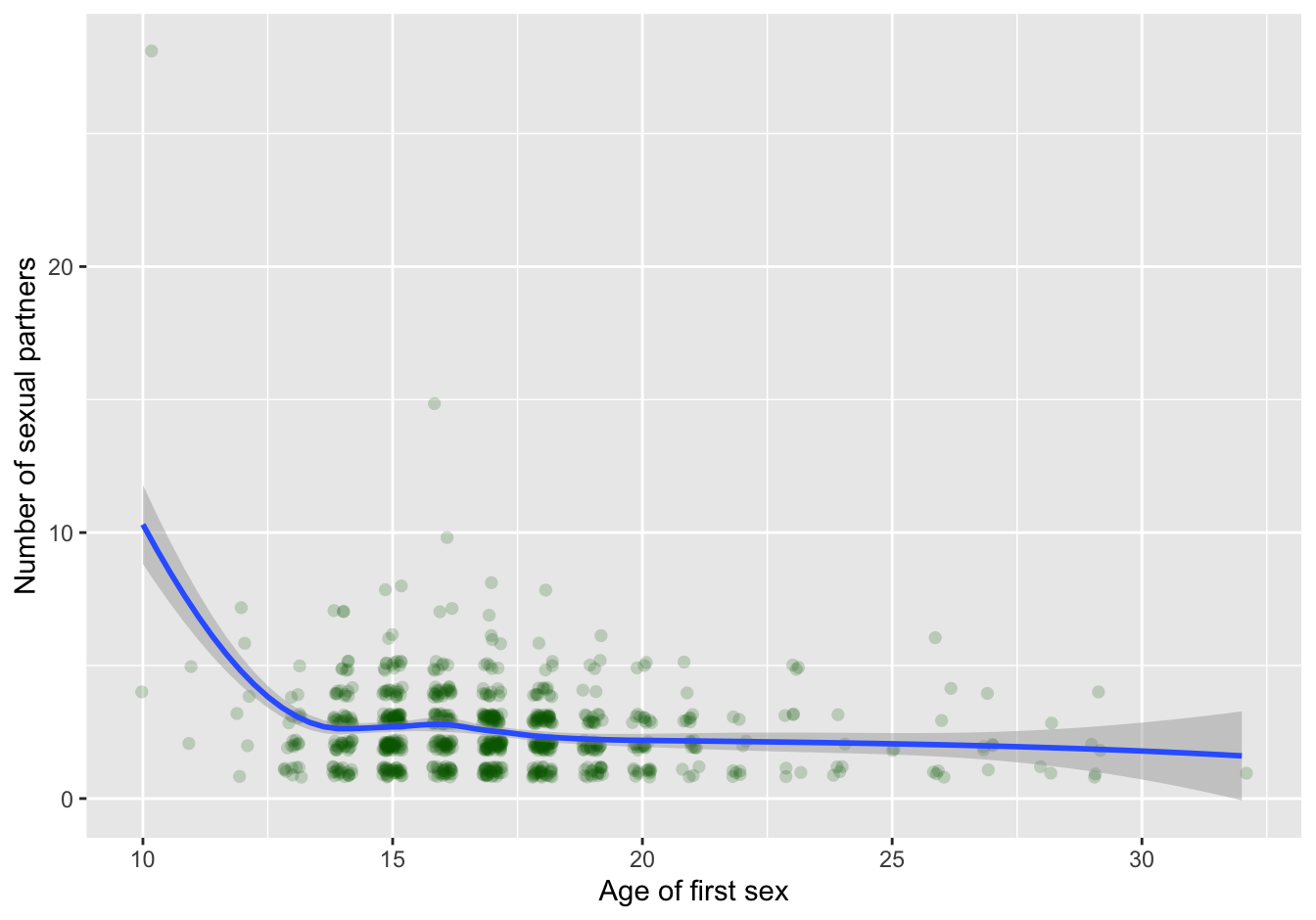
Figure 7.4: scatterplot with trendline
The trend line shows the high impact of a single outlier! In contrast to common belief about age of first sex and “promiscuity,” no apparent relationship is visible in this dataset when you omit the single outlier:
clean_data %>% filter(num.partners < 25 ) %>%
    ggplot(aes(x=first.sex, y=num.partners)) +
        labs(x="Age of first sex", y="Number of sexual partners") +
        geom_jitter(na.rm=T, alpha=0.2,
                shape=16, size=2,
                width = 0.2, height = 0.2,
                color = "darkgreen") +
        geom_smooth(method="loess", na.rm=T)
## `geom_smooth()` using formula 'y ~ x'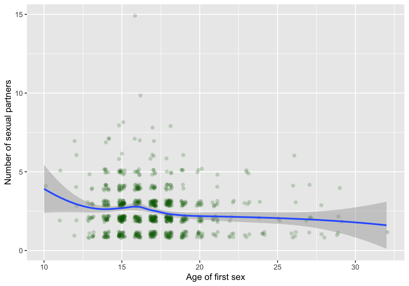
Figure 7.5: scatterplot with trendline
7.6.1.1 Binning
A method not discussed before is binning, With binning, you cluster the individual data points into “buckets.” The amount of cases in a bucket is then displayed using a color gradient.
baseplot_sp + geom_bin2d(na.rm=T)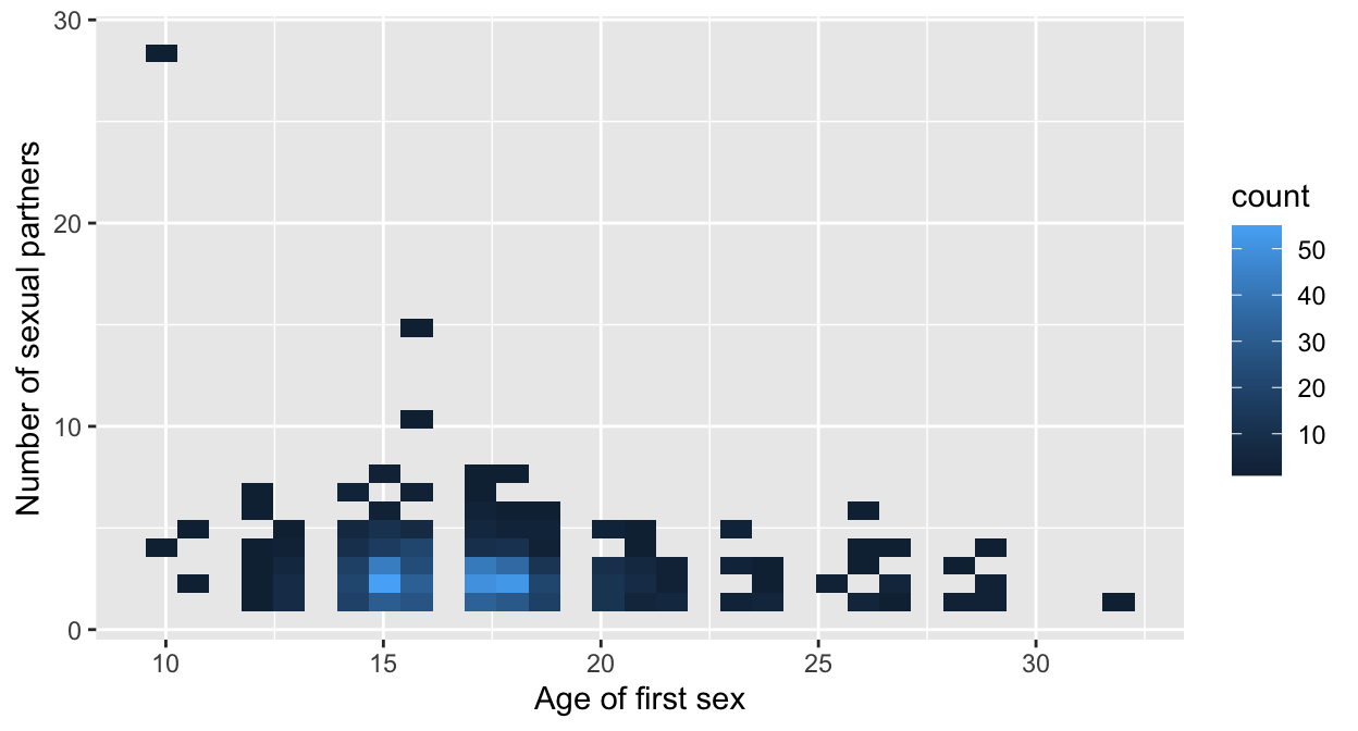
Here is a variation of binning - the hexagonal bin (requires package hexbin):
library(hexbin)
baseplot_sp + geom_hex(na.rm=T)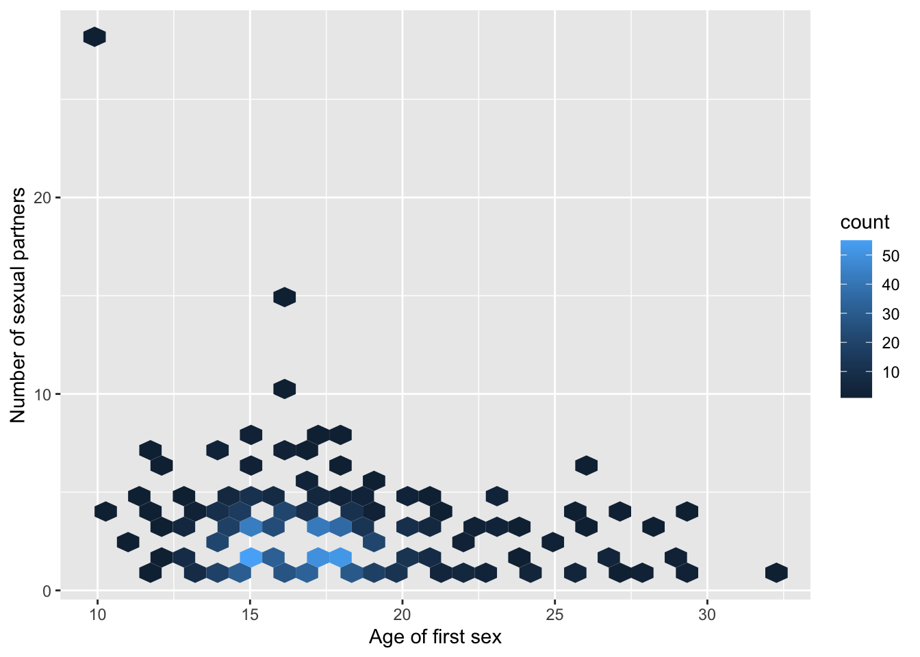
7.7 Look for patterns with the dependent variable
Why would you do that? The dependent variable is the thing you are interested in! Therefore it is a good idea to investigate variables in relation with the dependent variable.
clean_data %>% filter(num.partners < 25 ) %>%
    ggplot(aes(x=first.sex, y=num.preg, color=target.biopsy)) +
        labs(x="Age of first sex", y="Number of pregnancies") +
    geom_jitter(mapping = aes(color=target.biopsy),
                na.rm=T, width=0.2, height=0.2,
                alpha=0.5, shape=16, size=0.8) +
    ylim(0,10) +
    geom_smooth(method="loess", na.rm=T)
## `geom_smooth()` using formula 'y ~ x'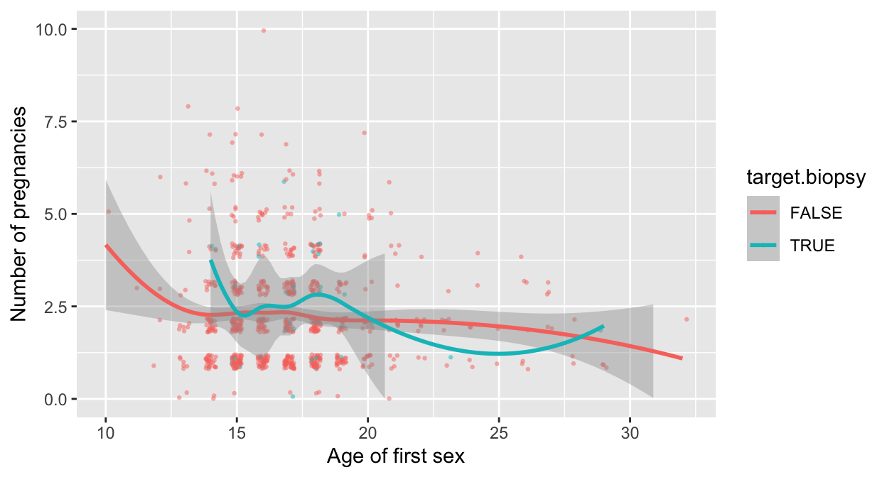
Again, the heatmap comes in handy. Start with creating the matrix.
selection <- c("num.partners", "first.sex", "num.preg", "horm.contracept.years", "IUD.years", "STDs.number", "target.biopsy")

tmp <- clean_data %>% select(selection) %>% drop_na()
## Note: Using an external vector in selections is ambiguous.
## ℹ Use `all_of(selection)` instead of `selection` to silence this message.
## ℹ See <https://tidyselect.r-lib.org/reference/faq-external-vector.html>.
## This message is displayed once per session.cor_matrix <- cor(tmp)
#cor_matrix
#colnames(cor_matrix) <- target_names
cor_matrix <- as_tibble(cor_matrix)
(cor_matrix <- cor_matrix %>% mutate(var1 = selection) %>% select(8, 1:7))## # A tibble: 7 x 8
## var1 num.partners first.sex num.preg horm.contracept… IUD.years STDs.number
## <chr> <dbl> <dbl> <dbl> <dbl> <dbl> <dbl>
## 1 num.pa… 1 -0.148 0.0937 0.0209 0.00705 0.0370
## 2 first.… -0.148 1 -0.0704 0.00434 -0.0357 0.00188
## 3 num.pr… 0.0937 -0.0704 1 0.217 0.156 -0.00460
## 4 horm.c… 0.0209 0.00434 0.217 1 -0.00885 -0.0175
## 5 IUD.ye… 0.00705 -0.0357 0.156 -0.00885 1 0.00262
## 6 STDs.n… 0.0370 0.00188 -0.00460 -0.0175 0.00262 1
## 7 target… -0.00266 0.0296 0.0452 0.0799 0.0422 0.105
## # … with 1 more variable: target.biopsy <dbl>And then create the plot. Here I used pivot_longer() instead of gather() to obtain the longer format required for ggplot2.
cor_matrix_long <- pivot_longer(data = cor_matrix, cols = selection, names_to = "variable", values_to = "cor")
ggplot(data = cor_matrix_long, aes(x=var1, y=variable, fill=cor)) +
    geom_tile() +
    labs(x=NULL, y=NULL) +
    scale_fill_gradient(high = "red", low = "white" )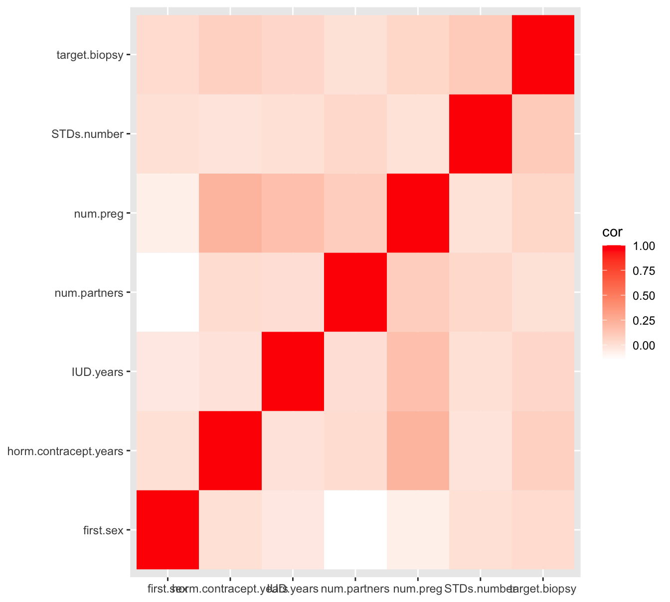
Figure 7.6: A heatmap pairwise correlation of selected numeric variables
As you can see, there is hardly any correlation between these numeric variables, and not with the target (dependent) variable target.biopsy either. This is not a hopeful result when the goal is to be able to predict cervical cancer occurrence.
7.8 Density plots show class distinction
A density plot, split over the categories of your target variable, will often quickly reveal whether there is promise in a variable. I’ll demonstrate with the iris dataset since the cervical cancer dataset is not so nice in that respect.
ggplot(iris, aes(x=Petal.Length)) + geom_density(aes(color=Species))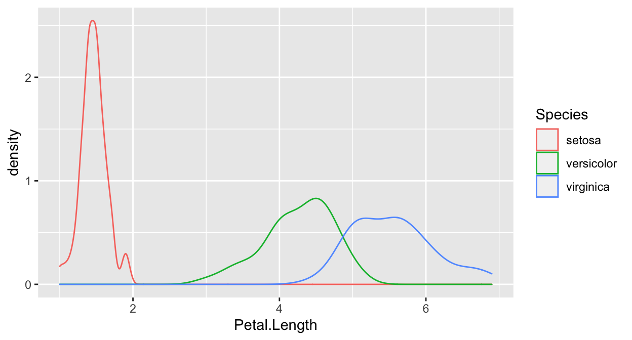 In this plot, you can see that Setosa separates quite nicely, by the other two don’t.
7.8.1 The ‘xor’ problem
The density approach is not flawless! Consider this:
var_x <- c(runif(300, -1, 0), runif(300, 0, 1))
var_y <- c(runif(150, -1, 0), runif(150, 0, 1), runif(150, 0, 1), runif(150, -1, 0))
label = rep(c(rep("sick", 150), rep("healthy", 150)), 2)
df <- data.frame(dosage = var_x, response=var_y, patient_type = label)
ggplot(data=df, mapping=aes(x=dosage)) + geom_density(aes(color=patient_type))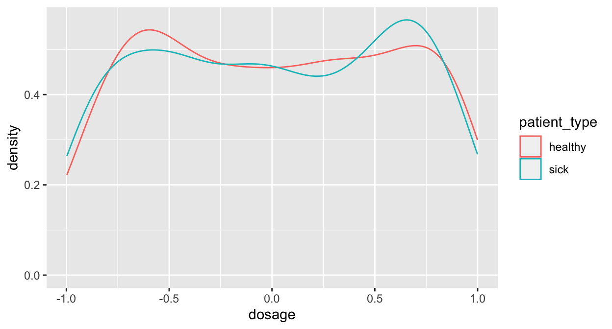
This looks like there is little to win, doesn’t it?
Here’s another view of the same data!
ggplot(df, aes(x=dosage, y=response)) + geom_point()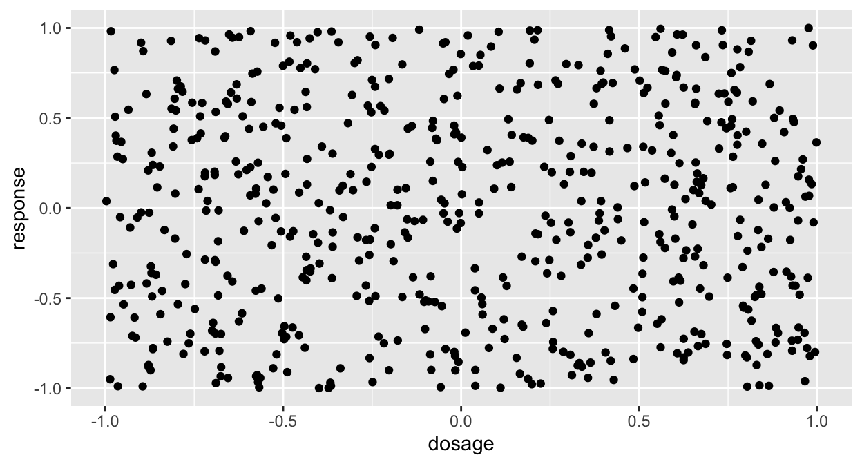 Still not interesting! Give it one more shot:
ggplot(df, aes(x=dosage, y=response, color=patient_type)) + geom_point()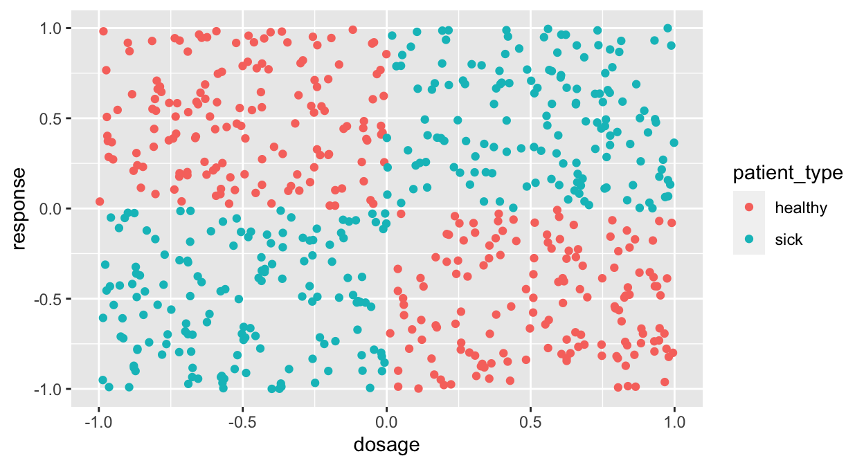
This is called the XOR problem because the cases follow an “Exclusive Or” rule.
7.9 Advanced Explorations
7.9.1 PCA
First PCA will be shown with the iris dataset and then with the cervical cancer dataset.
ir.pca <- prcomp(iris[, -5],
                 center = TRUE,
                 scale. = TRUE)
print(ir.pca)
## Standard deviations (1, .., p=4):
## [1] 1.708 0.956 0.383 0.144
##
## Rotation (n x k) = (4 x 4):
## PC1 PC2 PC3 PC4
## Sepal.Length 0.521 -0.3774 0.720 0.261
## Sepal.Width -0.269 -0.9233 -0.244 -0.124
## Petal.Length 0.580 -0.0245 -0.142 -0.801
## Petal.Width 0.565 -0.0669 -0.634 0.524The plot method returns a plot of the variances (y-axis) associated with the PCs (x-axis).
plot(ir.pca, type = "l")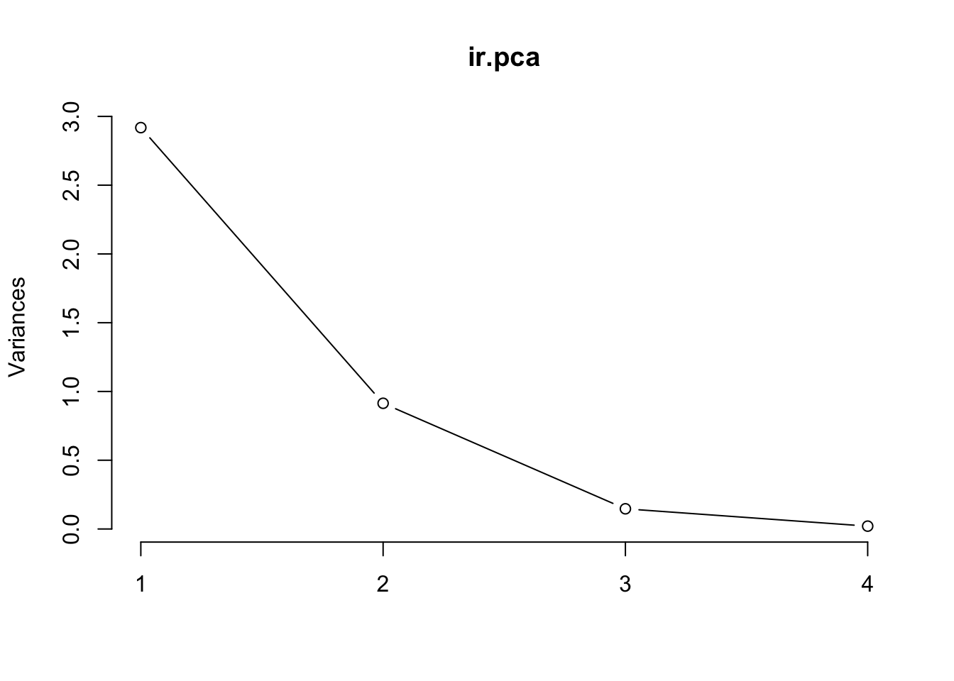
The summary method describe the importance of the PCs.
summary(ir.pca)## Importance of components:
## PC1 PC2 PC3 PC4
## Standard deviation 1.71 0.956 0.3831 0.14393
## Proportion of Variance 0.73 0.229 0.0367 0.00518
## Cumulative Proportion 0.73 0.958 0.9948 1.00000The PC plot
library(ggbiplot)## Loading required package: plyr## ------------------------------------------------------------------------------## You have loaded plyr after dplyr - this is likely to cause problems.
## If you need functions from both plyr and dplyr, please load plyr first, then dplyr:
## library(plyr); library(dplyr)## ------------------------------------------------------------------------------##
## Attaching package: 'plyr'## The following objects are masked from 'package:dplyr':
##
## arrange, count, desc, failwith, id, mutate, rename, summarise,
## summarize## Loading required package: scalesggbiplot(ir.pca, obs.scale = 1, var.scale = 1,
groups = iris[,5], ellipse = FALSE,
circle = TRUE) +
scale_color_discrete(name = '') +
theme(legend.direction = 'horizontal', legend.position = 'top')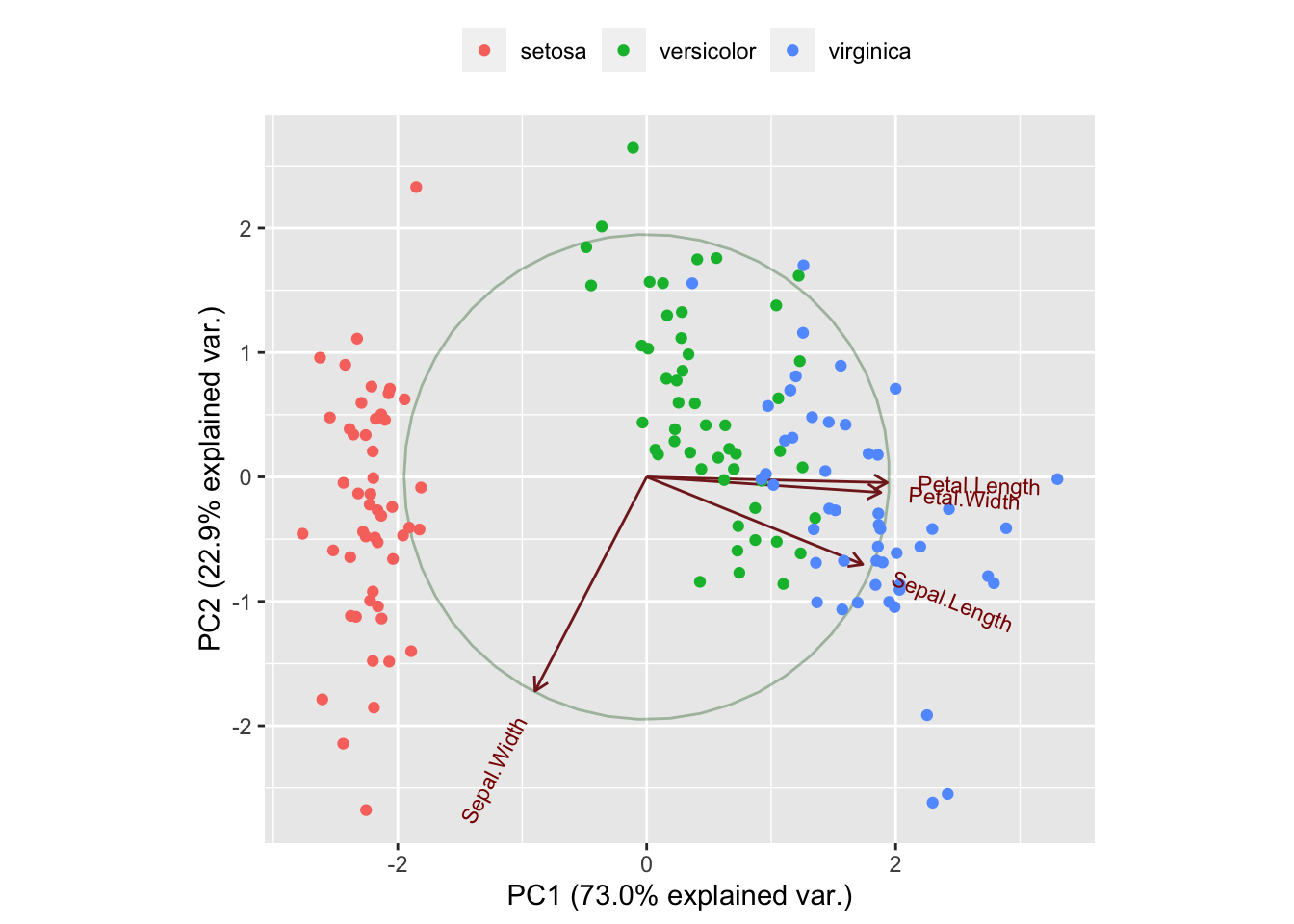
Now the same procedure for the cervical cancer dataset, with a selection of numerical variables.
selection <- c("num.partners", "first.sex", "num.preg", "horm.contracept.years", "IUD.years", "STDs.number", "target.biopsy")
tmp <- clean_data %>% select(selection) %>% drop_na()
tmp
## # A tibble: 676 x 7
## num.partners first.sex num.preg horm.contracept.years IUD.years STDs.number
## <dbl> <dbl> <dbl> <dbl> <dbl> <dbl>
## 1 4 15 1 0 0 0
## 2 1 14 1 0 0 0
## 3 5 16 4 3 0 0
## 4 3 21 4 15 0 0
## 5 3 23 2 0 0 0
## 6 3 17 6 0 7 0
## 7 1 26 3 2 7 0
## 8 1 20 5 0 0 0
## 9 3 26 4 2 0 0
## 10 1 17 3 8 0 0
## # … with 666 more rows, and 1 more variable: target.biopsy <lgl>cc.pca <- prcomp(tmp[, -7],
center = TRUE,
scale. = TRUE)
print(cc.pca)## Standard deviations (1, .., p=6):
## [1] 1.151 1.052 1.005 0.999 0.918 0.848
##
## Rotation (n x k) = (6 x 6):
## PC1 PC2 PC3 PC4 PC5 PC6
## num.partners -0.3816 0.552 0.2388 0.0143 -0.6832 -0.15857
## first.sex 0.3461 -0.570 -0.0559 0.2939 -0.6801 0.05260
## num.preg -0.6473 -0.258 -0.0466 0.0622 -0.0273 0.71257
## horm.contracept.years -0.4427 -0.471 0.4721 0.1730 0.1630 -0.55043
## IUD.years -0.3457 -0.104 -0.8319 -0.0899 -0.0903 -0.40168
## STDs.number -0.0113 0.266 -0.1506 0.9336 0.1875 0.00171The plot method returns a plot of the variances (y-axis) associated with the PCs (x-axis).
plot(cc.pca, type = "l")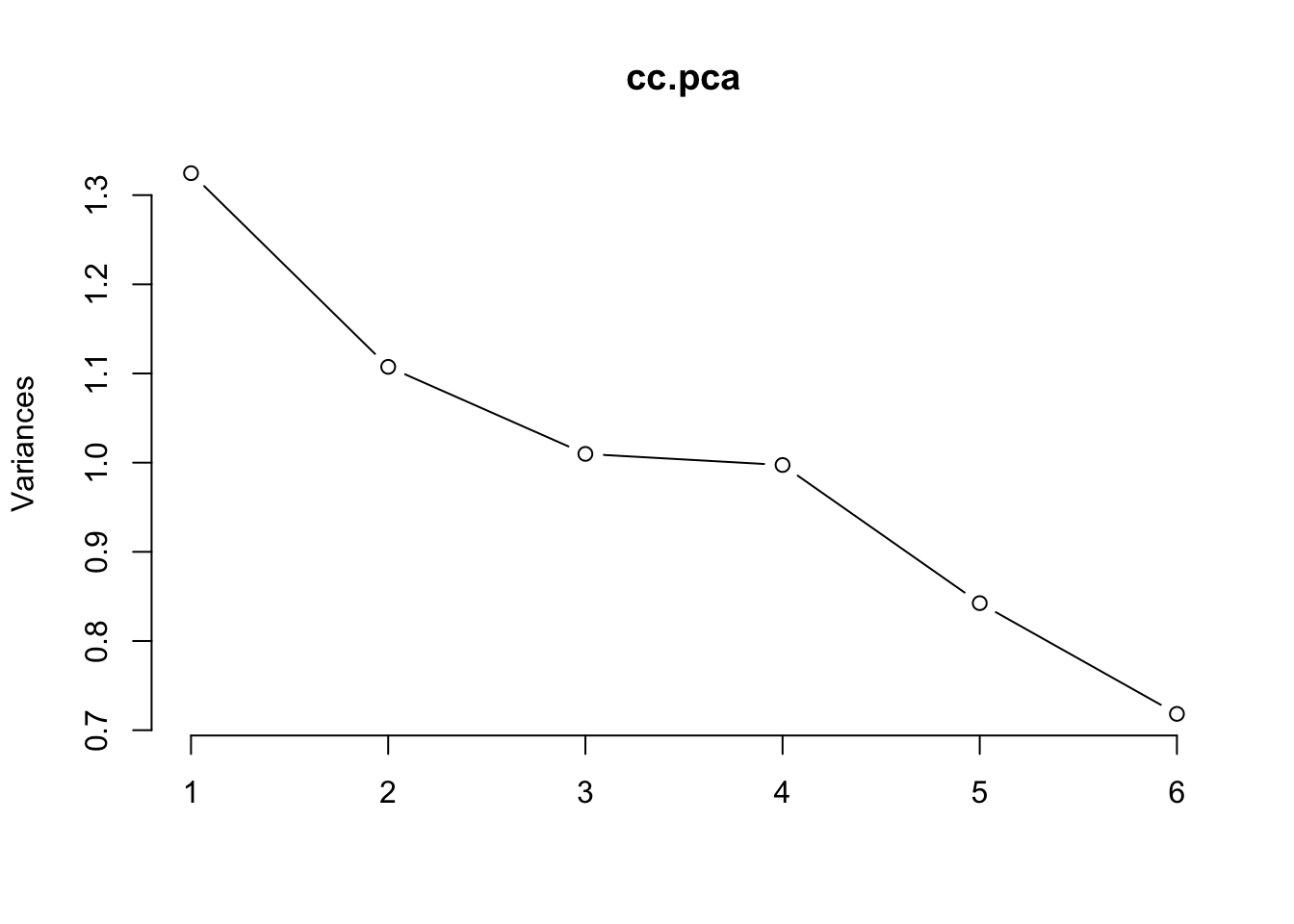
The summary method describe the importance of the PCs.
summary(cc.pca)## Importance of components:
## PC1 PC2 PC3 PC4 PC5 PC6
## Standard deviation 1.151 1.052 1.005 0.999 0.918 0.848
## Proportion of Variance 0.221 0.185 0.168 0.166 0.140 0.120
## Cumulative Proportion 0.221 0.405 0.574 0.740 0.880 1.000PC plot
ggbiplot(cc.pca, obs.scale = 1, var.scale = 1,
              groups = tmp$target.biopsy, ellipse = FALSE,
              circle = TRUE, alpha = 0.5) +
    scale_color_discrete(name = '') +
    theme(legend.direction = 'horizontal', legend.position = 'top')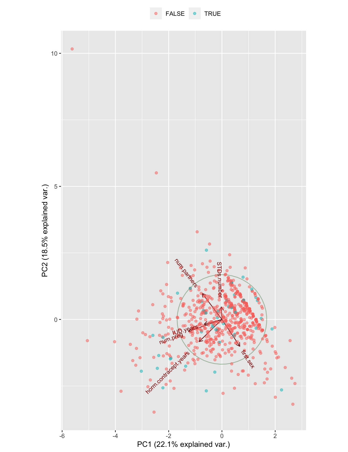
Figure 7.7: A PCA plot of the numerical variables
This is very promising neither; no structure in the data, not in general and not in relation with the dependent variable.
7.9.2 Clustering
- Using clustering, you can sometimes see obvious patterns in the data.
- Most obvious are:
- k-Means clustering
- Hierarchical clustering
7.9.3 k-Means clustering
k-means is very sensitive to the scale of your data so you’ll need to normalize it.
#km_clusters <- kmeans()