Chapter 10 Exercise Solutions
10.1 Introduction
Only solutions chunks are displayed here, not the output - except for the plots.
10.2 The ggplot2 and tidyr packages
library(ggplot2)
library(tidyr)
library(dplyr)
library(lubridate)
10.2.1 Trees
A [❋]
ggplot(data = trees,
       mapping = aes(x = Girth, y = Height)) +
    geom_point(color = "blue") +
    xlab('Girth (in)') +
    ylab('Height (ft)')
B [❋❋]
ggplot(data = trees,
       mapping = aes(x = Girth, y = Height)) +
    geom_point(color = "blue") +
    geom_smooth(method = "lm", se = FALSE) +
    xlab('Girth (in)') +
    ylab('Height (ft)')
C [❋❋]
Final figure.
ggplot(data = trees,
       mapping = aes(x = Girth, y = Height)) +
    geom_point(aes(size = Volume), color = "blue", alpha = 0.6) +
    geom_smooth(method = "lm", se = FALSE) +
    xlab('Girth (in)') +
    ylab('Height (ft)') +
    labs(size = 'Volume (ft^3)')
## `geom_smooth()` using formula 'y ~ x'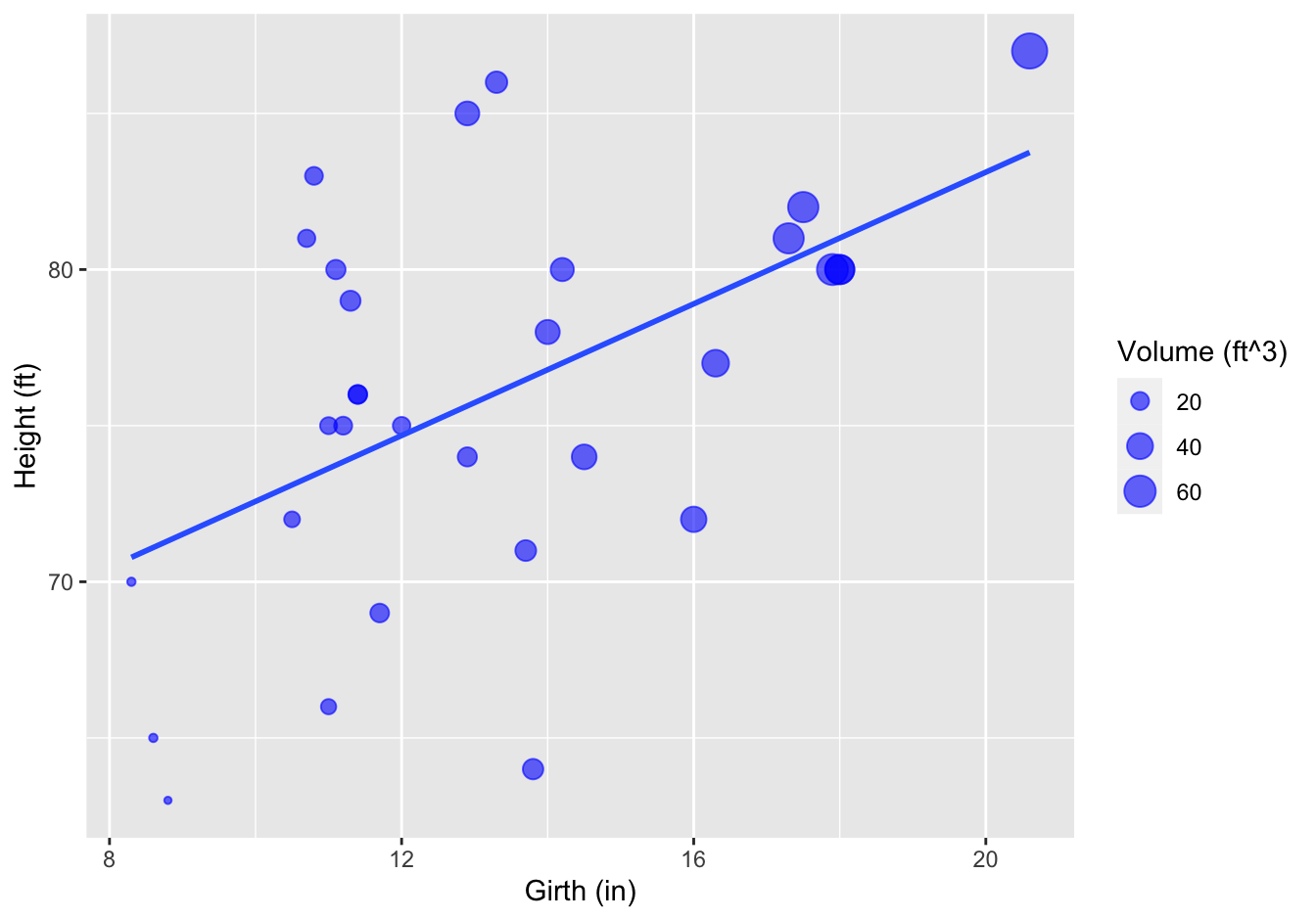
Figure 10.1: Tree girth, height and volume relationship
10.2.2 Insect Sprays
The datasets package that is shipped with R has a dataset called ?. Type ?InsectSprays to get information on it.
A [❋]
ggplot(data = InsectSprays,
       mapping = aes(x = spray, y = count)) +
    geom_boxplot() +
    ylab("Insect count") +
    xlab("Insect spray")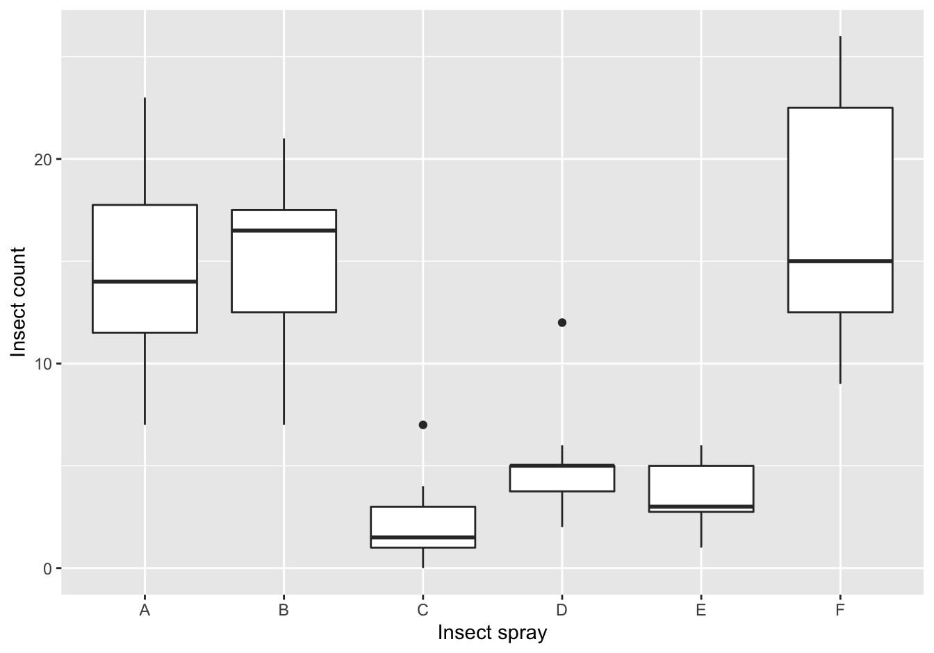
Figure 10.2: The counts of insects in agricultural experimental units treated with different insecticides
B [❋❋]
Create a jitter plot, splitting on the spray type and jittering minimally on the y-axis. Make sure that overlapping plot symbols do not hide each other and try to find a nice color.
[Extra: Give each spray a different plot symbol.]
ggplot(data = InsectSprays,
       mapping = aes(x = spray, y = count, color = spray)) +
    geom_jitter(height = 0, width = 0.1, shape = 18, size = 2, alpha = 0.7) +
    ylab("Insect count") +
    xlab("Insect spray")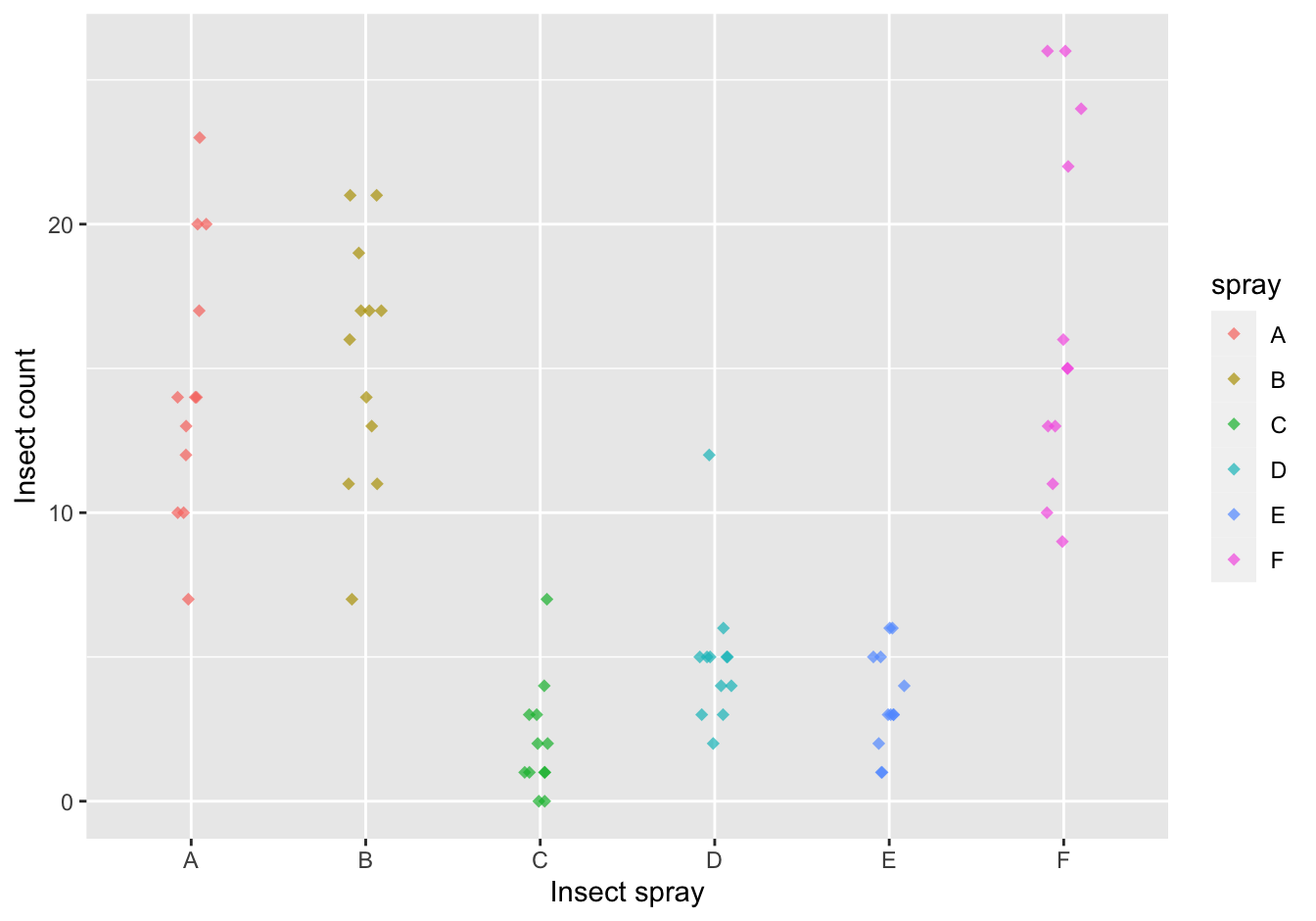
Figure 10.3: The counts of insects in agricultural experimental units treated with different insecticides
10.2.3 Diauxic growth
A [❋❋]
remote <- "https://raw.githubusercontent.com/MichielNoback/datasets/master/diauxic_growth/monod_diauxic_growth.csv"
local <- "../diauxic.csv"
#download.file(url = remote, destfile = local)
diauxic <- read.table(local, sep = ";", header = T)
diauxic <- pivot_longer(data = diauxic,
                        cols = -1,
                        names_to = "Substrate",
                        values_to = "OD")
B [❋]
diauxic$Substrate <- factor(diauxic$Substrate,
       levels = c("GlucMann", "GlucXyl", "GlucArab", "GlucRham"),
       labels = c("Glucose Mannose", "Glucose Xylose", "Glucose Arabinose", "Glucose Rhamnose"))
C [❋❋]
Create a line plot with all four growth curves within a single graph.
ggplot(data = diauxic,
       mapping = aes(x = Time, y = OD, color = Substrate)) +
    geom_point() +
    stat_smooth(method = "loess", se = FALSE, span = 0.3) +
    theme_bw()
## `geom_smooth()` using formula 'y ~ x'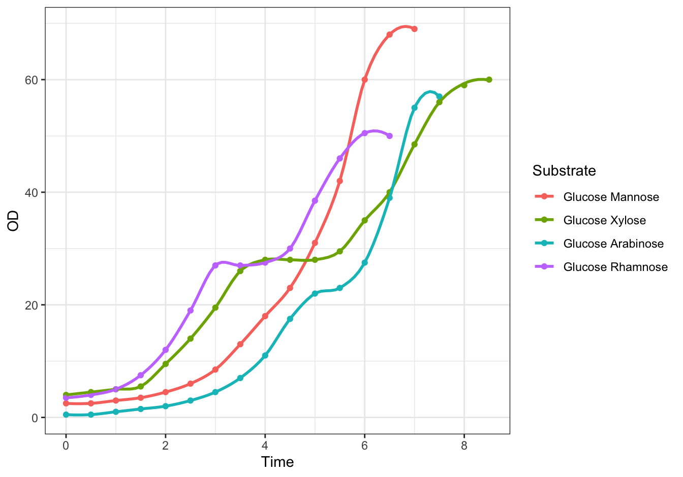
Figure 10.4: Monod’s Diauxic shift experiment.
D [❋❋❋]
ggplot(data = diauxic,
       mapping = aes(x = Time, y = OD)) +
    geom_point() +
    stat_smooth(method = "loess", se = FALSE, span = 0.3) +
    facet_wrap(. ~ Substrate, nrow = 2) +
    theme_bw()
## `geom_smooth()` using formula 'y ~ x'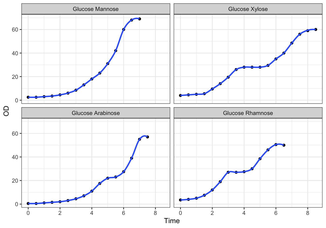
Figure 10.5: Monod’s Diauxic shift experiment.
10.2.4 Virginia Death Rates
library(dplyr)
## %>% is used to pipe results from one operation to the other, just like '|' in Linux.
virginia_death_rates <- as_tibble(VADeaths)
virginia_death_rates <- virginia_death_rates %>%
    mutate("Age Group" = factor(rownames(virginia_death_rates), ordered = TRUE)) %>%
    select(`Age Group`, everything()) #reorder the columns
A (❋❋;❋)
Pivot this table to long (tidy) format. This should generate a dataframe with four columns: Age Group, Habitat, Gender and DeathRate.
virginia_death_rates <- virginia_death_rates %>% pivot_longer(cols = -1,
                 names_to = c("Habitat", "Gender"),
                 names_sep = " ",
                 values_to = "DeathRate")
B (❋❋)
ggplot(data = virginia_death_rates, aes(Gender)) +
    geom_bar(aes(weight = DeathRate, fill = Habitat), position = "dodge")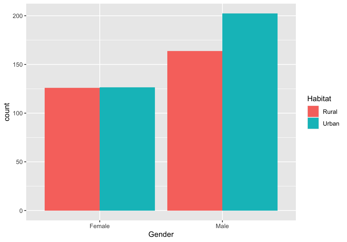
Figure 10.6: Virginia Death rates
10.2.5 Investigate new visualization [❋❋]
This assignment has no solution of course. It is included here solely to keep the numbering consistent for both assignment chapters.
10.2.6 ToothGrowth
[❋❋]
In my opinion, the boxplot is an excellent choice for this visualization. However, geom_jitter() could also work but is more of a hassle to split out on Dose.
ggplot(data = ToothGrowth, mapping = aes(x = supp, y = len)) +
    geom_boxplot(aes(color = as.factor(dose))) +
    xlab("Supplement") +
    ylab("Tooth length (mm)") +
    labs(color = "Dose (mg/day)")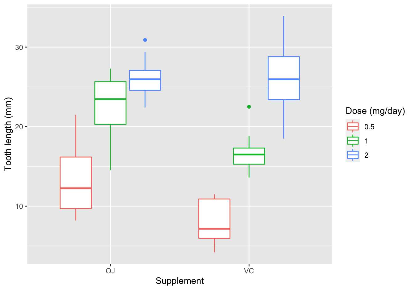
Figure 10.7: length of odontoblasts with vitamin C
10.2.7 Puromycin
[❋❋❋]
ggplot(data = Puromycin,
       mapping = aes(x = conc, y = rate, color = state)) +
    geom_point() +
    geom_smooth(method = "loess", formula = y ~ log(x), se = F)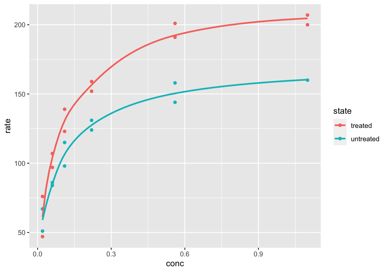
Figure 10.8: reaction velocity versus substrate concentration
10.2.8 Global temperature
Load the data.
remote_file <- "https://raw.githubusercontent.com/MichielNoback/datasets/master/global_temperature/annual.csv"
local_file <- "../annual.csv"

if (! file.exists(local_file)) {
    download.file(remote_file, destfile = local_file)
}

global_temp <- read.table("annual.csv",
                          header = TRUE,
                          sep = ",")
10.2.8.1 Create a scatter-and-line-plot [❋❋]
ggplot(data = global_temp,
       mapping = aes(x = Year, y = Mean, color = Source)) +
    geom_point(size = 0.5) +
    geom_line() +
    geom_smooth(se = FALSE, method = "loess") +
    theme_bw()
## `geom_smooth()` using formula 'y ~ x'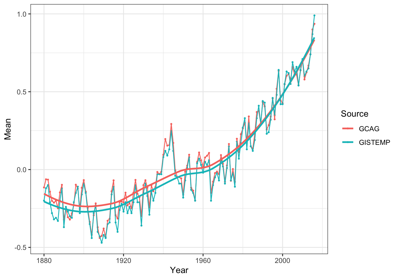
Figure 10.9: Global temperature anomalies
10.2.8.2 Re-create the heatmap [❋❋❋]
ggplot(data = global_temp[global_temp$Source == "GCAG", ],
       mapping = aes(x = Year, y = 1)) +
    geom_tile(aes(fill = Mean), colour = "white") +
    scale_fill_gradient2(low = "blue", mid = "white", high = "red") +
    theme_bw() +
    theme(axis.text.y = element_blank(), axis.ticks.y = element_blank(), axis.title.y = element_blank())
Figure 10.10: Global temperature anomalies
Note: rescaling the temperature from 0 to 1 may yield even better results.
10.2.9 Epilepsy drug trial
10.2.9.1 Load data [❋]
epilepsy_file <- "https://raw.githubusercontent.com/MichielNoback/datasets/master/epilepsy/epilepsy.csv"
epilepsy <- read.table(epilepsy_file,
                        header = TRUE,
                        sep = ",")
epilepsy$period <- factor(epilepsy$period, ordered=TRUE)
10.2.9.2 Reorganize the data [❋❋]
epilepsy <- as_tibble(
    epilepsy[, c("subject","age","base","treatment","period","seizure.rate")])
10.2.9.3 Create plots of seizure rates
A [❋❋]
I used the color aesthetic here:
ggplot(data = epilepsy,
       mapping = aes(x = period, y = seizure.rate, color = treatment)) +
    geom_boxplot()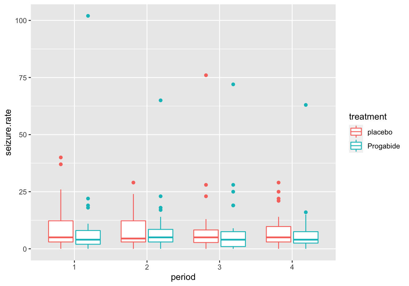
Figure 10.11: Seizure rates with color
This is the alternative with facet_wrap()
ggplot(data = epilepsy,
       mapping = aes(x = period, y = seizure.rate)) +
    geom_boxplot() +
    facet_wrap(. ~ treatment)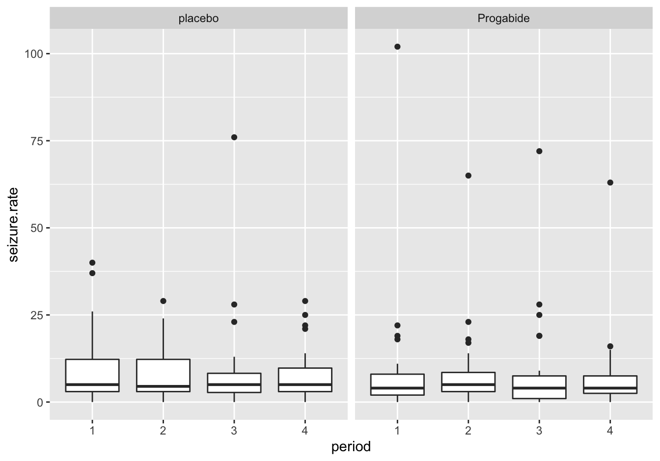
Figure 10.12: Seizure rates with facet wrap
B [❋❋❋]
Again, this could be done with color or facetting, but in this case shape is also an option (not shown). I used a little trick to separate the period for treated/untreated.
tmp <- epilepsy
tmp$period <- as.integer(tmp$period)
tmp$period_offset <- ifelse(epilepsy$treatment == "placebo", tmp$period - 0.10, tmp$period + 0.10)
#tmp
ggplot(data = tmp,
       mapping = aes(x = period_offset, y = seizure.rate, color = treatment)) +
geom_jitter(width = 0.05, alpha = 0.7) 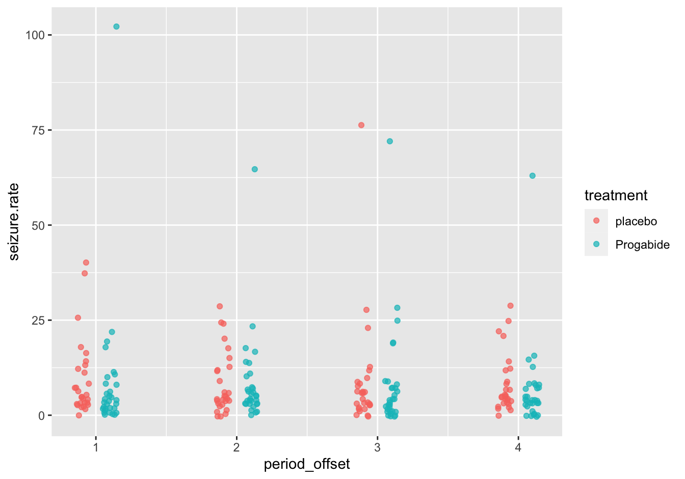
Figure 10.13: Seizure rates
C [❋❋❋]
ggplot(data = epilepsy,
       mapping = aes(x = period, y = seizure.rate, color = treatment)) +
    geom_boxplot(aes(fill = treatment), alpha = 0.2) +
    geom_jitter(data = tmp, aes(x = period_offset), width = 0.05, height = 0, alpha = 0.5, shape = 18, size = 2) +
    theme_bw()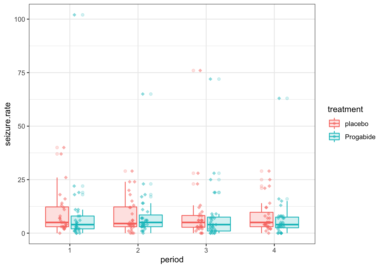
Figure 10.14: Seizure rates
Note that it would have been nicer to omit the outliers from the boxplot. This is your challenge.
There are many more variations possible! You should really explore some of these as practice.
10.2.9.4 A boxplot after correction [❋❋❋]
Correction:
epilepsy_corrected <- aggregate(
    seizure.rate ~ subject + age + base + treatment,
    data = epilepsy,
    FUN = sum)
epilepsy_corrected$seizure_rate_corrected <- epilepsy_corrected$seizure.rate - epilepsy_corrected$base
The plot:
ggplot(data = epilepsy_corrected,
       mapping = aes(x = treatment, y = seizure_rate_corrected)) +
    geom_boxplot()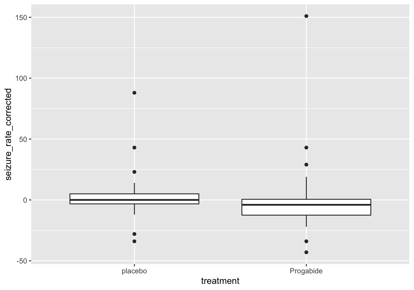
Figure 10.15: Seizure rates after correction
10.2.9.5 Test for statistical significance [❋❋❋]
placebo <- epilepsy_corrected$seizure_rate_corrected[epilepsy_corrected$treatment == "placebo"]
treated <- epilepsy_corrected$seizure_rate_corrected[epilepsy_corrected$treatment == "Progabide"]
t.test(x = placebo, y = treated)
##
## Welch Two Sample t-test
##
## data: placebo and treated
## t = 0.5, df = 53, p-value = 0.6
## alternative hypothesis: true difference in means is not equal to 0
## 95 percent confidence interval:
## -10.9 17.6
## sample estimates:
## mean of x mean of y
## 3.607 0.226##better:
t.test(seizure_rate_corrected ~ treatment, data = epilepsy_corrected)##
## Welch Two Sample t-test
##
## data: seizure_rate_corrected by treatment
## t = 0.5, df = 53, p-value = 0.6
## alternative hypothesis: true difference in means is not equal to 0
## 95 percent confidence interval:
## -10.9 17.6
## sample estimates:
## mean in group placebo mean in group Progabide
## 3.607 0.226Note: you should actually test for normality sing the shapiro.test() function before embarking on a t-test analysis:
shapiro.test(treated)
shapiro.test(placebo)
So this is not the correct test; you should use the Mann-Whitney U test.
wilcox.test(seizure_rate_corrected ~ treatment, data = epilepsy_corrected)## Warning in wilcox.test.default(x = c(5L, 5L, 5L, -3L, 0L, 23L, 3L, 3L, 2L, :
## cannot compute exact p-value with ties##
## Wilcoxon rank sum test with continuity correction
##
## data: seizure_rate_corrected by treatment
## W = 559, p-value = 0.06
## alternative hypothesis: true location shift is not equal to 010.2.10 Bacterial growth curves with Varioscan
10.2.10.1 Load, preprocess and tidy [❋❋❋❋]
Load:
growth_data_file <- "data/varioscan/2020-01-30_wide.csv"
growth_data <- read.csv(growth_data_file)
Preprocess. Applying corrctions to the dataset is not easy as it is; this is much easier when the dataframe is transposed so samples are in columns and timepoints in rows. Also, transposition will force all data into character because the first columns contain character data. To prevent this, they are removed (and stored), leaving only the numerical OD measurements.
## Add rownames to get a hold of them after transpose
row_names <- paste0(growth_data$Content, '.',
                    growth_data$.copy, '.',
                    rep(LETTERS[1:8], times = 12)) #letters A-H represent the 8 dilutions
rownames(growth_data) <- row_names

## remove non-numeric cols but store them first
label_columns <- growth_data[, 1:4]
tmp <- growth_data[, -(1:4)]

## transpose
tmp <- t(tmp)

## build a new dataframe/tibble, empty but with predefined number of rows
growth_data_corr <- tibble(.rows = nrow(tmp))
Carry out the corrections; can this be done more efficiently? Take the challenge!
##1  9 17 25 33 41 49 57 65 73 81 89

for (col_select in 1:8) {
    #Using correction columns 25-32
    #Red.1: columns 1 to 8
    growth_data_corr[, row_names[col_select]] <- tmp[ , col_select] - tmp[ , col_select + 24]
    #Red.2: columns 9 to 16
    growth_data_corr[, row_names[col_select + 8]] <- tmp[ , col_select + 8] - tmp[ , col_select + 24]
    #Red.3: columns 17 to 24
    growth_data_corr[, row_names[col_select + 16]] <- tmp[, col_select + 16] - tmp[, col_select + 24]

    #Using correction columns 57-64
    #White.1: columns 33 to 40
    growth_data_corr[, row_names[col_select + 32]] <- tmp[ , col_select + 32] - tmp[ , col_select + 56]
    #White.2: columns 41 to 48
    growth_data_corr[, row_names[col_select + 40]] <- tmp[ , col_select + 40] - tmp[ , col_select + 56]
    #White.3: columns 49 to 56
    growth_data_corr[, row_names[col_select + 48]] <- tmp[ , col_select + 48] - tmp[ , col_select + 56]

    #Using correction columns 89-96
    #Elution.1: columns 65 to 72
    growth_data_corr[, row_names[col_select + 64]] <- tmp[ , col_select + 64] - tmp[ , col_select + 88]
    #Elution.2: columns 73 to 80
    growth_data_corr[, row_names[col_select + 72]] <- tmp[ , col_select + 72] - tmp[ , col_select + 88]
    #Elution.1: columns 81 to 89
    growth_data_corr[, row_names[col_select + 80]] <- tmp[ , col_select + 80] - tmp[ , col_select + 88]
}
growth_data_corr <- growth_data_corr[, row_names[-c(25:32, 57:64, 89:96)]]
Re-attach the
## Transpose back and re-attach the first columns and time series labels
growth_data_corr <- t(growth_data_corr)
label_columns <- label_columns[-c(25:32, 57:64, 89:96), ]
growth_data_corr <- cbind(label_columns, growth_data_corr)
names(growth_data_corr) <- c(colnames(label_columns), rownames(tmp))
Tidy:
growth_data_tidy <- growth_data_corr %>%
    pivot_longer(cols = starts_with("T."),
             names_prefix = "T.",
             names_to = "Time",
             values_to = "OD") %>%
    mutate(Time = as.integer(Time)/60,
           Dilution = factor(Dilution, ordered = T),
           Copy = factor(.copy, ordered = T)) %>%
    select(Content, Copy, Dilution, Time, OD)
Note that using the names_prefix = "T." argument makes the T. prefix disappear so converting time to a number is easier. This conversion is done in the last step of this workflow, and it is also converted to hours instead of minutes. Dilution and .copy are converted to factors so they can be used as discrete values in ggplot2.
10.2.10.2 Create a growth curve visualization [❋❋❋❋]
Let’s first look at the three copies of the same sample. Can they maybe be merged?
library(ggplot2)
growth_data_tidy %>%
    filter(Content == "Red", ) %>%
    ggplot(mapping = aes(x = Time, y = OD)) +
        geom_line(aes(color = Dilution, linetype = Copy)) +
    xlab("Time (H)")
growth_data %>% filter(.copy == 1 & Dilution %in% c(0, 0.25, 2)) %>%
ggplot(mapping = aes(x = Time, y = OD)) +
geom_line(aes(linetype = Dilution, color = Content)) +
scale_color_manual()10.2.11 The dinos
10.2.11.1 export to csv [❋❋]
This exercise has no code. I exported the data and placed the csv files under data/dinos/ of this repo.
10.2.11.2 clean up and load codebook.csv
Non-data lines were deleted. Lines 1-18 relate to skeleton data and 19-29 to footprint data.
A [❋]
The separator is “:” but it is not possible to define multi-character separators in read.table(). For now, simply use “:”
codebook_file <- "data/dinos/codebook.csv"
codebook <- read.table(codebook_file,
                      sep = ":",
                      stringsAsFactors = FALSE)
B [❋]
names(codebook) <- c('variable', 'description')C [❋❋]
codebook$description <- sub('^ ', '', codebook$description)D [❋❋]
codebook$dataset <- c(rep('skeleton', 18), rep('footprint', 11))10.2.11.3 Write a utility function [❋❋❋]
get_description <- function(column_name, dataset = 'skeleton') {
    if (! is.element(dataset, codebook$dataset)) {
        stop(paste0('dataset ', dataset, ' does not exist'))
    }
    if (! is.element(column_name, codebook$variable)) {
        stop(paste0('column ', column_name, ' does not exist'))
    }
    ##return the value
    codebook[codebook$dataset == dataset & codebook$variable == column_name, "description"]
}
get_description('Dinosaur_gen', 'skeleton')
## [1] "Number of genera of Dinosauria"10.2.11.4 Load skeleton data [❋]
skeleton_file <- "data/dinos/skeletons.csv"

(skeleton <- read.table(skeleton_file,
                        sep = ";",
                        header = TRUE,
                        dec = ",",
                        as.is = 1))
10.2.11.5 Plot species versus time [❋❋❋]
Note the use of the utility function previously created, get_description().
ggplot(data = skeleton,
       mapping = aes(x = Midpoint, y = log2(Total_spec))) +
    geom_point(aes(color = Epoch)) +
    geom_smooth(method = "loess") +
    xlab(get_description("Midpoint")) +
    ylab(paste0("log2 of ", get_description("Total_spec"))) +
    scale_x_reverse()
## `geom_smooth()` using formula 'y ~ x'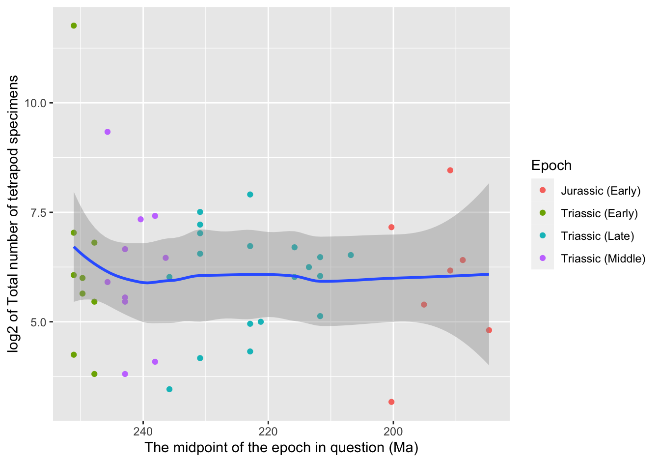
Figure 10.16: A first visualization
10.2.11.6 Reproducing the publication figure
A [❋❋]
We have not yet dealt with dplyr so we’ll use base R for this. Note that the column Total_gen already contains the sum of all tetrapods.
skeleton$genera_proportion <- (skeleton$Dinosaur_gen / skeleton$Total_gen) * 100
skeleton$specimen_proportion <- (skeleton$Dinosaur_spec / skeleton$Total_spec) * 100
B [❋❋❋]
skeleton_proportions <- aggregate(
    cbind(genera_proportion, specimen_proportion) ~ Epoch + Stage + Midpoint,
    data = skeleton,
    FUN = mean)
C [❋❋❋]
skeleton_proportions_long <- pivot_longer(data = skeleton_proportions,
             names_to = "level",
             values_to = "Proportion",
             cols = ends_with("_proportion"))
D [❋❋❋❋]
First it needs to be flattened for use in ggplot2:
ggplot(data = skeleton_proportions_long,
       mapping = aes(x = Midpoint, y = Proportion, color = level)) +
    geom_point() +
    scale_x_reverse() +
    scale_color_manual(values = c("blue", "red")) +
    xlab("Geological age (Myr)") +
    annotate("point", x = 231, y = 1, shape = 23, size = 5, fill = "goldenrod1") +
    annotate("text", x = 231, y = -3, label = "CPE")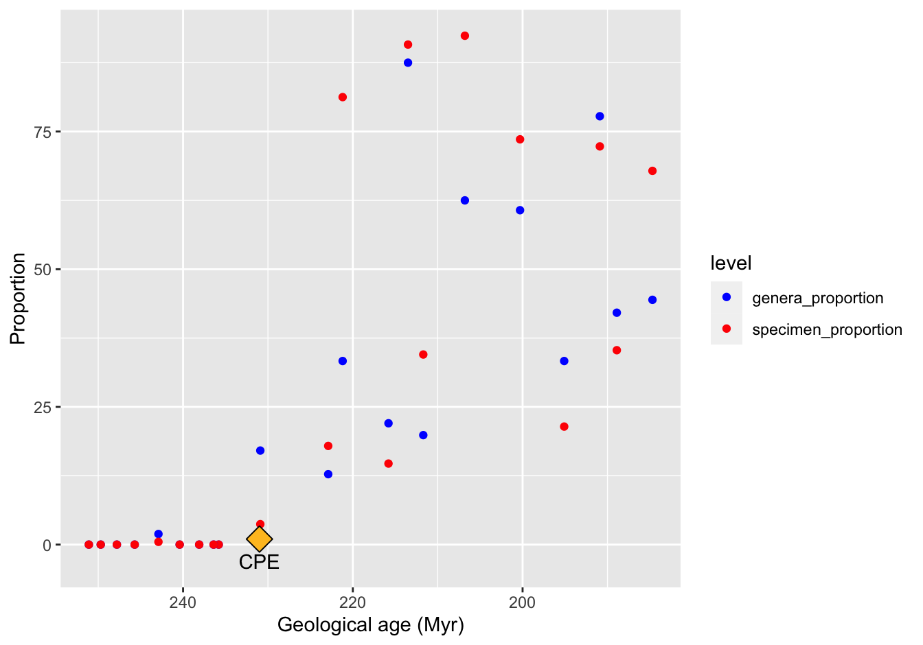
Figure 10.17: A reproduction
E [❋❋❋❋❋]
Actually, this is not that simple to do with base R. What you want is a function that calculates the mean over a time period or over a fixed sequence of numbers. We’ll take the mean over a sequence of 3 numbers. This could be a possible solution, using a for loop.
rows <- nrow(skeleton_proportions)
moving_average_spec <- numeric(rows)
moving_average_gen <- numeric(rows)
n <- 2
## reversed traversal!
for (i in rows:1) {
    if (i >= rows - n) {
        series <- i:rows
    } else {
        series <- i:(i+n) ## beware of the parentheses!
    }
    moving_average_gen[i] <- mean(skeleton_proportions$genera_prop[series])
    moving_average_spec[i] <- mean(skeleton_proportions$specimen_prop[series])
}
##attach to the proportions dataframe
skeleton_proportions$specimen_moving_average <- moving_average_spec
skeleton_proportions$genera_moving_average <- moving_average_gen

#skeleton_proportions <- skeleton_proportions[, c(1:4, 6, 5, 7)]

## recreate the long form. Note the use of `.value` which is a critical aspect!
skeleton_prop_avg_long <- pivot_longer(data = skeleton_proportions,
              cols = matches("_"),
              names_pattern = "(genera|specimen)_(proportion|moving_average)",
              names_to = c("level",".value"))
Finally, plot:
ggplot(data = skeleton_prop_avg_long) +
    geom_point(mapping = aes(x = Midpoint, y = proportion, color = level)) +
    geom_line(mapping = aes(x = Midpoint, y = moving_average, color = level)) +
    scale_x_reverse() +
    scale_color_manual(values = c("blue", "red")) +
    xlab("Geological age (Myr)") +
    annotate("point", x = 231, y = 1, shape = 23, size = 5, fill = "goldenrod1") +
    annotate("text", x = 231, y = -3, label = "CPE")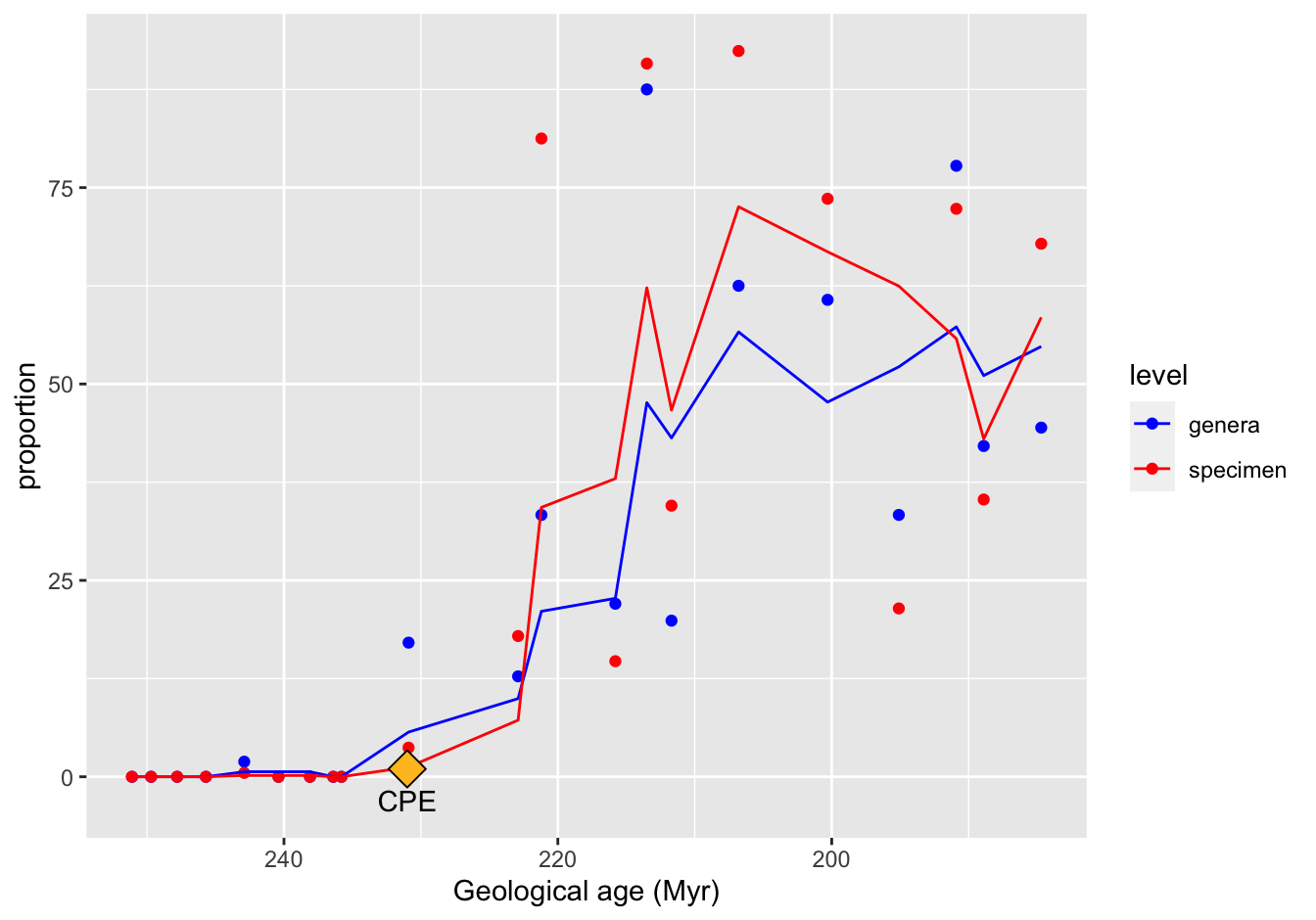
Figure 10.18: A reproduction
[THIS IS NOT CORRECT YET!!]
10.2.11.7 Make a better figure [❋❋❋❋]
The Loess regression curve is a favorite of mine.
ggplot(data = skeleton_prop_avg_long,
       mapping = aes(x = Midpoint, y = proportion, color = level)) +
    geom_point() +
    geom_smooth(method = "loess", se = FALSE) +
    scale_x_reverse() +
    scale_color_manual(values = c("blue", "red")) +
    xlab("Geological age (Myr)") +
    annotate("point", x = 231, y = 1, shape = 23, size = 5, fill = "goldenrod1") +
    annotate("text", x = 231, y = -3, label = "CPE")
## `geom_smooth()` using formula 'y ~ x'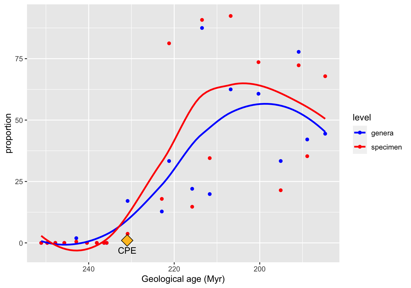
Figure 10.19: A reproduction
10.2.11.8 Use the size aesthetic [❋❋❋❋❋]
We need more data for this, the totals for each “Stage”:
## re-create mean proportions
skeleton_proportions <- aggregate(
    cbind(genera_proportion, specimen_proportion) ~ Epoch + Stage + Midpoint,
    data = skeleton,
    FUN = mean)

## first sum the finds:
skeleton_totals <- aggregate(
    cbind(Total_gen, Total_spec) ~ Midpoint,
    data = skeleton,
    FUN = sum)
tmp <- names(skeleton_totals)
tmp[2] <- "genera_totals"
tmp[3] <- "specimen_totals"
names(skeleton_totals) <- tmp

## combine with proportions
skeleton_prop_and_totals <- merge(skeleton_proportions, skeleton_totals, by = "Midpoint")

## reshuffling is required for pivot_longer to work as expected!!!
skeleton_prop_and_totals <- skeleton_prop_and_totals[, c(1:4, 6, 5, 7)]


## again this used to work but not anymore
(skeleton_prop_totals_long <- pivot_longer(
    data = skeleton_prop_and_totals,
    cols = matches("_"),
    names_pattern = "(genera|specimen)_(proportion|totals)",
    #values_to = c("proportion", "totals"),
    names_to = c("level", ".value")))
## # A tibble: 42 x 6
## Midpoint Epoch Stage level proportion totals
## <dbl> <fct> <fct> <chr> <dbl> <int>
## 1 185. Jurassic (Ear… Pliensbachian (u) genera 44.4 9
## 2 185. Jurassic (Ear… Pliensbachian (u) specim… 67.9 28
## 3 189. Jurassic (Ear… Sinemurian (u) - Pliensbac… genera 42.1 19
## 4 189. Jurassic (Ear… Sinemurian (u) - Pliensbac… specim… 35.3 85
## 5 191. Jurassic (Ear… Sinemurian (u) - Pliensbac… genera 77.8 30
## 6 191. Jurassic (Ear… Sinemurian (u) - Pliensbac… specim… 72.3 424
## 7 195. Jurassic (Ear… Sinemurian (l,u) genera 33.3 21
## 8 195. Jurassic (Ear… Sinemurian (l,u) specim… 21.4 42
## 9 200. Jurassic (Ear… Hettangian genera 60.7 13
## 10 200. Jurassic (Ear… Hettangian specim… 73.6 152
## # … with 32 more rowsNow for the plot
ggplot(data = skeleton_prop_totals_long,
       mapping = aes(x = Midpoint, y = proportion, color = level, size = totals)) +
    geom_point() +
    geom_smooth(method = "loess", se = FALSE) +
    scale_x_reverse() +
    scale_color_manual(values = c("blue", "red")) +
    xlab("Geological age (Myr)") +
    annotate("point", x = 231, y = 1, shape = 23, size = 5, fill = "goldenrod1") +
    annotate("text", x = 231, y = -3, label = "CPE")
## `geom_smooth()` using formula 'y ~ x'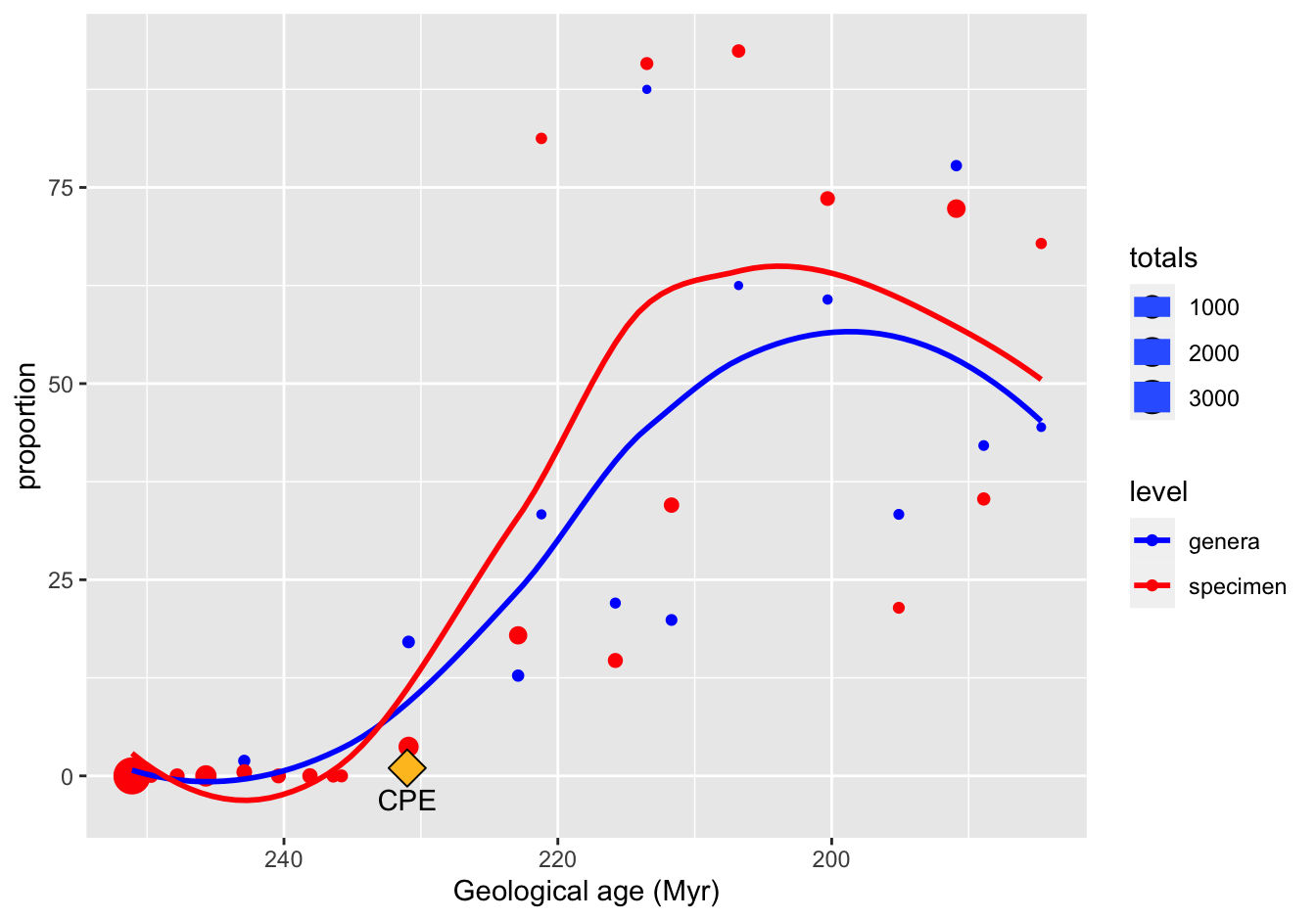
Figure 10.20: A reproduction
10.3 The tidyr and dplyr packages
10.3.1 Global temperature revisited
A [❋❋]
global_temp %>% filter(Source == "GCAG" & Year < 1970 & Mean > 0.1)
global_temp %>% filter(Source == "GISTEMP" & Year < 1970 & Mean > 0.1)
B [❋❋]
global_temp %>% filter(Source == "GCAG" & Year > 1945) %>%
    filter(Mean == min(Mean))

global_temp %>% filter(Source == "GISTEMP" & Year > 1945) %>%
    filter(Mean == min(Mean))
C [❋❋❋]
This is a case for filter(row_number() ...) or slice():
global_temp %>%
    group_by(Source) %>%
    arrange(desc(Mean)) %>%
    slice(1:5) %>%
    #filter(row_number() %in% 1:5) %>% #works as well
    ungroup()
D [❋❋❋]
This is a case for splitting with cut(). Package dplyr has an equivalent named ntile().
cut(global_temp$Year, breaks = seq(min(global_temp$Year), max(global_temp$Year), 10))

global_temp %>%
    filter(Year >= 1970) %>%
    mutate(Decade = cut(Year,
                        breaks = seq(1970, 2020, 10),
                        labels = seq(1970, 2010, 10),
                        right = FALSE)) %>%
    group_by(Decade, Source) %>%
    summarize(Mean = mean(Mean))
10.3.2 ChickWeight
- Starting weight [❋❋].
ChickWeight %>%
    filter(Time == 0) %>%
    arrange(desc(weight)) %>%
    select(Chick, Diet, weight) %>%
head(1)- Total weight gain [❋❋❋].
ChickWeight %>%
    group_by(Chick) %>%
    mutate(weight_gain = weight - lag(weight)) %>%
    summarize(timepoints = n(),
              total_weight_gain = sum(weight_gain, na.rm = T),
              Diet = first(Diet)) %>%
     arrange(desc(total_weight_gain)) %>% head(4)
Note: you could also have selected the first and last measurement for each chic of course, but not simply the last timepoint since several chickens had died by then.
- Average weight gain per diet [❋❋❋❋].
ChickWeight %>%
    group_by(Chick) %>%
    mutate(weight_gain = weight - lag(weight)) %>%
    summarize(timepoints = n(),
              total_weight_gain = sum(weight_gain, na.rm = T),
              Diet = unique(Diet)) %>%
    ungroup() %>%
    group_by(Diet) %>%
    summarize(num_chicks = n(),
              average_weight_gain = mean(total_weight_gain))
10.3.3 Population numbers
10.3.3.1 Load the data [❋]
pop_data_file <- "https://raw.githubusercontent.com/MichielNoback/datasets/master/population/EDU_DEM_05022020113225751.csv"
local_file <- "population_data.csv"
if (! file.exists(local_file)) {
    download.file(pop_data_file, destfile = local_file)
}
population <- read.table(local_file,
header = TRUE,
sep=",")10.3.3.2 Clean up [❋❋
Which?
str(population) tells me that Unit.Code, Unit and PowerCode are factors with one level. Using table(population$PowerCode.Code, useNA = "always") tells me that there are only zeros there. Same for Reference.Period.Code and Reference.Period. The variables Flags and Flag.Codes refer to the same, so one of them can be removed (I choose to remove Flag.Codes). The same counts for SEX/Sex, AGE/Age and YEAR/Year.
Select This is my selection:
keep <- names(population)[c(1, 2, 4, 6, 8, 15, 16)]
keep
population <- as_tibble(population[, keep]) #tibble is nicer!
head(population)
10.3.3.3 Create a “wide” yearly report of totals [❋❋❋
pop_totals <- dplyr::filter(population, Sex == "Total" & Age == "Total: All age groups")
##or, using base R
#population[population$Sex == "Total" & population$Age == "Total: All age groups", ]
pop_totals_wide <- pivot_wider(
    data = pop_totals[, c(1, 2, 5, 6)],
    names_from = Year,
    values_from = Value)
pop_totals_wide
10.3.3.4 Create a “wide” yearly report of population change [❋❋❋❋]
You could do this on the pop_totals dataset using the lag() function, after using group_by(), but since we have the wide format, you could also use a simple for loop, iterating the columns by index and subtracting the first from the second. I will demonstrate the only the first.
pop_totals %>%
    group_by(Country) %>%
    mutate(Pop_change = as.integer(Value - lag(Value))) %>%
    ungroup() %>%
    select(-Value) %>%
    pivot_wider(names_from = Year,
        values_from = Pop_change) %>%
    select(-`2005`, -`2010`, -Flag.Codes)
## backticks in above selection are required
## because we are selecting names that are numbers!
10.3.3.5 Create a bar plot [❋❋❋
sel <- population %>%
    filter(Sex == "Women" | Sex == "Men") %>%
    filter(COUNTRY %in% c("BEL", "CHE", "DNK", "FRA", "IRL", "DEU", "LUX", "NLD", "GBR")) %>%
    drop_na()

ggplot(sel, mapping = aes(Year)) +
    geom_bar(aes(weight = Value, fill = Sex))  +
    facet_wrap(. ~ COUNTRY)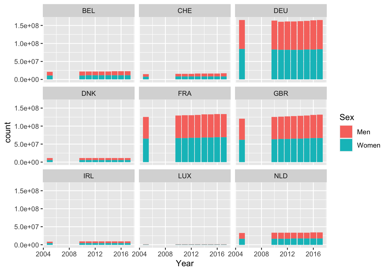
Figure 10.21: Barplot of population numbers in some European countries
10.3.3.6 Highest growth rate [❋❋❋❋]
population %>%
    filter(Sex == "Total" & Age == "Total: All age groups" & (Year == 2005 | Year == 2017)) %>%
    group_by(Country) %>%
    mutate(Change = Value - lag(Value),
           Previous = lag(Value)) %>%
    mutate(GrowthRate = Change / Previous * 100) %>%
    ungroup() %>%
    select(COUNTRY, Country, GrowthRate ) %>%
    arrange(desc(GrowthRate)) %>%
    head(3)
10.3.4 Rubella and Measles
No solutions (yet) for this exercise.
10.4 The lubridate package
10.4.1 Female births
10.4.1.1 Load the data [❋❋]
remote_file <- "https://raw.githubusercontent.com/MichielNoback/datasets/master/female_births/daily-total-female-births.csv"
local_file <- "../female_births.csv"

if (! file.exists(local_file)) {
    download.file(remote_file, destfile = local_file)
}
female_births <- read.table(local_file,
                          header = TRUE,
                          sep = ",",
                          stringsAsFactors = F)
female_births <- female_births %>%
    mutate(Date = as_date(female_births$Date))

(female_births <- as_tibble(female_births))
Note that in this case as_tibble(female_births) with the original dataframe would have converted the Date column to date objects as well.
10.4.1.2 Check for missing rows [❋❋❋]
female_births %>%
    mutate(lagged = lag(Date),
           diff = as.integer(Date - lagged)) %>%
    filter(is.na(diff) | diff != 1)
10.4.1.3 Report birth numbers [❋❋❋]
Report the number of births per month (Jan - Dec) and per weekday (Mon - Sun), as barplots. Is there a month or day that seems to be anomalous, or do you see seasonal trends? Try a statistical test!
First create the required columns:
female_births <- female_births %>%
    mutate(Day = wday(Date, label = T),
           Month = month(Date, label = T))
Report monthly counts, as barplot.
#library(ggplot2)
female_births %>%
    ggplot(mapping = aes(x = Month, weight = Births)) +
    geom_bar(fill = "darkblue") +
    theme_bw()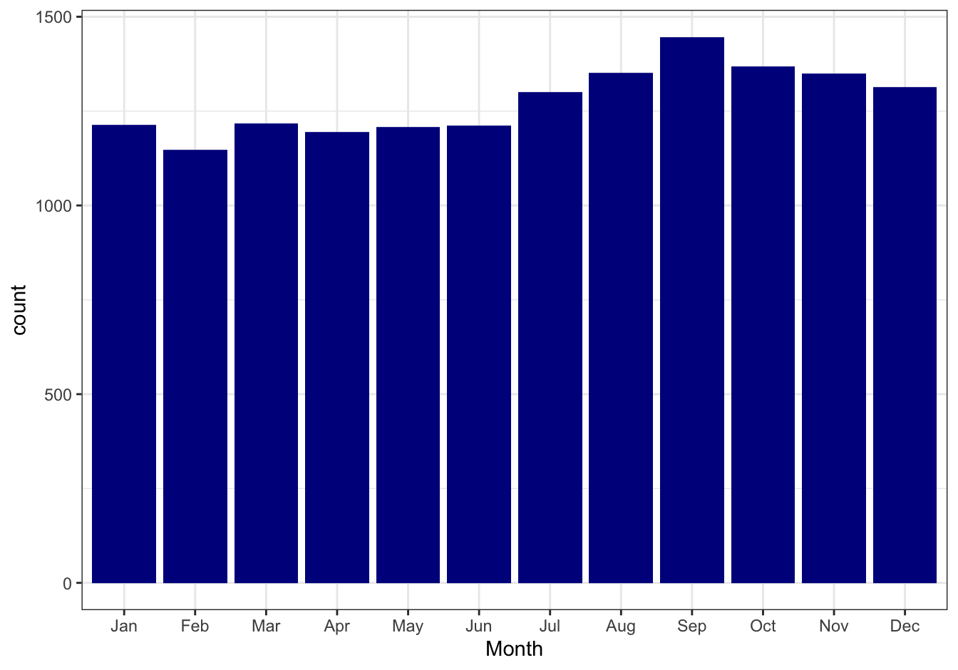
Figure 10.22: Monthly birth counts
The days
library(ggplot2)
female_births %>%
    ggplot(mapping = aes(x = Day, weight = Births)) +
    geom_bar(fill = "darkblue") +
    theme_bw()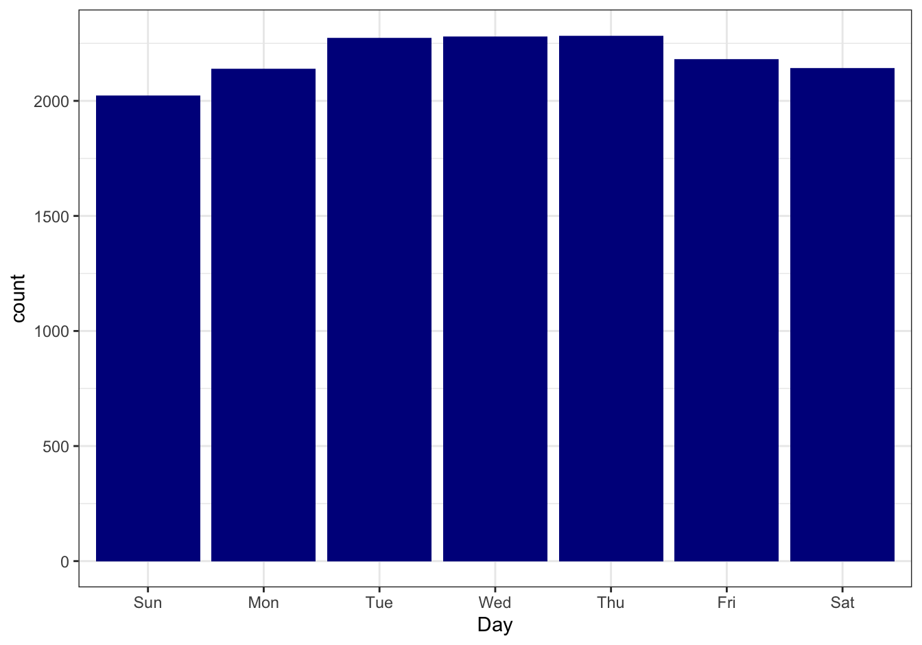
Figure 10.23: Daily birth counts
10.4.2 Diabetes
The datasets repo of this course contains a folder named UCI_diabetes_dataset. The complete dataset contains various types of information for 70 diabetes patients. Study the Readme file of this dataset before proceeding.
10.4.2.1 Create a codebook [❋❋]
Copy-and-paste the Code Fields into a file named codebook.txt and load it as a dataframe with name codebook_diab.
codebook_diab <- read.table("data/diabetes_codebook.txt", sep = ",", header = TRUE)
codebook_diab <- as_tibble(codebook_diab)
head(codebook_diab)
## # A tibble: 6 x 2
## Code Description
## <int> <chr>
## 1 33 Regular insulin dose
## 2 34 NPH insulin dose
## 3 35 UltraLente insulin dose
## 4 48 Unspecified blood glucose measurement
## 5 57 Unspecified blood glucose measurement
## 6 58 Pre-breakfast blood glucose measurement10.4.2.2 Create a function to load patient data [❋❋❋]
Create a function -load_patient_data(<patient-number>)- that can be used to load data for specific patients from file and return this as a dataframe. If you access the remote copies of the files you should cache the data locally so a second requests for the same data will return a local copy of the file. The function should give a friendly error message when there is no data for the specific patient (e.g. patient 99 is not present in the dataset).
As extra challenge, you could read the documentation on the tryCatch() function and try to use this for your remote file access.
load_patient_data <- function(patient_number) {
    base_url <-"https://raw.githubusercontent.com/MichielNoback/datasets/master/UCI_diabetes_dataset/data-"
    if (patient_number <= 9) patient_number <- paste0("0", patient_number)
    remote_file <- paste0(base_url, patient_number)
    local_file <- paste0("../diab-patient-", patient_number)
    column_names <- c("Date", "Time", "Code", "Value")
    #format:
    #04-21-1991 9:09    58  100
    result <- NULL
    if (! file.exists(local_file)) {
        result <- tryCatch( {#success
                message(paste0("downloading ", remote_file))
                download.file(remote_file, destfile = local_file)
                patient_data <- read.table(local_file,
                                           sep = "\t",
                                           stringsAsFactors = F)
                names(patient_data) <- column_names
                return(patient_data)
            },
            error = function(cond) {
                message(paste("Remote file does not seem to exist:", remote_file))
                message("Here's the original error message:")
                message(cond)
                return(NULL)
            },
            warning = function(cond) {
                message(paste("URL caused a warning:", remote_file))
                message("Here's the original warning message:")
                message(cond)
                return(NULL)
            })
    } else {
        message(paste0("reading local cache of", local_file))
        result <- read.table(local_file,
                             sep = "\t",
                             stringsAsFactors = F)
        names(result) <- column_names
    }
    return(result)
}
patient8 <- load_patient_data(8)
## reading local cache of../diab-patient-08head(patient8)## Date Time Code Value
## 1 07-31-1990 12:09 60 100
## 2 07-31-1990 17:28 62 190
## 3 07-31-1990 18:41 62 124
## 4 08-01-1990 05:58 58 222
## 5 08-01-1990 12:57 60 339
## 6 08-01-1990 13:00 68 0str(patient8)## 'data.frame': 177 obs. of 4 variables:
## $ Date : chr "07-31-1990" "07-31-1990" "07-31-1990" "08-01-1990" ...
## $ Time : chr "12:09" "17:28" "18:41" "05:58" ...
## $ Code : int 60 62 62 58 60 68 60 61 62 65 ...
## $ Value: int 100 190 124 222 339 0 71 72 193 0 ...B$