19 Exercise solutions
19.3 Basic R
19.3.1 Math in the console
31 + 11
66 - 24
126 / 3
12^2
256**0.5
(3 * (4 + 8^0.5))/(5^3)
## [1] 42
## [1] 42
## [1] 42
## [1] 144
## [1] 16
## [1] 0.16419.3.2 Functions (I)
A
Answer: paste() and paste0(). The difference lies in the separator, which is an empty string in paste0() and one space in paste(). Moreover, the separator can be configured in paste() using the sep = parameter.
B
Answer: abs() returns the absolute value. Simply put, a number with the minus sign removed if present.
abs(-20)## [1] 20
abs(20)## [1] 20C
Answer: it combines (concatenates) its arguments into a single vector. The first example creates a “character” (text data) and the second a “numeric” (numeric data).
c(1, 2, "a")## [1] "1" "2" "a"## [1] "character"
c(1, 2, 3)## [1] 1 2 3## [1] "numeric"D
#install it. Note the quotes
install.packages("RColorBrewer")
#load it into your session. Note the absence of quotes
library(RColorBrewer)
E
F
strsplit(names, " ")G
unique(birds)19.3.4 Vectors
Circles
The circumference of a circle is \(2\pi\cdot r\), its surface \(4\pi \cdot r^2\) and its volume \(4/3 \pi\cdot r^3\). Given this vector of circle radiuses,
radiuses <- c(0, 1, 2, pi, 4)A
Calculate their cirumference.
2 * pi * radiusesB
Calculate their surface.
4 * pi * radiuses^2C
Calculate their volume.
4/3 * pi * radiuses^3Creating vectors
Create the following vectors, as efficiently as possible. The functions rep(), seq() and paste0() and the colon operator : can be used, in any combination.
A[1] 1 2 5 1 2 5
B[1] 9 9 9 8 8 8 7 7 7 6 6 6 5 5 5
rep(9:5, each = 3)C[1] 1 1 1 4 4 4 9 9 9 1 1 1 4 4 4 9 9 9
D[1] "1a" "2b" "3c" "4d" "5e" "1a" "2b" "3c" "4d" "5e"
E[1] "0z" "0.2y" "0.4x" "0.6w" "0.8v" "1u"
F[1] "505" "404" "303" "202" "101" "000"
paste0(5:0, 0, 5:0)G [Challenge][1] "0.5A5.0" "0.4B4.0" "0.3C3.0" "0.2D2.0" "0.1E1.0"
19.4 Complex datatypes
19.4.1 Creating factors
A
animal_risk <- c(2, 4, 1, 1, 2, 4, 1, 4, 1, 1, 2, 1)
animal_risk_factor <- factor(x = animal_risk,
                             levels = c(1, 2, 3, 4),
                             labels = c("harmless", "risky", "dangerous", "deadly"),
                             ordered = TRUE)
B
set.seed(1234)
wealth_male <- sample(x = letters[1:4],
                 size = 1000,
                 replace= TRUE,
                 prob = c(0.7, 0.17, 0.12, 0.01))
wealth_female <- sample(x = letters[1:4],
                 size = 1000,
                 replace= TRUE,
                 prob = c(0.8, 0.15, 0.497, 0.003))

wealth_labels <- c("poor", "middle class", "wealthy", "rich")

wealth_male_f <- factor(x = wealth_male,
                        levels = letters[1:4],
                        labels = wealth_labels,
                        ordered = TRUE)

wealth_female_f <- factor(x = wealth_female,
                        levels = letters[1:4],
                        labels = wealth_labels,
                        ordered = TRUE)

#combine
wealth_all_f <- c(wealth_male_f, wealth_female_f)

prop.table(table(wealth_all_f)) * 100
## wealth_all_f
## poor middle class wealthy rich
## 63.65 12.45 23.35 0.5519.4.2 List actions
A
house_admin[1]B
house_admin[2]
#OR
house_admin$Rose
C
house_admin[1:2]D
house_admin$Mike$cooking
#OR
house_admin$Mike[[1]]
#OR
house_admin[[3]][["cooking"]]
#MORE POSSIBILITIES
E
house_admin$John$tasks[2]
#MANY MORE POSSIBILITIES
19.4.3 Named vectors
A
codons <- c("G", "P", "K", "S")
names(codons) <- c("GGA", "CCU", "AAA", "AGU")

my_DNA <- "GGACCUAAAAGU"
my_prot <- ""
for (i in seq(from = 1, to = nchar(my_DNA), by = 3)) {
        codon <- substr(my_DNA, i, i+2)
        my_prot <- paste0(my_prot, codons[codon])
}
print(my_prot)
## [1] "GPKS"B
19.4.4 Lowry
bsa_conc <- c(0, 0, 0.025, 0.025, 0.075, 0.075, 0.125, 0.125)
OD750 <- c(0.063, 0.033, 0.16, 0.181, 0.346, 0.352, 0.491, 0.488)A
dilution <- data.frame(bsa_conc, OD750)B
C
df_temp <- data.frame("prot_conc" = bsa_conc2,
                      "absorption" = OD750_2)
D
dilution <- rbind(dilution, df_temp)E
even <- dilution[c(T, F), ]
odd <- dilution[c(F, T), ]
dilution_duplo <- cbind(odd, even)
dilution_duplo
F
G
{rlowry-duplo-mean-a, eval = FALSE} dilution_duplo$mean <- (dilution_duplo$abs1 + dilution_duplo$abs2) / 2 dilution_duplo
19.4.5 Island surfaces
A
islands_df <- data.frame(Island = names(islands),
                        Area = islands)
rownames(islands_df) <- NULL
islands_df
B
19.4.6 USArrests
The USArrests dataset is also one of the datasets included in the datasets package. It has info on the fifty states for these variables:
Murder arrests (per 100,000)
Assault arrests (per 100,000)
UrbanPop Percent urban population
Rape arrests (per 100,000)
We’ll explore this dataset for a few questions.
A
USArrests[rownames(USArrests) == "Montana", ]B
USArrests[USArrests$Rape == max(USArrests$Rape), ]C
USArrests[USArrests$Assault < USArrests$Murder * 10, ]19.4.7 File reading practice
File 01
my_dir <- "data/file_reading"
my_file <- "file01.txt"
my_path <- paste0(my_dir, "/", my_file)
my_data <- read.table(
    my_path,
    comment.char = "#",
    header = T,
    sep = ",",
    dec = ".",
    na.strings = "ND",
    as.is = c(1, 3))
File 02
my_file <- "file02.txt"
my_path <- paste0(my_dir, "/", my_file)
my_data <- read.table(
    my_path,
    comment.char = "$",
    header = T,
    sep = "\t",
    dec = ",",
    na.strings = "?",
    as.is = c(1, 3)
)
File 03
my_file <- "file03.txt"
my_path <- paste0(my_dir, "/", my_file)
my_data <- read.table(
    my_path,
    header = T,
    sep = ";",
    dec = ".",
    na.strings = "ND",
    as.is = c(1, 3)
)
File 04
my_file <- "file04.txt"
my_path <- paste0(my_dir, "/", my_file)
my_data <- read.table(
    my_path,
    header = T,
    sep = "\t",
    dec = ",",
    na.strings = "no data",
    as.is = c(1, 3)
)
File 05
my_file <- "file05.txt"
my_path <- paste0(my_dir, "/", my_file)
my_data <- read.table(
    my_path,
    comment.char = "#",
    header = T,
    sep = ";",
    dec = ".",
    na.strings = "ND",
    as.is = c(1, 3)
)
File 06
my_file <- "file06.txt"
my_path <- paste0(my_dir, "/", my_file)
my_data <- read.table(
    my_path,
    comment.char = "#",
    header = T,
    sep = ",",
    dec = ".",
    na.strings = "-",
    as.is = c(1, 3))
my_data
File 07
my_file <- "file07.txt"
my_path <- paste0(my_dir, "/", my_file)
my_data <- read.table(
    my_path,
    comment.char = "#",
    header = F,
    sep = ";",
    dec = ".",
    na.strings = "-",
    as.is = c(1, 3))
File 08
my_file <- "file08.txt"
my_path <- paste0(my_dir, "/", my_file)
my_data <- read.table(
    my_path,
    comment.char = "@",
    header = T,
    sep = ";",
    dec = ".",
    na.strings = "ND",
    as.is = c(1, 3))
(More files, but solutions omitted.)
19.5 Basics of the ggplot2 package
19.5.1 Trees
With the trees dataset from the datasets package, create a scatter plot according to these constraints.
- x-axis: Height
- y-axis: Girth
- size of plot symbol: Volume
- color of plot symbol: darkgreen
- a smoother without error margins
NB: Where you specify aesthetics matters here!
As extra practice you could convert the values to the metric system first.
ggplot(data = trees,
       mapping = aes(x = Height, y = Girth)) +
  geom_point(aes(size = Volume), color = "darkgreen") +
  geom_smooth(method = "loess", se = FALSE, formula = y~x) +
  labs(x = "Height (ft)", y = "Girth (inches)")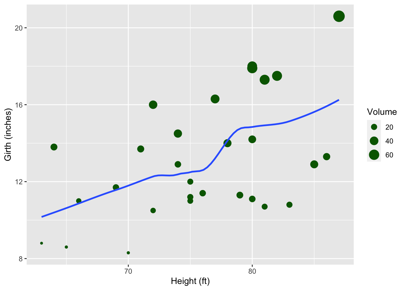
19.5.2 Insect Sprays
The datasets package that is shipped with R has a dataset called ?. Type ?InsectSprays to get information on it.
A [❋]
ggplot(data = InsectSprays,
       mapping = aes(x = spray, y = count)) +
    geom_boxplot() +
    ylab("Insect count") +
    xlab("Insect spray")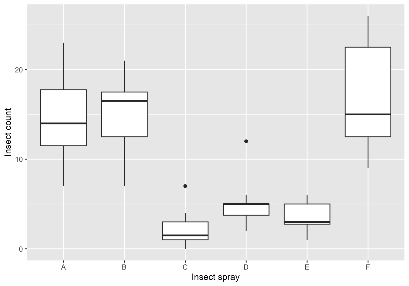
Figure 19.1: The counts of insects in agricultural experimental units treated with different insecticides
B [❋❋]
ggplot(data = InsectSprays,
       mapping = aes(x = spray, y = count, color = spray)) +
    geom_jitter(height = 0, width = 0.1, shape = 18, size = 2, alpha = 0.7) +
    ylab("Insect count") +
    xlab("Insect spray")
Figure 19.2: The counts of insects in agricultural experimental units treated with different insecticides
19.5.3 Pharmacokinetics
The Theoph dataset contains pharmacokinetics of theophylline, the anti-asthmatic drug theophylline. Twelve subjects were given oral doses of theophylline, then serum concentrations were measured at 11 time points over the next 25 hours.
A
ggplot(data = Theoph,
       mapping = aes(x = Time, y = conc, color = Dose, linetype = Subject)) +
  geom_line() +
  labs(x = "Time (h)", y = "Concentration (mg/l)")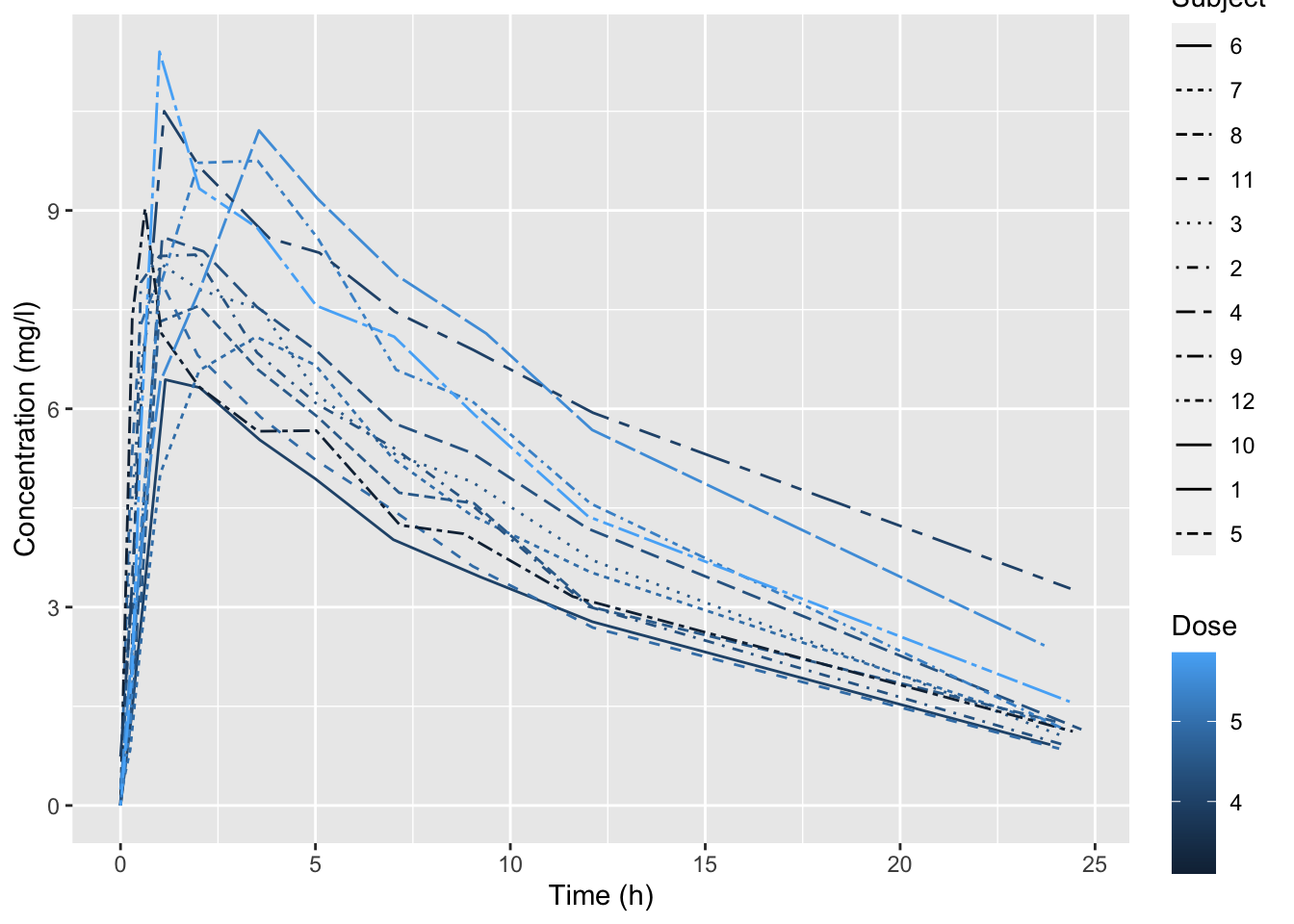
B
ggplot(data = Theoph,
       mapping = aes(x = Time, y = conc)) +
  geom_line(aes(group = Subject, color = Dose)) +
  scale_color_gradient(low = "green", high = "red") +
  labs(x = "Time (h)", y = "Concentration (mg/l)") +
  theme_minimal()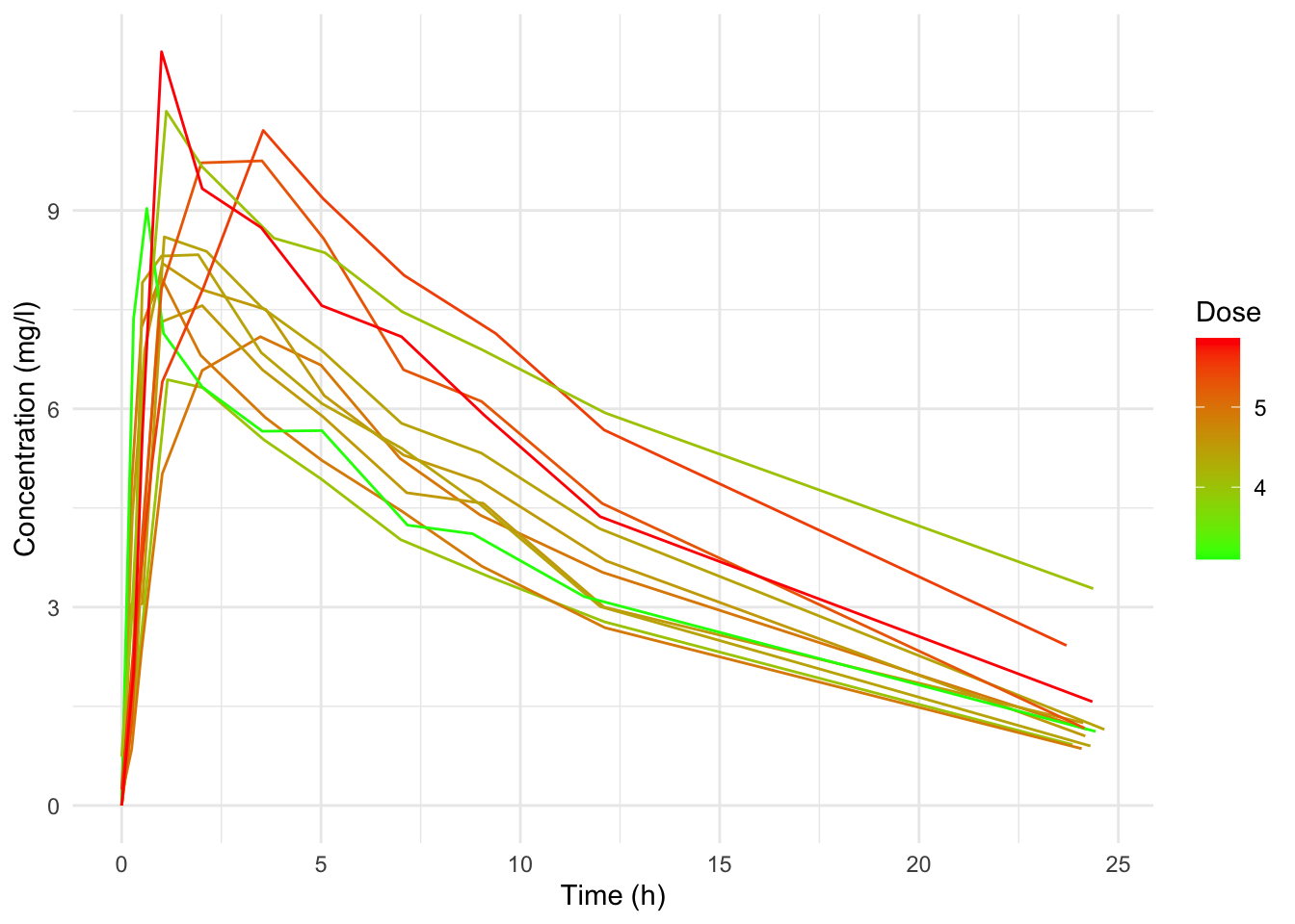
(Many more solutions possible)
19.5.4 USArrests (II)
A
ggplot(data = USArrests,
       mapping = aes(x = Assault,
                     y = Murder)) +
  geom_point(color = "darkgreen") +
  geom_smooth(method = "lm", formula = y~x, se = FALSE, color = "darkred") +
  labs(x = "Assault arrests (per 100,000)", y = "Murder arrests (per 100,000)")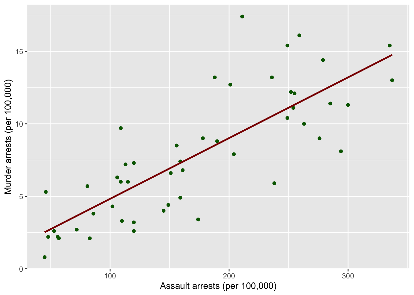
B
scale <- 1
ggplot(data = USArrests,
       mapping = aes(x = Assault)) +
  geom_histogram(aes(y=..density..), fill = "lightblue", color = "black", bins = 30) +
  geom_density(color = "darkblue") +
  #scale_y_continuous(sec.axis = sec_axis(~ . * scale, name="Assault prob")) +
  labs(x = "Assault arrests (per 100,000)")
## Warning: The dot-dot notation (`..density..`) was deprecated in ggplot2 3.4.0.
## ℹ Please use `after_stat(density)` instead.
## This warning is displayed once every 8 hours.
## Call `lifecycle::last_lifecycle_warnings()` to see where this warning was generated.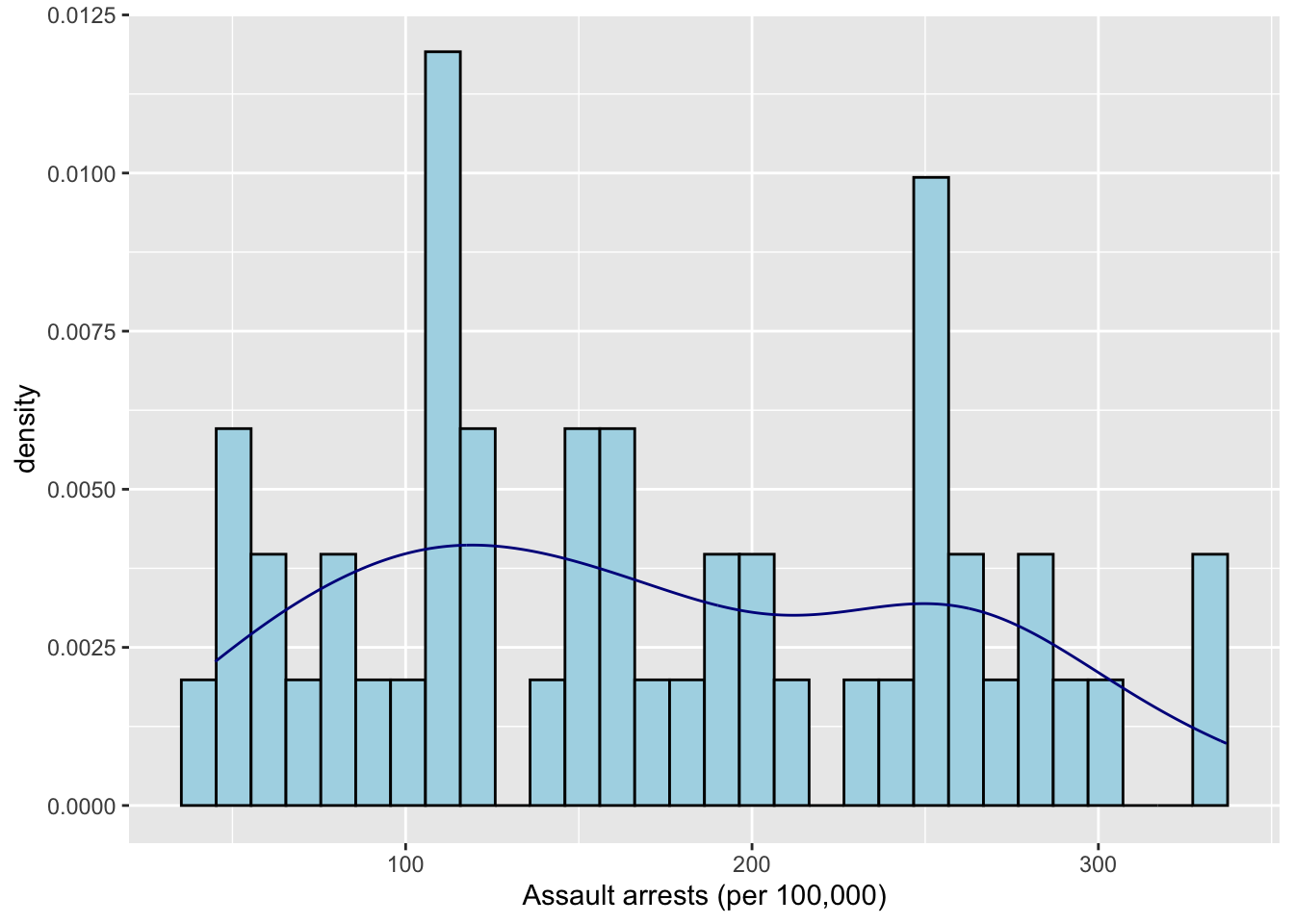
19.5.5 Orchard Sprays
A
ggplot(data = OrchardSprays,
       mapping = aes(x = treatment, y = decrease)) +
  geom_boxplot() +
  geom_jitter(color = "darkred", width = 0.2, alpha = 0.7)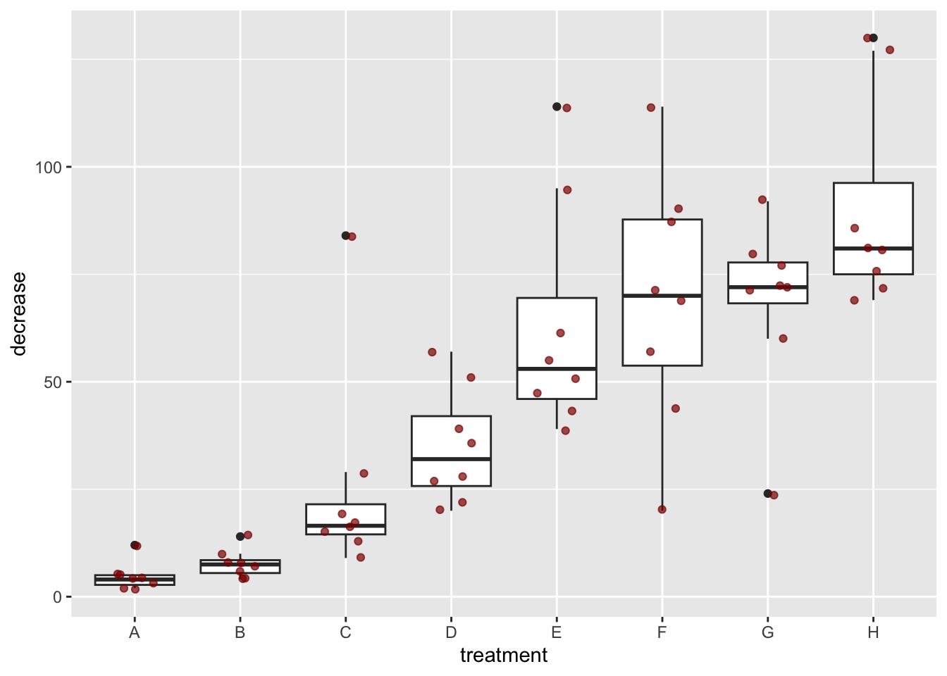
B
ggplot(data = OrchardSprays,
       mapping = aes(x = treatment, y = decrease)) +
  geom_violin(aes(fill=treatment))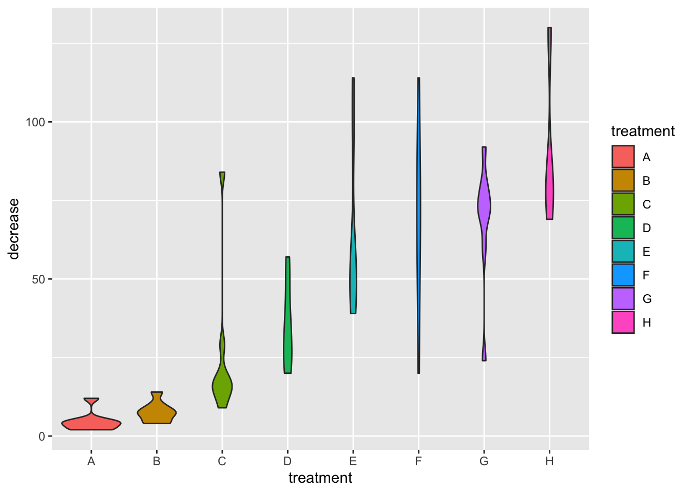
19.5.6 Diauxic growth
A [❋❋]
remote <- "https://raw.githubusercontent.com/MichielNoback/datasets/master/diauxic_growth/monod_diauxic_growth.csv"
#local <- "../diauxic.csv"
#download.file(url = remote, destfile = local)
diauxic <- read.table(remote, sep = ";", header = T)
diauxic <- pivot_longer(data = diauxic,
                        cols = -1,
                        names_to = "Substrate",
                        values_to = "OD")
B [❋]
diauxic$Substrate <- factor(diauxic$Substrate,
       levels = c("GlucMann", "GlucXyl", "GlucArab", "GlucRham"),
       labels = c("Glucose Mannose", "Glucose Xylose", "Glucose Arabinose", "Glucose Rhamnose"))
C [❋❋]
Create a line plot with all four growth curves within a single graph.
ggplot(data = diauxic,
       mapping = aes(x = Time, y = OD, color = Substrate)) +
    geom_point() +
    stat_smooth(method = "loess", se = FALSE, span = 0.3) +
    theme_bw()
## `geom_smooth()` using formula = 'y ~ x'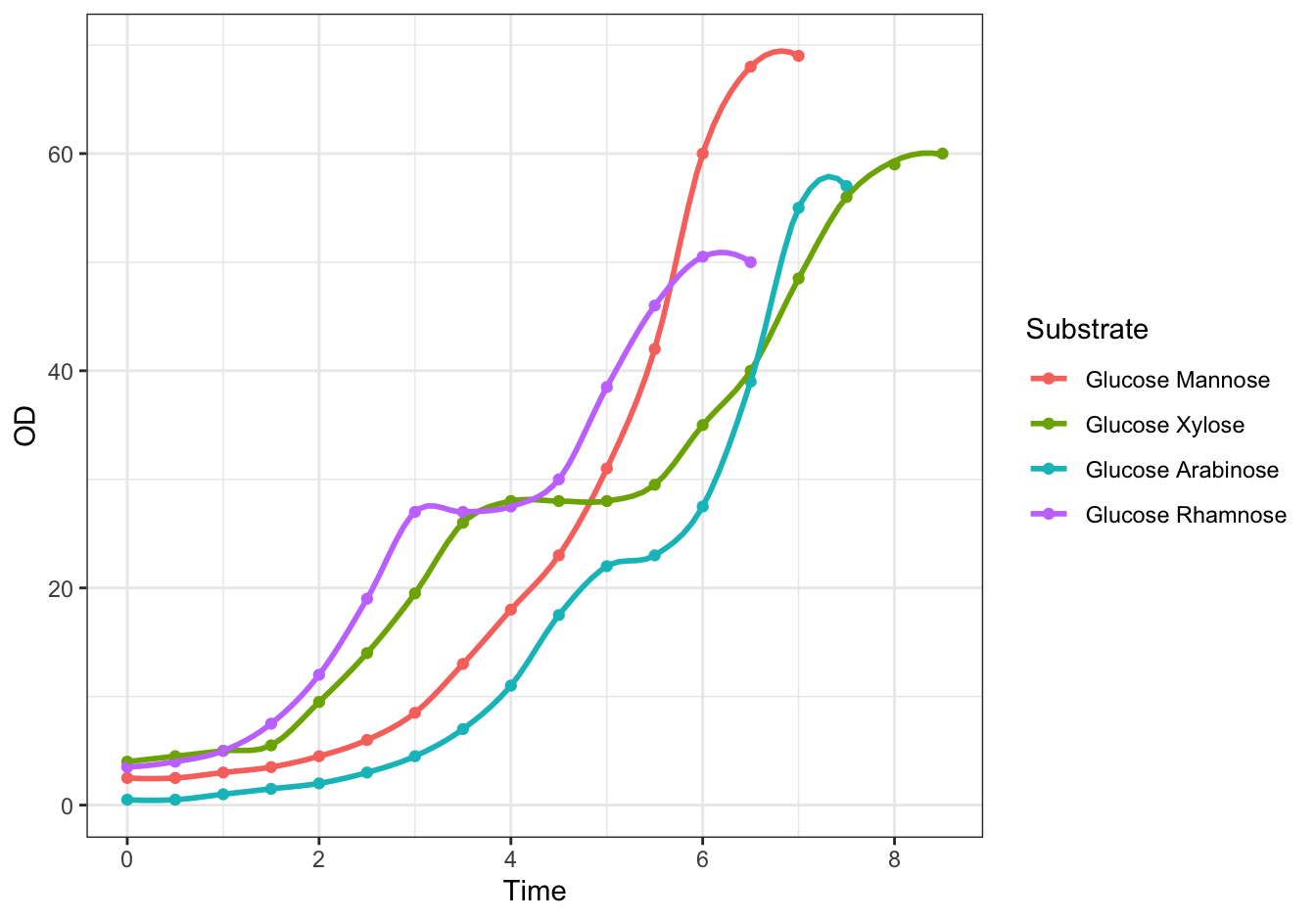
Figure 19.3: Monod’s Diauxic shift experiment.
D [❋❋❋]
ggplot(data = diauxic,
       mapping = aes(x = Time, y = OD)) +
    geom_point() +
    stat_smooth(method = "loess", se = FALSE, span = 0.3) +
    facet_wrap(. ~ Substrate, nrow = 2) +
    theme_bw()
## `geom_smooth()` using formula = 'y ~ x'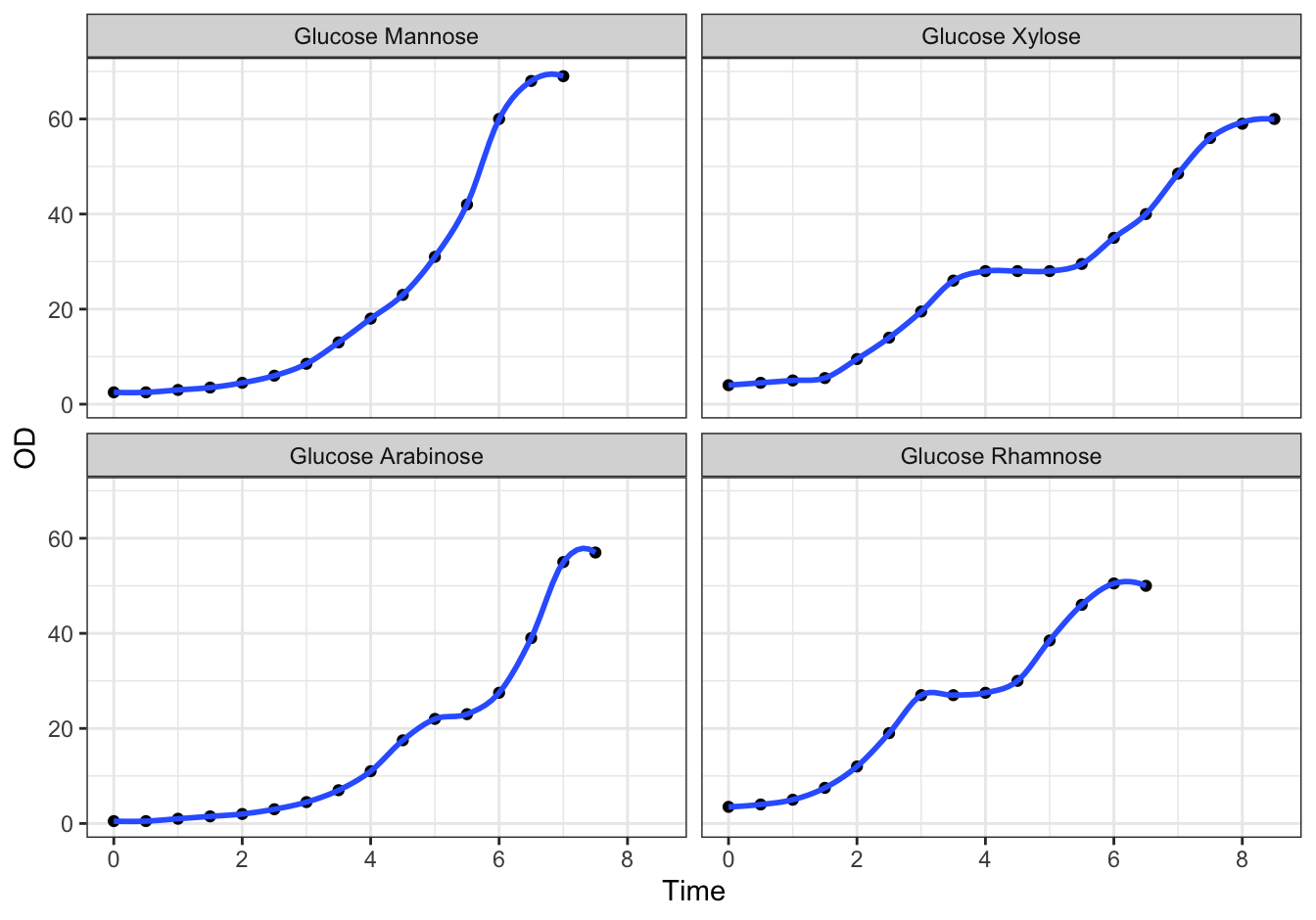
Figure 19.4: Monod’s Diauxic shift experiment.
19.5.7 Virginia Death Rates
library(dplyr)
## %>% is used to pipe results from one operation to the other, just like '|' in Linux.
virginia_death_rates <- as_tibble(VADeaths)
virginia_death_rates <- virginia_death_rates %>%
    mutate("Age Group" = factor(rownames(virginia_death_rates), ordered = TRUE)) %>%
    select(`Age Group`, everything()) #reorder the columns
A (❋❋❋)
Pivot this table to long (tidy) format. This should generate a dataframe with four columns: Age Group, Habitat, Gender and DeathRate.
virginia_death_rates <- virginia_death_rates %>% pivot_longer(cols = -1,
                 names_to = c("Habitat", "Gender"),
                 names_sep = " ",
                 values_to = "DeathRate")
B (❋❋)
ggplot(data = virginia_death_rates, aes(Gender)) +
    geom_bar(aes(weight = DeathRate, fill = Habitat), position = "dodge")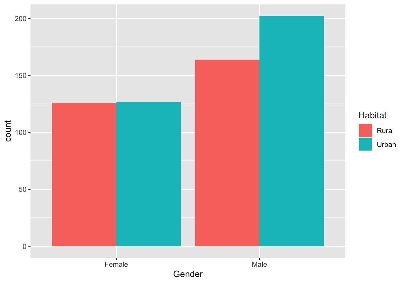
Figure 19.5: Virginia Death rates
19.5.8 Global temperature
Load the data.
remote_file <- "https://raw.githubusercontent.com/MichielNoback/datasets/master/global_temperature/annual.csv"
global_temp <- read.table(remote_file,
                          header = TRUE,
                          sep = ",")
19.5.8.1 Create a scatter-and-line-plot [❋❋]
ggplot(data = global_temp,
       mapping = aes(x = Year, y = Mean, color = Source)) +
    geom_point(size = 0.5) +
    geom_line() +
    geom_smooth(se = FALSE, method = "loess", formula = 'y ~ x') +
    theme_bw()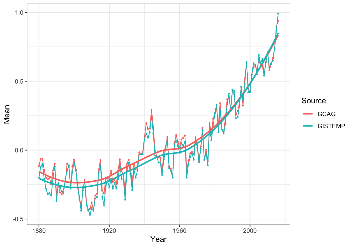
Figure 19.6: Global temperature anomalies
19.5.8.2 Re-create the heatmap [❋❋❋]
ggplot(data = global_temp[global_temp$Source == "GCAG", ],
       mapping = aes(x = Year, y = 1)) +
    geom_tile(aes(fill = Mean), colour = "white") +
    scale_fill_gradient2(low = "blue", mid = "white", high = "red") +
    theme_bw() +
    theme(axis.text.y = element_blank(), axis.ticks.y = element_blank(), axis.title.y = element_blank())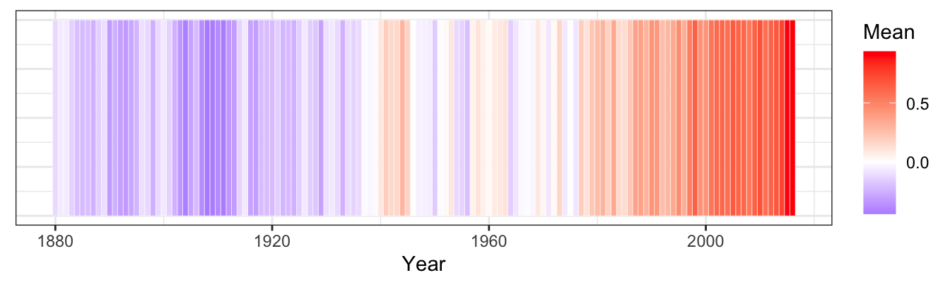
Figure 19.7: Global temperature anomalies
Note: rescaling the temperature from 0 to 1 may yield even better results.
19.7 Flow control and scripting
19.7.2 Various other functions
Add column compared to mean
add_compared_to_mean <- function (df, name) {
    if (! is.data.frame(df)) {
        stop(paste0("'", df, "' is not a dataframe."))
    }
    if(! name %in% colnames(df)) {
        stop(paste0("'", name, "' is not an existing column."))
    }
    if(! is.numeric(df[, name])) {
        stop(paste0("'", name, " is not a numeric column."))
    }
    the_col <- df[, name]
    tmp <- ifelse(the_col > mean(the_col), "greater", "less")
    df$compared_to_mean <- tmp
    return(df)
}
my_df <- data.frame(a = c(2, 4, 2, 3, 4, 3, 1, 5), b = rep(c("x", "y"), 4))
add_compared_to_mean(my_df, "a")
Interquantile ranges
interquantile_range <- function(x, lower = 0, upper = 1) {
  if (! is.numeric(x) |
      ! is.numeric(lower) |
      ! is.numeric(upper)) {
    stop("all three arguments should be numeric")
  }
  lower_val <- quantile(x, probs = lower)
  upper_val <- quantile(x, probs = upper)
  tmp <- upper_val - lower_val
  #a named vector is always nice, for acces but also for display purposes
  names(tmp) <- paste0(lower*100, "-", upper*100, "%")
  tmp
}
tst <- rnorm(1000)
interquantile_range(tst) # 0 to 1
interquantile_range(tst, 0.25, 0.75) # custom
#interquantile_range("foo") # error!
Vector distance
distance <- function(p, q) {
    if (! is.numeric(p) | ! is.numeric(q)) {
        stop("non-numeric vectors passed")
    }
    if (length(p) != length(q)) {
        stop("vectors have unequal length")
    }
    sqrt(sum((p - q)^2))
}
Other distance measures
my_distance <- function(p, q, method = "euclidean") {
  if (! (is.numeric(p) & is.numeric(q))) {
    stop("One or both of the vectors is not numeric")
  }
  if (length(p) != length(q)) {
    stop("Vectors are not of equal length")
  }
  if (method == "euclidean") {
    return(sqrt(sum((p - q)^2)))
  }
  else if (method == "manhattan") {
    return(sum(abs(p-q)))
  }
  else {
    stop(paste0("Method not found: ", method))
  }
}
my_distance(c(0,0,0), c(1, 1, 1))
G/C percentage
GC_perc <- function(seq, strict = TRUE) {
  if (is.na(seq)) {
    return(NA)
  }
  if (length(seq) == 0) {
    return(0)
  }
  seq.split <- strsplit(seq, "")[[1]]
  gc.count <- 0
  anom.count <- 0
  for (n in seq.split) {
    if (length(grep("[GATUCgatuc]", n)) > 0) {
      if (n == "G" || n == "C") {
        gc.count <- gc.count + 1
      }
    } else {
      if (strict) {
        stop(paste("Illegal character", n))
      } else {
        anom.count <- anom.count + 1
      }
    }
  }
  ##return perc
  ##print(gc.count)
  if (anom.count > 0) {
    anom.perc <- anom.count / nchar(seq) * 100
    warning(paste("Non-DNA characters have percentage of", anom.perc))
  }
  return(gc.count / nchar(seq) * 100)
}
19.8 Tidying dataframes using Package tidyr
19.8.1 Small examples
The data folder of this eBook contains three small csv files that need tidying. Read them from file and convert them into tidy format, with data columns as clean as possible (e.g. not “creatine_T0” but “T0”).
A
Tidy file untidy1.csv.
untidy1 <- read.table("data/untidy1.csv",
                      sep = ",",
                      header = TRUE)
pivot_wider(data = untidy1,
            names_from = type,
            values_from = value)
B
Tidy file untidy2.csv.
untidy2 <- read.table("data/untidy2.csv",
                      sep = ",",
                      header = TRUE)
pivot_longer(data = untidy2,
             cols = -patient,
             names_prefix = "creatine_",
             names_to = "timepoint",
             values_to = "creatine")
C
Tidy file untidy3.csv.
untidy3 <- read.table("data/untidy3.csv",
                      sep = ";",
                      header = TRUE)
pivot_longer(data = untidy3,
             cols = -species,
             names_sep = "_",
             #OR
             #names_pattern = "(leashed|unleashed)_(caged|free)",
             names_to = c("leashed", "caged"),
             values_to = "wellbeing")
19.8.2 Lung cancer
lung_cancer_deaths <- data.frame(year = rep(1974:1979, each = 12),
                     month = rep(month.abb, times = 6),
                     male = as.integer(mdeaths),
                     female = as.integer(fdeaths),
                     total = as.integer(ldeaths))
A
lung_cancer_deaths <- pivot_longer(data = lung_cancer_deaths,
             cols = 3:5,
             names_to = "type",
             values_to = "count")
B
Prep:
lung_cancer_deaths$date <- as.Date(x = paste(lung_cancer_deaths$month, lung_cancer_deaths$year, 1, sep="/"),
        format = "%b/%Y/%d")
Figure:
ggplot(data = lung_cancer_deaths,
       mapping = aes(x = date, y = count)) +
  geom_line(aes(color = type))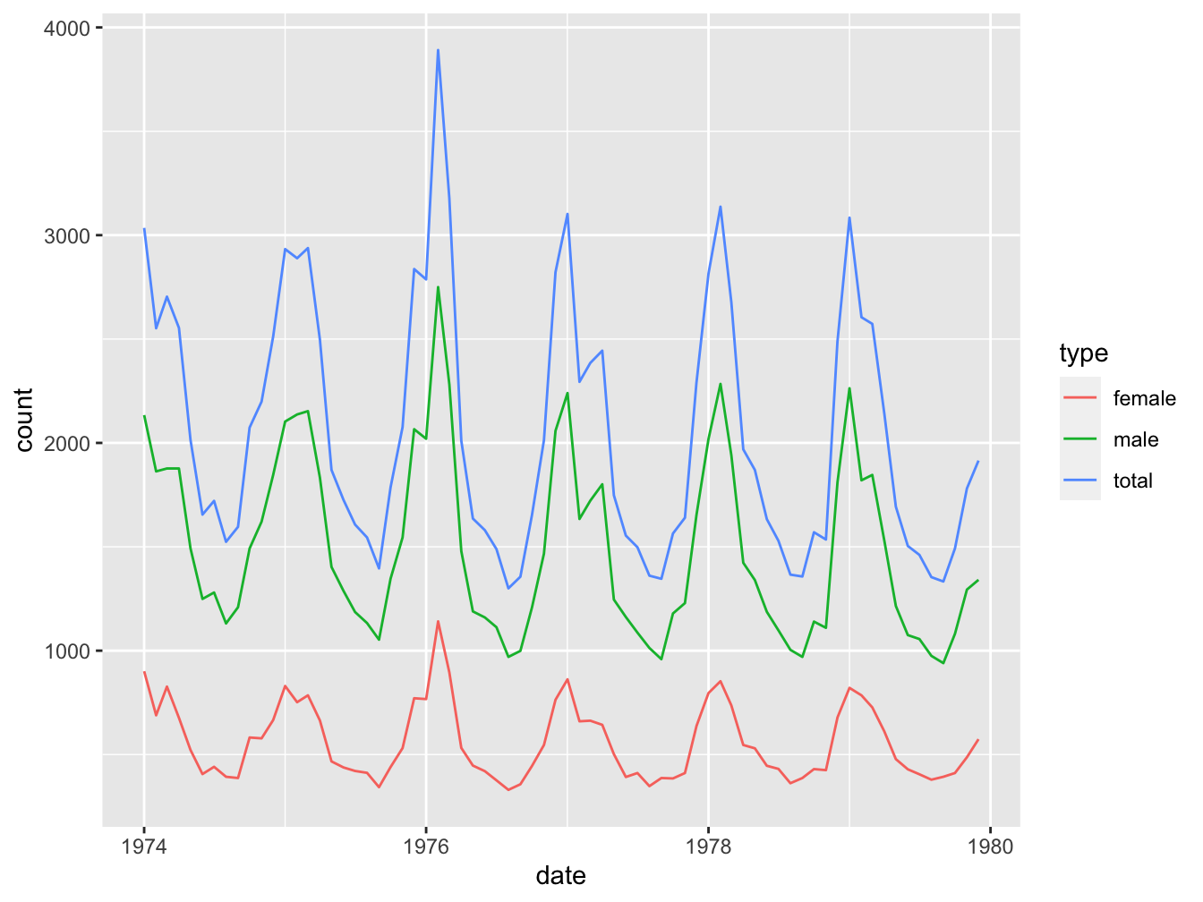
C
ggplot(data = lung_cancer_deaths,
       mapping = aes(x = type, y = count)) +
  geom_boxplot(aes(fill=type))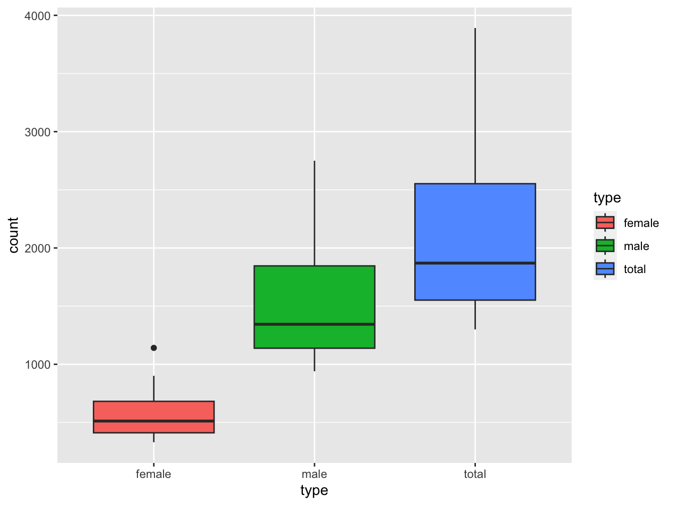
ANSWER: You can see a single outlier in the female set. We can identify the year by finding out when this occurred:
maximum <- max(lung_cancer_deaths[lung_cancer_deaths$type == "female", "count"]) ## 1141
lung_cancer_deaths[lung_cancer_deaths$count == maximum, ]
## # A tibble: 1 × 5
## year month type count date
## <int> <chr> <chr> <int> <date>
## 1 1976 Feb female 1141 1976-02-01So this was February 1976. A quick Google search turned up a pdf document “CDC Influenza Surveillance” that states
“The 1975-1976 influenza season was noteworthy because of several events. a) An H3N2 influenza virus (A/Victoria/3/75), isolated first in April 1975, caused a wide- spread epidemic late in the influenza season in the United States. Based on pneumonia- and influenza-associated mortality which peaked in February and March 1976, this was the most severe epidemic experienced by the United States since the 1968-1969 Hong Kong epidemic.”
As you may know, (lung) cancer patients are especially vulnerable for influenza infections.
19.9 Old school data mangling
19.9.1 Whale selenium
whale_sel_url <- "https://raw.githubusercontent.com/MichielNoback/davur1/gh-pages/exercises/data/whale_selenium.txt"
whale_selenium <- read.table(whale_sel_url,
        header = T,
        row.names = 1)
A
apply(X = whale_selenium, MARGIN = 2, FUN = mean)B
apply(X = whale_selenium, MARGIN = 2, FUN = sd)C
my.sem <- function(x) {
        sem <- sd(x) / sqrt(length(x))
}
apply(X = whale_selenium, MARGIN = 2, FUN = my.sem)
D
whale_selenium$ratio <- apply(X = whale_selenium,
            MARGIN = 1,
            FUN = function(x){
                    x[2] / x[1]
            })
ggplot(data = whale_selenium,
       mapping = aes(x = ratio)) +
  geom_histogram(bins = 15) +
  labs(x = "Tooth / Liver Selenium ratio", title = "Tooth / Liver Selenium ratios in whales")
E
Inline expressions are like this: 15.4 MpH.
19.9.2 Urine properties
urine_file_name <- "urine.csv"
url <- paste0("https://raw.githubusercontent.com/MichielNoback/datasets/master/urine/", urine_file_name)
local_name <- paste0("../", urine_file_name) #specifiy your own folder!
download.file(url = url, destfile = local_name)
A
urine <- read.table(local_name,
                     sep = ",",
                     header = TRUE)
B
names(urine)[2] <- "ox_crystals"
urine$ox_crystals <- factor(urine$ox_crystals, levels = c(0, 1), labels = c("no", "yes"))
C
mean_sd <- function(x) {
    # returns a named vector
    c("mean" = round(mean(x, na.rm = T), 2),
      "sd" = round(sd(x, na.rm = T), 2))
}
apply(X = urine[, 3:8], MARGIN = 2, FUN = mean_sd)
## gravity ph osmo cond urea calc
## mean 1.02 6.03 615 20.90 266 4.14
## sd 0.01 0.72 238 7.95 131 3.26D
aggregate(cbind(gravity, ph, osmo, cond, urea, calc) ~ ox_crystals,
          data = urine,
          FUN = function(x) round(mean(x, na.rm = T), 2))
## ox_crystals gravity ph osmo cond urea calc
## 1 no 1.02 6.13 562 20.6 232 2.63
## 2 yes 1.02 5.93 683 21.4 302 6.2019.10 Data mangling with dplyr
19.10.1 Global temperature revisited
A [❋]
f <- "https://raw.githubusercontent.com/MichielNoback/datasets/master/global_temperature/GLB.Ts%2BdSST.csv"
#temp_dat <- readr::read_csv(f)
temp_dat <- read.table(f, sep = ",", header=TRUE, na.strings = "***")
temp_dat <- as_tibble(temp_dat)
B [❋❋]
C [❋❋]
# coldest
cold <- temp_dat %>%
    arrange(J.D) %>%
    select(Year, J.D) %>%
    slice(1:5)
# warmest
warm <- temp_dat %>%
    arrange(desc(J.D)) %>%
    select(Year, J.D) %>%
    slice(1:5)
# combine
bind_rows(cold, warm)
D [❋❋]
E [❋❋❋]
decade_avg <- temp_dat %>%
    filter(Year > 1969) %>%
    mutate(Decade = paste0(substr(as.character(Year), 1, 3), "0")) %>% # there probably is a better way to do this...
    select(Year, Decade, DJF, MAM, JJA, SON) %>%
    group_by(Decade) %>%
    summarize(across(-Year, mean, na.rm=T))
decade_avg %>%
    pivot_longer(cols = -Decade,
                 names_to = "Season",
                 values_to = "Anomaly") %>%
    mutate(Season = factor(Season,
                           levels = c("DJF", "MAM", "JJA", "SON"),
                           labels = c("Winter", "Spring", "Summer", "Autumn"),
                           ordered = TRUE)) %>%
    ggplot(mapping = aes(x = Decade)) +
        geom_bar(aes(weight = Anomaly, fill = Season), position = position_dodge()) +
    theme_classic()
F [❋❋❋❋]
19.10.2 Pigs
A [❋]
pigs <- read.table("https://raw.githubusercontent.com/MichielNoback/datasets/master/pigs/dietox.csv",
                   header = TRUE,
                   sep = ",")

head(pigs)
B [❋❋]
pigs %>%
    filter(Time == 12 & Evit == 3 & Cu == 3) %>%
    select(Pig, Litter, Feed, Weight) %>%
    arrange(desc(Weight))
C [❋❋]
D [❋❋❋]
E [❋❋❋]
gain <- pigs %>%
    select(Pig, Time, Weight, Feed, Evit, Cu) %>%
    group_by(Pig) %>%
    mutate(Cu = factor(Cu),
           Evit = factor(Evit),
           Lag_Weight = lag(Weight),
           Gain = (Weight - Lag_Weight)/Lag_Weight*100)

ggplot(gain, aes(x = Cu, y = Gain, color = Cu)) +
    geom_violin() +
    facet_wrap(~Evit)
F [❋❋❋]
# select and pivot
pigs %>%
    select(-X) %>%
    pivot_wider(names_from = Time,
                names_prefix = "w_",
                values_from = c(Weight, Feed))
19.10.3 Population numbers
A [❋]
pop_data_file <- "https://raw.githubusercontent.com/MichielNoback/datasets/master/population/EDU_DEM_05022020113225751.csv"
population <- read.table(pop_data_file,
                         header = TRUE,
                         sep=",")
B [❋❋]
Which?
str(population) tells me that Unit.Code, Unit and PowerCode are factors with one level. Using table(population$PowerCode.Code, useNA = "always") tells me that there are only zeros there. Same for Reference.Period.Code and Reference.Period. The variables Flags and Flag.Codes refer to the same, so one of them can be removed (I choose to remove Flag.Codes). The same counts for SEX/Sex, AGE/Age and YEAR/Year.
Select This is my selection:
keep <- names(population)[c(1, 2, 4, 6, 8, 15, 16)]
keep
population <- as_tibble(population[, keep]) #tibble is nicer!
head(population)
C [❋❋❋]
pop_totals <- dplyr::filter(population, Sex == "Total" & Age == "Total: All age groups")
##or, using base R
#population[population$Sex == "Total" & population$Age == "Total: All age groups", ]
pivot_wider(
    data = pop_totals[, c(1, 2, 5, 6)],
    names_from = Year,
    values_from = Value)
D [❋❋❋❋]
You could do this on the pop_totals dataset using the lag() function, after using group_by(), but since we have the wide format, you could also use a simple for loop, iterating the columns by index and subtracting the first from the second. I will demonstrate the only the first.
pop_totals %>%
    group_by(Country) %>%
    mutate(Pop_change = as.integer(Value - lag(Value))) %>%
    ungroup() %>%
    select(-Value) %>%
    pivot_wider(names_from = Year,
        values_from = Pop_change) %>%
    select(-`2005`, -`2010`, -Flag.Codes)
## backticks in above selection are required
## because we are selecting names that are numbers!
E [❋❋❋]
sel <- population %>%
    filter(Sex == "Women" | Sex == "Men") %>%
    filter(COUNTRY %in% c("BEL", "CHE", "DNK", "FRA", "IRL", "DEU", "LUX", "NLD", "GBR")) %>%
    drop_na()

ggplot(sel, mapping = aes(Year)) +
    geom_bar(aes(weight = Value, fill = Sex))  +
    facet_wrap(. ~ COUNTRY)
F [❋❋❋❋]
population %>%
    filter(Sex == "Total" & Age == "Total: All age groups" & (Year == 2005 | Year == 2017)) %>%
    group_by(Country) %>%
    mutate(Change = Value - lag(Value),
           Previous = lag(Value)) %>%
    mutate(GrowthRate = Change / Previous * 100) %>%
    ungroup() %>%
    select(COUNTRY, Country, GrowthRate ) %>%
    arrange(desc(GrowthRate)) %>%
    head(3)
19.11 Text processing with regex
19.11.1 Restriction enzymes
A [❋❋]
pacI_re <- "TTAATTAA"
patterns <- c("T{2}A{2}T{2}A{2}",
           "(TTAA){2}",
           "(T{2}A{2}){2}")
for(ptrn in patterns){
    print(grepl(ptrn, pacI_re))
}
B [❋❋]
19.11.2 Prosite Patterns
A [❋❋]
PS00211:
“[LIVMFYC]-[SA]-[SAPGLVFYKQH]-G-[DENQMW]-[KRQASPCLIMFW]-[KRNQSTAVM]-[KRACLVM]-[LIVMFYPAN]-{PHY}-[LIVMFW]-[SAGCLIVP]-{FYWHP}-{KRHP}-[LIVMFYWSTA].”
PS00211<- "[LIVMFYC][SA][SAPGLVFYKQH]G[DENQMW][KRQASPCLIMFW][KRNQSTAVM][KRACLVM][LIVMFYPAN][^PHY][LIVMFW][SAGCLIVP][^FYWHP][^KRHP][LIVMFYWSTA]"B [❋❋]
PS00018:
“D-{W}-[DNS]-{ILVFYW}-[DENSTG]-[DNQGHRK]-{GP}-[LIVMC]-[DENQSTAGC]-x(2)- [DE]-[LIVMFYW].”
PS00018 <- "D[^W][DNS][^ILVFYW][DENSTG][DNQGHRK][^GP][LIVMC][DENQSTAGC].{2} [DE][LIVMFYW]"19.12 Package ggplot2 revisited
19.12.1 Eye colors
A [❋❋]
(ec_data <- readr::read_csv("data/eyecolor_data.csv",
                            col_types = "cfiffffffff",
                            na="-"))
B [❋❋❋]
ec_data <- ec_data %>%
    mutate(across(4:11, ~ recode_factor(.x, blauw = "blue", bruin = "brown", groen = "green")))
C [❋❋❋❋]
## Majority for use in mutate()
majority <- function(x) {
    #print(as.character(x))
    # there are many other approaches to be taken
    t <- table(x)
    if (length(t) == 1) return(x[1]) # one entry = no problem
    else if(length(unique(t)) == 1) return("intermediate") # same counts = no majority
    else{
        # order by count and return the most abundant one
        df <- as.data.frame(t)
        return(as.character(df[order(df$Freq, decreasing = T)[1], 1]))
    }
}

# mutate to apply the function
# this requires rowwise() and c_across()
ec_data <- ec_data %>%
    rowwise() %>%
    mutate(majority = majority(c_across(-(1:3))))
D [❋❋❋]
ec_data_tidy <- ec_data %>%
    pivot_longer(cols = -c(Identifier, sex, age, majority),
                 names_sep = "_",
                 names_to = c("eye", "experimenter"),
                 values_to = "observed_color")
E [❋❋❋]
## create the contingency table
counts <- ec_data_tidy %>% select(sex, eye, observed_color) %>%
    group_by(sex, eye, observed_color) %>%
    summarize(count = n(), .groups = "drop")

## The balloon plot. Not that quotes around variables are required!
ggpubr::ggballoonplot(data = counts,
                      x = 'eye',
                      y = 'observed_color',
                      facet.by = 'sex',
                      size = 'count',
                      fill = "blue")
19.13 Working with date-time data
19.13.1 Bacterial growth
A [❋❋]
bact_growth <- read.table('data/growth-exp-data.csv',
           sep = ";",
           header = TRUE)
B [❋❋]
bact_growth <- bact_growth %>%
    unite(date_time, date, time, sep="@") %>%
    mutate(date_time = lubridate::dmy_hm(date_time))
C [❋❋❋]
start <- bact_growth$date_time[1]
bact_growth <-
    bact_growth %>%
    mutate(elapsed_time = hour(seconds_to_period(date_time - start)))
D [❋❋❋]
# Value used to transform the data of the second axis
coeff <- 1

OD_color <- "#69b3a2"
glucose_color <- "deepskyblue3"
ggplot(data = bact_growth, mapping = aes(x=elapsed_time)) +
  geom_line(mapping = aes(y = OD600), linewidth = 1, color = OD_color) +
  geom_line(mapping = aes(y=glucose / coeff), linewidth = 1, color = glucose_color) +
  scale_y_continuous(
    # Features of the first axis
    name = "OD600",
    # Add a second axis and specify its features
    sec.axis = sec_axis(~ . * coeff, name = "Glucose level")
  ) +
  xlab("elapsed time (h)") +
  theme_classic() +
  theme(
    axis.title.y = element_text(color = OD_color, size=13),
    axis.title.y.right = element_text(color = glucose_color, size=13)
  )