5 Basics of the ggplot2 package
In this chapter, we’ll explore the basics of the ggplot2 package. This package is one of the most popular packages of R, and the de facto standard for creating publishable visualizations. A later chapter will present more details of it possibilities.
Whole books have been written about ggplot2 (e.g. ggplot2 - Elegant Statistics for Data Aanalysis); these will not be repeated here. Instead, I have selected the minimal amount of information and examples to get you going in your own visualization endeavours in biomedical research. For that reason, this chapter only deals with the base ggplot() function and its most important usage scenarios.
In my opinion, you are best prepared when first learning the ggplot “language” structure, not the complete listing of possibilities. You can check these out later on your own. If you are interested in what the package has to offer, type help(package="ggplot2") on the console.
5.1 Getting started
Keep the goal in mind
You should always remember the purpose with which you create a plot:
- Communicate results in a visual way. The audience consists of other professionals: fellow scientists, students, project managers, CEO’s. The scope is in reports, publications, presentations etc. Your plots should be immaculately annotated - have a title and/or caption, axis labels with physical quantities (e.g. Temperature) and measurement units (e.g. Celsius), and a legend (if relevant).
- Create a representation of data for visual inspection. The audience is yourself. This is especially important in Exploratory Data Analysis (EDA). You visualize your data in order to discover patterns, trends, outliers and to generate new questions and hypotheses. The biggest challenge is to select the correct, most appropriate visualization that keeps you moving on your research track.
Besides this, you should of course choose a relevant visualization for your data. For instance, generating a boxplot representing only a few data points is a poor choice, as will a scatterplot for millions of data points almost always be.
To help your imagination and see what is possible you should really browse through The R Graph Gallery. It has code for all the charts in the gallery.
A first plot
Install the packages ggplot2 first, if not already installed.
install.packages("ggplot2")After installing, you’ll need to load the packages.
Let’s dive right in and create a first plot, and walk through the different parts of this code.
ggplot(data = airquality, mapping = aes(x = Temp, y = Ozone)) +
  geom_point()
## Warning: Removed 37 rows containing missing values (`geom_point()`).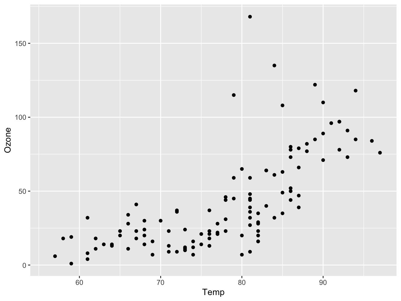
Figure 5.1: A scatter plot visualizing Ozone as a function of Temperature
There are two chained function calls: ggplot() and geom_point(). They are chained using the + operator. The first function, ggplot(), creates the base layer of the plot. It receives the data and defines how it maps to the two axes. By itself, ggplot(), will not display anything of your data. It creates an empty plot where the axes are defined and have the correct scale:
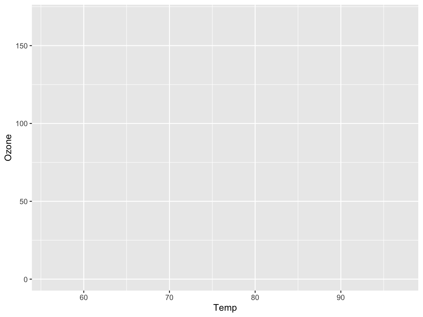
Figure 5.2: An empty plot pane
The next function, geom_point(), builds on the base layer it receives via the + operator and adds a new layer to the plot, a data representation using points.
The geom_point() function encounters rows with missing data and issues a warning (Warning: Removed 37 rows...) but proceeds anyway. There are two ways to prevent this annoying warning message. The first is to put a warning=FALSE statement in the RMarkdown chunk header. This is usually not a good idea because you should be explicit about problem handling when implementing a data analysis workflow because it hinders the reproducibility of your work. Therefore, removing the missing values explicitly is a better solution:
airqual <- na.omit(airquality)
#convert to use month labels instead of numbers
airqual$Month <- as.factor(month.abb[airqual$Month])
ggplot(data = airqual, mapping = aes(x = Temp, y = Ozone)) +
  geom_point()
To obtain a similar plot as created above with “base” R, you would have done something like this:
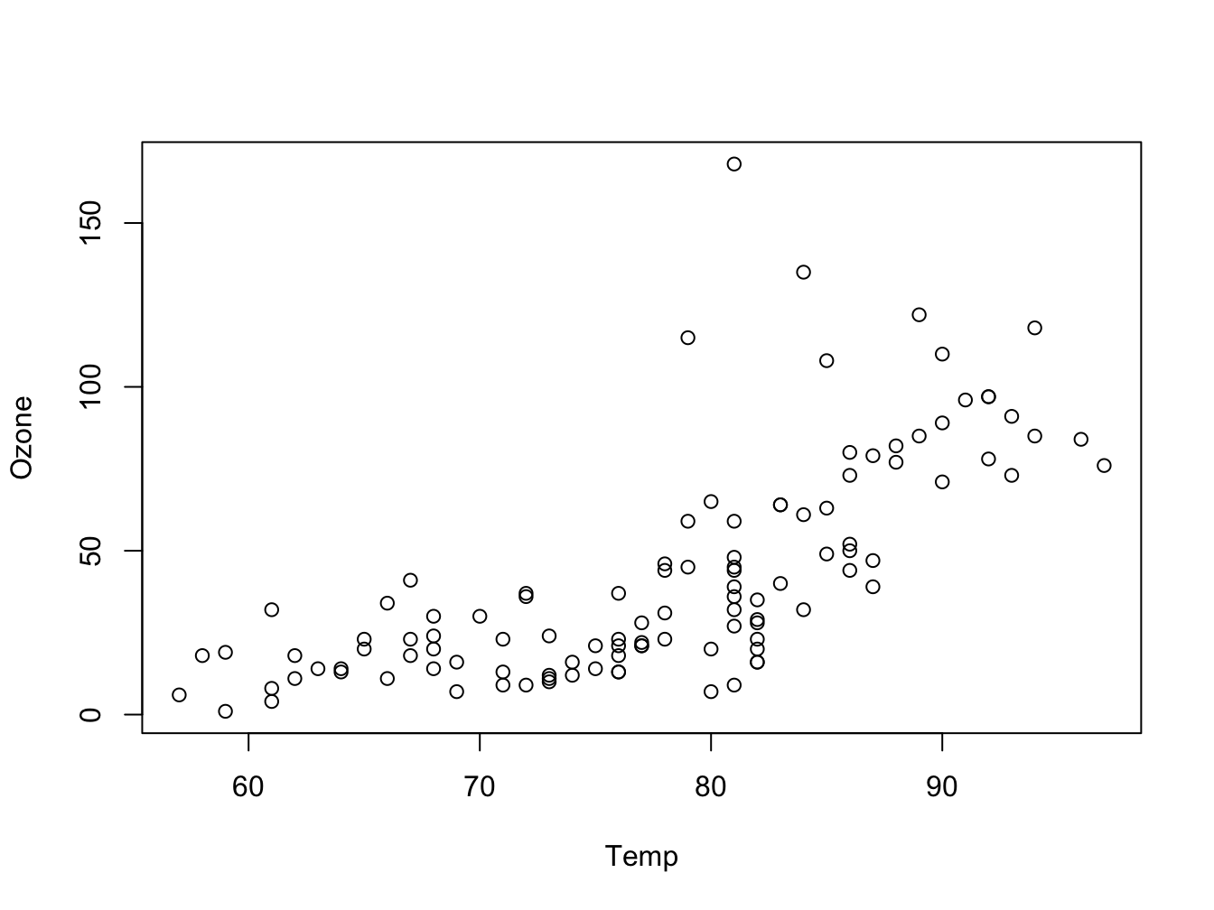
Figure 5.3: The same visualization with base R
You can immediately see why ggplot2 has become so popular. When creating more complex plots it becomes more obvious still, as shown below.
Adding a dimension using color
This plot shows the power of ggplot2: building complex visualizations with minimal code.
ggplot(data = airqual, mapping = aes(x = Temp, y = Ozone, color = Month)) +
geom_point() 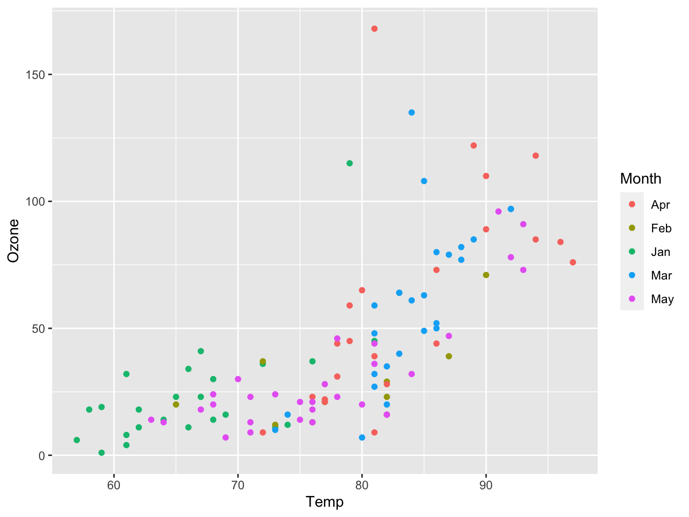
Figure 5.4: Ozone as function of Temp with plot symbols colored by Month
Inspecting and tuning the figure
What can you tell about the data and its measurements when looking at this plot?
Looking at the above plot, you should notice that
- the temperature measurement is probably in degrees Fahrenheit. This should be apparent from the plot. The measurement unit for Ozone is missing. You should look both up; the
datasetspackage doc says it is in Parts Per Billion (ppb).
- temperature is lowest in the fifth month -probably May but once again you should make certain- and highest in months 8 and 9.
- ozone levels seem positively correlated with temperature (or Month), but not in an obvious linear way
- a detail: temperature is measured in whole degrees only. This will give plotting artifacts: discrete vertical lines of data points.
The plot below fixes and addresses the above issues to create a publication-ready figure. We’ll get to the details of this code as we proceed in this chapter. For now the message is be meticulous in constructing your plot.
ggplot(data = airqual,
       mapping = aes(x = Temp, y = Ozone)) +
  geom_point(mapping = aes(color = Month)) +
  geom_smooth(method = "loess", formula = y ~ x) + #the default formula, but prevents a printed message
  xlab(expression("Temperature " (degree~F))) +
ylab("Ozone (ppb)") 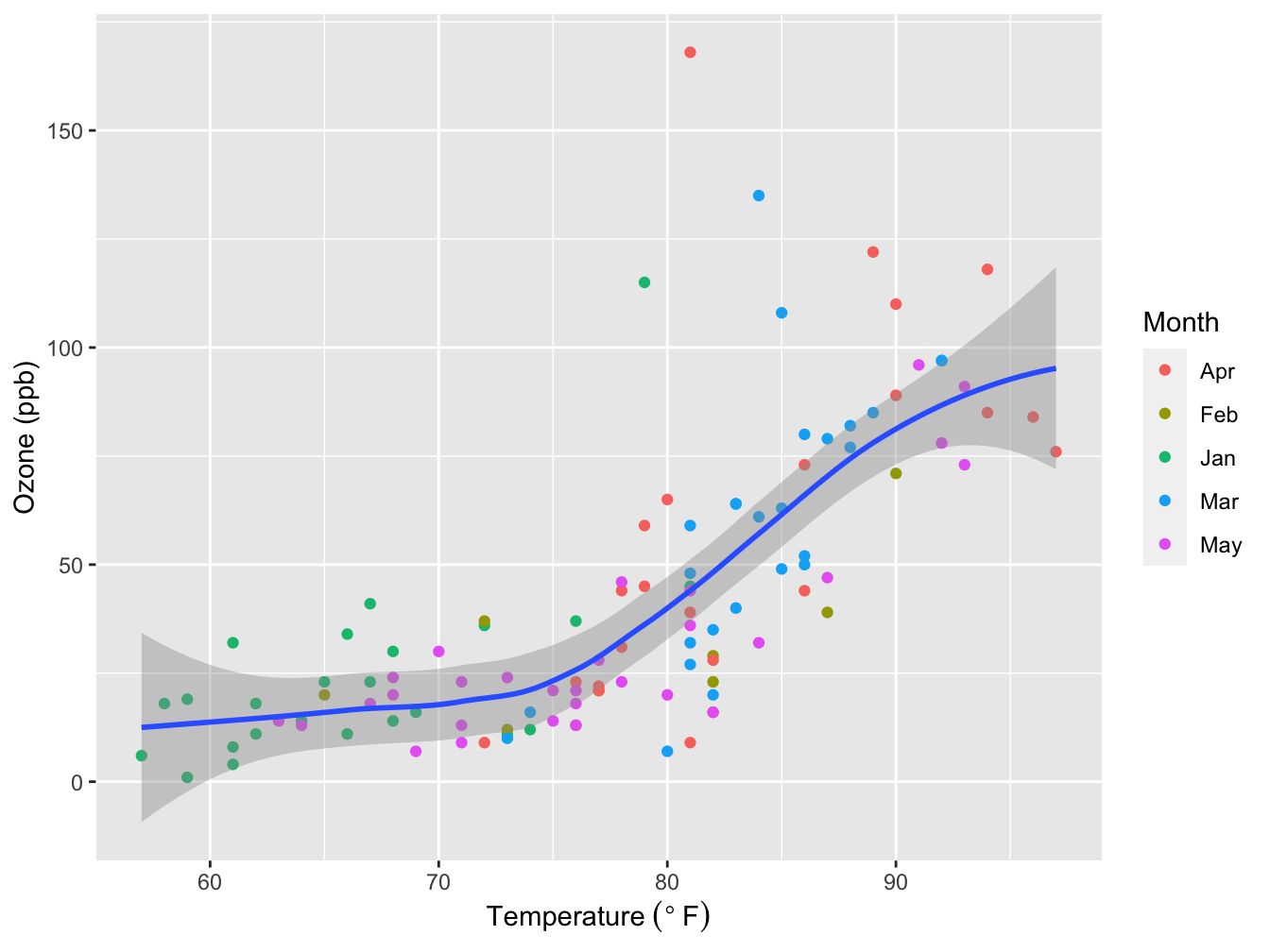
Figure 5.5: Ozone level dependency on Temperature. Grey area: Loess smoother with 95% confidence interval. Source: R dataset “Daily air quality measurements in New York, May to September 1973.”
5.2 Overview of ggplot
5.2.1 ggplot2 and the theory of graphics
Philosophy of ggplot2
The author of ggplot2, Hadley Wickham, had a very clear goal in mind when he embarked on the development of this package:
“The emphasis in ggplot2 is reducing the amount of thinking time by making it easier to go from the plot in your brain to the plot on the page.” (Wickham, 2012)
The way this is achieved is through “The grammar of graphics”
The grammar of graphics
The grammar of graphics tells us that a statistical graphic is a mapping from data to geometric objects (points, lines, bars) with aesthetic attributes (color, shape, size).
The plot may also contain statistical transformations of the data and is drawn on a specific coordinate system. Faceting -grid layout- can be used to generate the same plot for different subsets of the dataset. (Wickham, 2010)
5.2.2 Building plots with ggplot2
The layered plot architecture
A graph in ggplot2 is built using a few “layers”, or building blocks.
| ggplot2 | description |
|---|---|
| data= | the data that you want to plot |
| aes() | mappings of data to position (axes), colors, sizes |
| geom_…..() | shapes (geometries) that will represent the data |
First, there is the data layer - the input data that you want to visualize:
Next, using the aes() function, the data is mapped to a coordinate system. This encompasses not only the xy-coordinates but also possible extra plot dimensions such as color and shape.
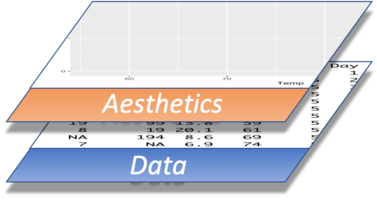
As a third step, the data is visually represented in some way, using a geometry (dealt with by one of the many geom_....() functions). Examples of geometries are point for scatterplots, boxplot, line etc.
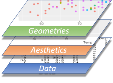
At a minimum, these three layers are used in every plot you create.
Besides these fundamental aspects there are other elements you may wish to add or modify: axis labels, legend, titles, etc. These constitute additional, optional layers:
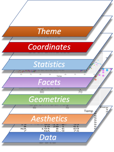
Except for Statistics and Coordinates, each of these layers will be discussed in detail in subsequent paragraphs.
“Tidy” the data
This is a very important aspect of plotting using ggplot2: getting the data in a way that ggplot2 can deal with it. Sometimes it may be a bit challenging to get the data in such a format: some form of data mangling is often required. How to get your data like this is the topic of a next chapter, but here you’ll already see a little preview.
The ggplot2 function expects its data to come in a tidy format. A dataset is considered tidy when it is formed according to these rules:
- Each variable has its own column.
- Each observation has its own row.
- Each value has its own cell.
Want to know more about tidy data? Read the paper by Hadley Wickham: (tidy-data?).
Here is an example dataset that requires some mangling, or tidying, to adhere to these rules.
##    patient sex dose10mg dose100mg
## 1      001   f       12        88
## 2      002   f       11        54
## 3      003   m       54        14
## 4      004   m       71        21
## 5      005   f       19        89
## 6      006   f       22        99
## 7      007   f       23        69
## 8      008   m       68        31
## 9      009   f       30        85
## 10     010   m       83        18
## 11     011   m       72        37
## 12     012   m       48        28
## 13     013   m       67        16
## 14     014   f       13        79
## 15     015   m       73        22
## 16     016   f       20        84
## 17     017   f       22        96
## 18     018   m       40        14
## 19     019   m       57        12
## 20     020   f       26        63
## 21     021   f       17        89
## 22     022   f       29        77
## 23     023   m       54        21
## 24     024   m       61        10
## 25     025   m       57        36
## 26     026   f       11        80
This dataset is not tidy because there is an independent variable -the dose- that should have its own column; its value is now buried inside two column headers (dose10mg and dose10mg). Also, there is actually a single variable -the response- that is now split into two columns. Thus, a row now contains two observations.
Suppose you want to plot the response as a function of the dose. That is not quite possible right now in ggplot2. This is because you want to do something like
ggplot(data=dose_response,
       mapping = aes(x = "<I want to get the dose levels here>",
                     y = "<I want to get the response here>")) +
    geom_boxplot()
The problem is you cannot specify the mapping in a straightforward manner. Note that in base R you would probably do this:
boxplot(dose_response$dose10mg, dose_response$dose100mg)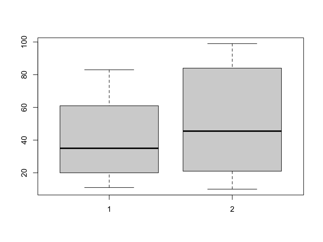
Figure 5.6: Selecting untidy data
So, we need to tidy this dataframe since the dose_10_response and dose_100_response columns actually describe the same variable (measurement) but with different conditions.
Luckily, there is a very nice package that makes this quite easy: tidyr.
Tidying data using tidyr::pivot_longer()
## tidy
dose_response_tidy <- pivot_longer(data = dose_response,
                                   cols = c("dose10mg", "dose100mg"),
                                   names_pattern = "dose(\\d+)mg",
                                   names_to = "dose",
                                   values_to = "response")

DT::datatable(dose_response_tidy,
              options = list(pageLength = 15,
                             dom = 'tpli'))
The data is tidy now, and ready for use within ggplot2.
We’ll explore the pivot_longer() function in detail in a next chapter when discussing the tidyr package.
Now, creating the plot in ggplot2 is a breeze
dr_plot <- ggplot(dose_response_tidy, aes(x = dose, y = response))
dr_plot +
    geom_boxplot()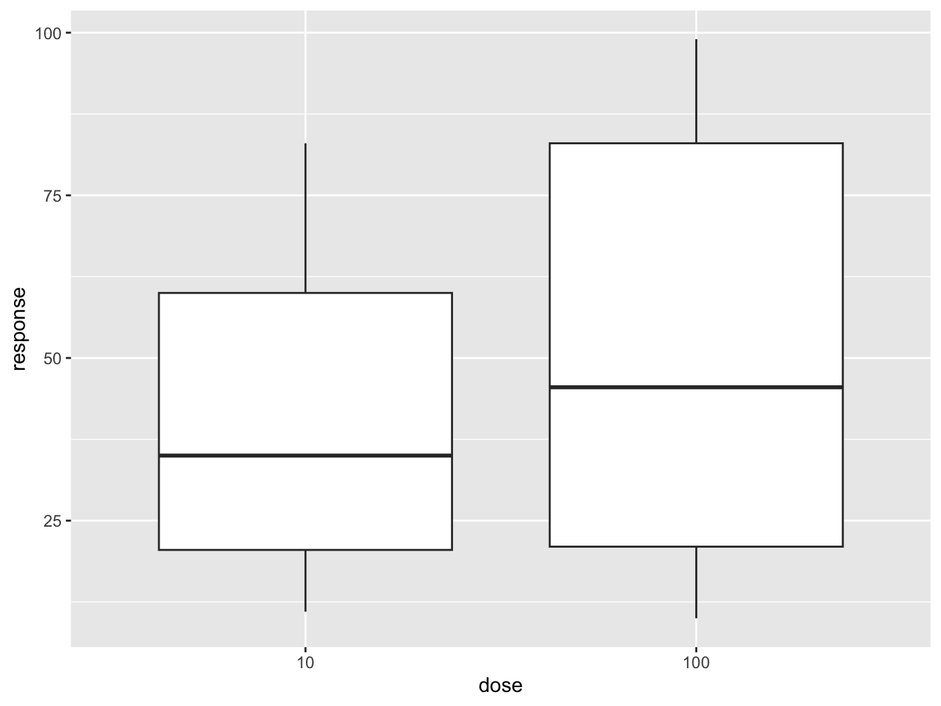
Would you proceed with this hypothetical drug?
5.2.3 Inheritance of aesthetics
In the code that creates the figure above you see two calls to the aes() function: one in ggplot() and one in geom_point(). Look at the same code, but with the aesthetics combined into the main ggplot call.
ggplot(data = airqual,
       mapping = aes(x = Temp, y = Ozone, color = Month)) +
  geom_point() +
  geom_smooth(method = "loess", formula = y ~ x) + #the default formula, but prevents a printed message
  xlab(expression("Temperature " (degree~F))) +
ylab("Ozone (ppb)") 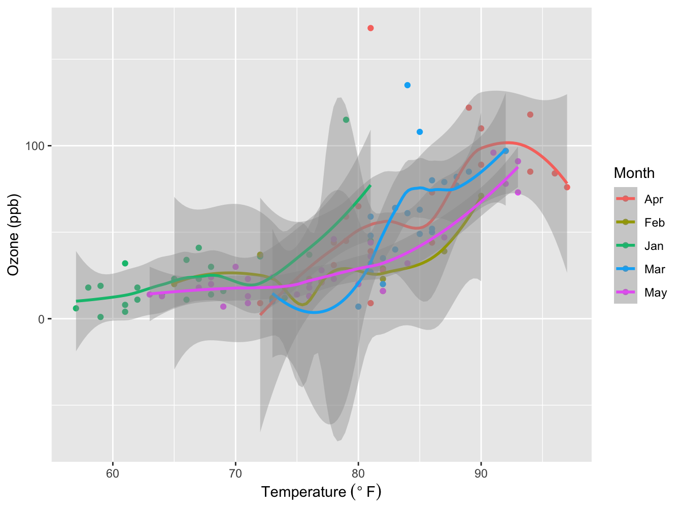
Figure 5.7: Ozone level dependency on Temperature. Grey area: Loess smoother with 95% confidence interval. Source: R dataset “Daily air quality measurements in New York, May to September 1973.”
The difference is cause by inheritance of aesthetics!
Like the main ggplot() function, every geom_ function accepts its own mapping = aes(...). The mapping is inherited from the ggplot() function so any aes(...) mapping defined in the main ggplot() call applies to all subsequent layers. However, you can specify your own “local” aesthetic mapping within a geom_xxxx(). Aesthetics defined within a geom_ function are scoped to that function call only.
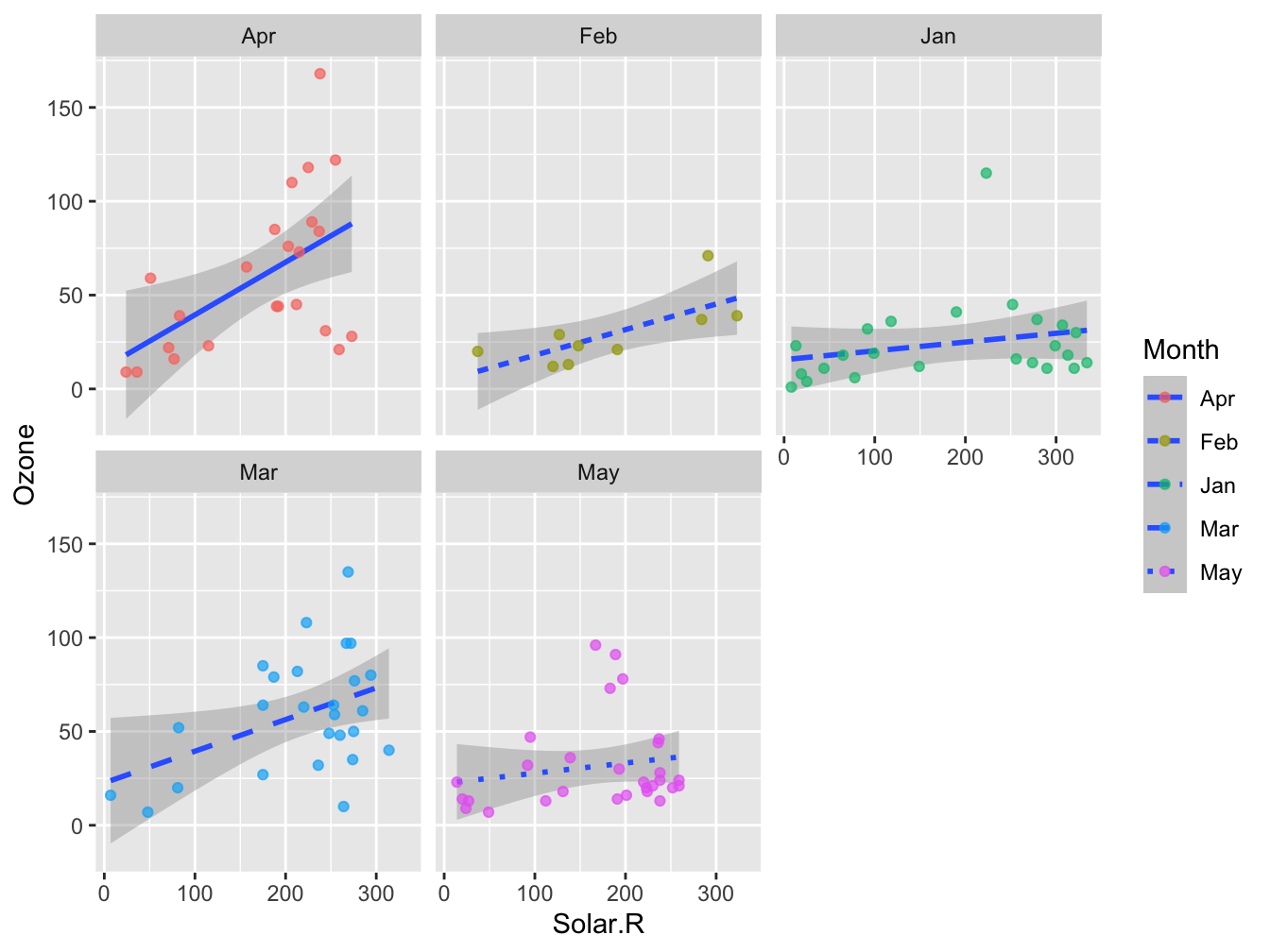
In the plot below you see another example of how this works (it is not a nice plot any more).
ggplot(data = airqual, mapping = aes(x = Solar.R, y = Ozone)) +
    geom_smooth(aes(linetype = Month), method = "lm", formula = y ~ x) +
geom_point(aes(color = Month), alpha = 0.7) 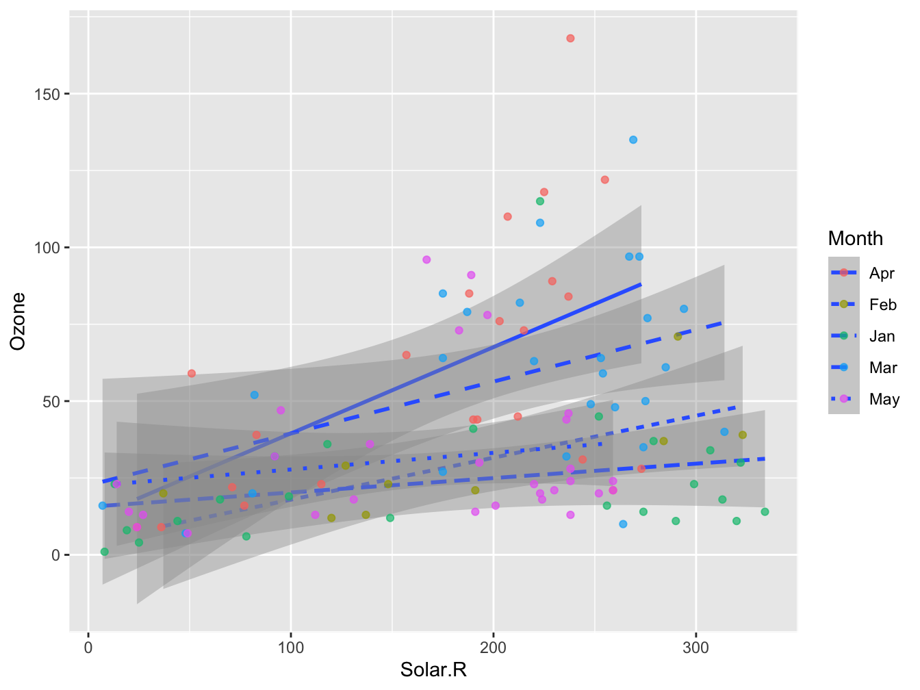
Any aesthetics defined outside the aes() function calls are static properties and will be dealt with in a literal manner.
Note that you can “override” global (ggplot()) aesthetics in geom_xxx() but this can give unexpected behavior, as seen in the paragraph on Color.
5.3 Aesthetics
After you obtain a tidy dataset and pass it to ggplot you must decide what the aesthetics are: the way the data are represented in your plot. Very roughly speaking, you could correlate the aesthetics to the dimensions of the data you want to visualize. For instance, given this chapters’ first example of the airquality dataset, the aesthetics were defined in three “dimensions”:
- dimension “X” for temperature,
- dimension “Y” for Ozone
- dimension “color” for the month.
Although color is used most often to represent an extra dimension in the data, other aesthetics you may consider are shape, size, line width, line type and facetting (making a grid of plots).
Colors
Colors can be defined in a variety of ways in ggpplot (and R in general):
- color name
- existing color palette
- custom color palette
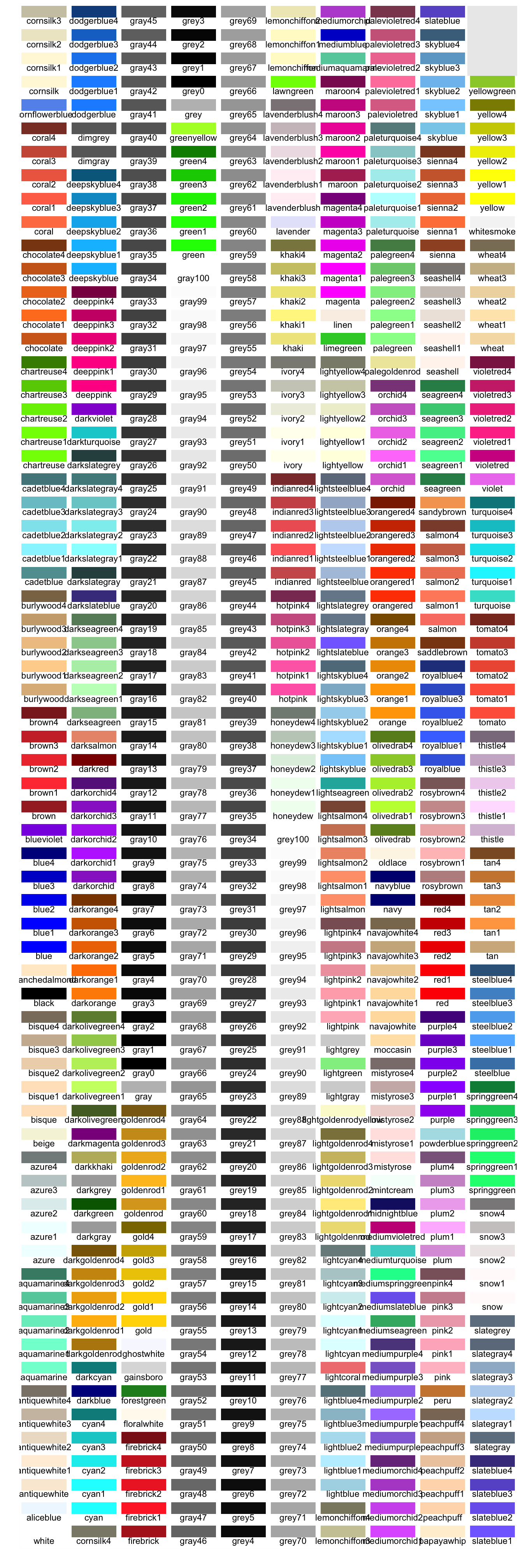
Below is a panel displaying all named colors you can use in R
When you provide a literal (character) for the color aesthetic it will simply be that color. If you want to map a property (e.g. “Month”) to a range of colors, you should use a color palette. Since ggplot has build-in color palettes, you can simply use color=<my-third-dimension-variable>. This variable mapping to color can be either a factor (discrete scale) or numeric (continuous scale).
The ggplot function will map the variable the default color palette.
Be aware that there is a big difference in where you specify an aesthetic. When it should be mapped onto a variable (the values within a column) you should put it within the aes() call. When you want to specify a literal -static- aesthetic (e.g. color) you place it outside the aes() call. When you misplace the mapping you get strange behavior:
ggplot(iris, aes(Sepal.Length, Sepal.Width)) +
    geom_point(aes(color = 'Green'))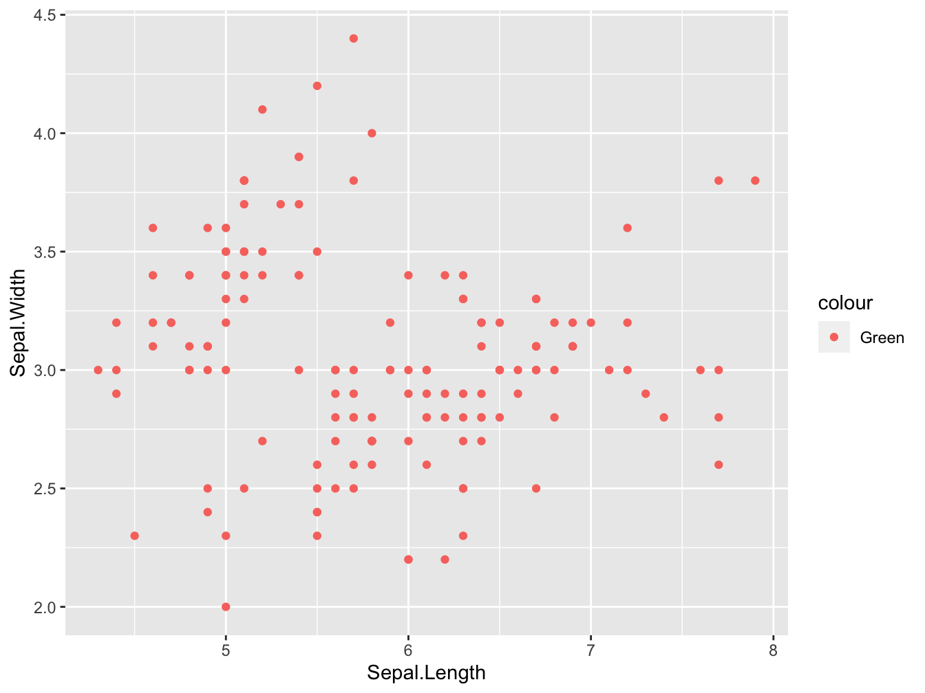
This will not work either (not evaluated because it gives an error):
ggplot(iris, aes(Sepal.Length, Sepal.Width)) +
    geom_point(color = Species)
And when you specify it twice the most ‘specific’ will take precedence (but the legend label is incorrect here):
ggplot(data = airqual,
       mapping = aes(x = Ozone, y = Solar.R, color = Month)) +
    geom_point(mapping = aes(color = Day))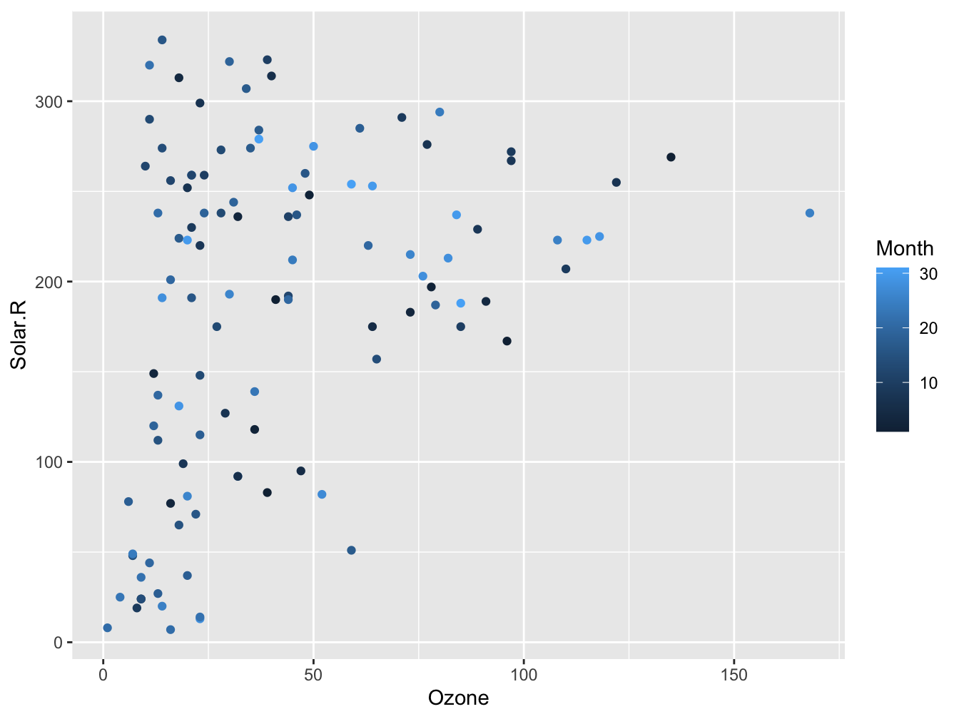
Have a look at the paragraph “Inheritance of aesthetics” for more detail. Here are some ways to work with color palettes
The default palette
#store it in variable "sp" for re-use in subsequenct chunks
sp <- ggplot(iris, aes(Sepal.Length, Sepal.Width)) +
    geom_point(aes(color = Species))
sp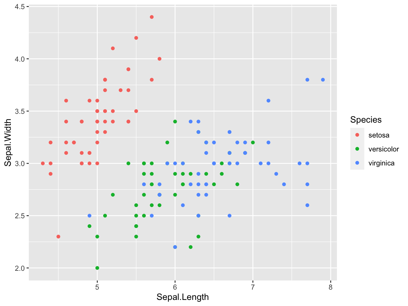
Manual palettes
You can specify your own colors using scale_color_manual() for scatter plots or scale_fill_manual() for boxplots and bar plots.
sp + scale_color_manual(values = c("#00AFBB", "#E7B800", "#FC4E07"))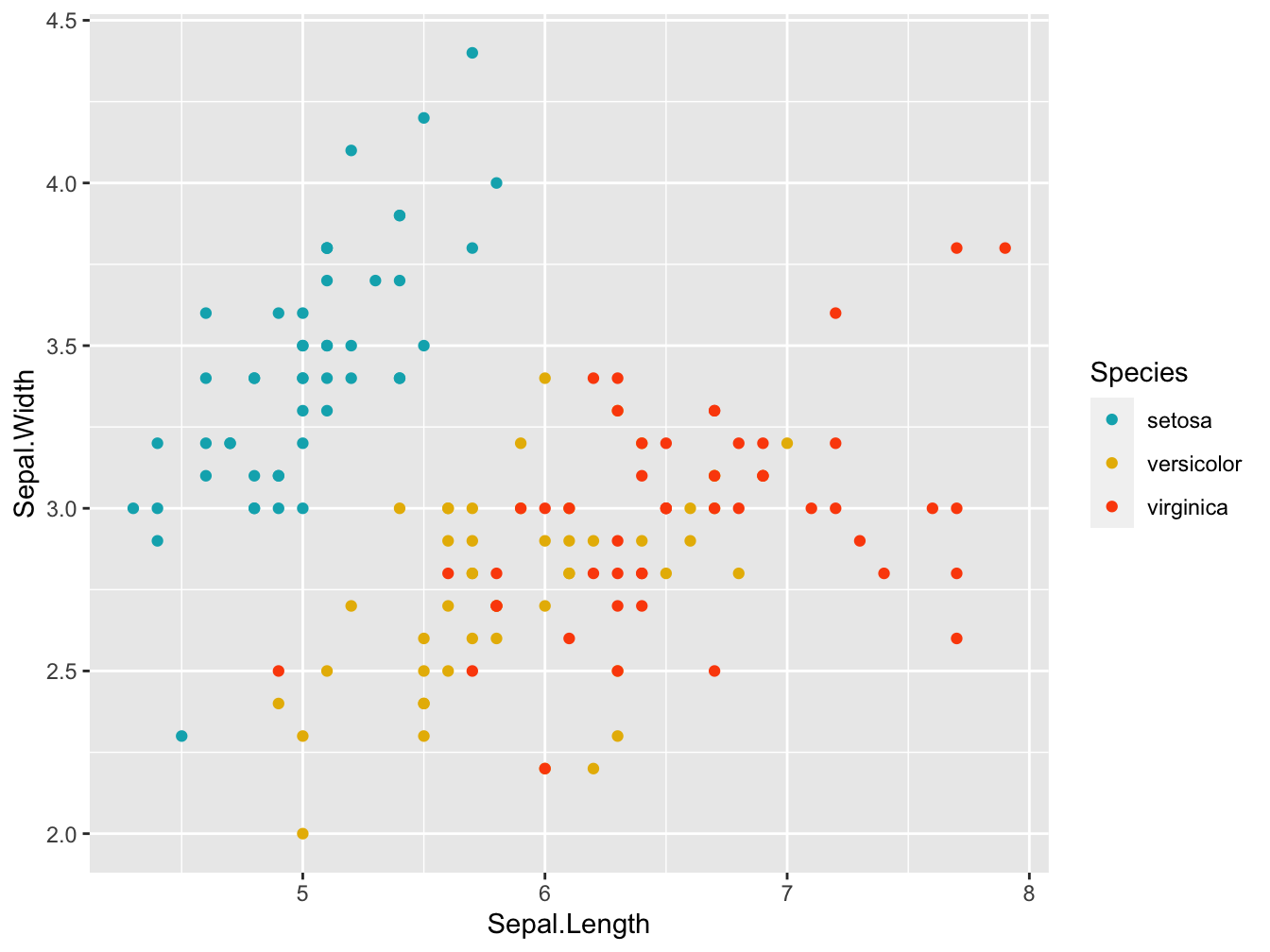
Here the palette is defined using the hexadecimal notation: Each color can be specified as a mix of Red, Green, and Blue values in a range from 0 to 255. In Hexadecimal notation these are the position 1 and 2 (Red), 3 and 4 (Green) and 5 and 6 (Blue) after the hash sign (#). 00 equals zero and FF equals 255 (16*16). This is quite a universal encoding: a gazillion websites style their pages using this notation.
Here is a nice set of colors:
custom_col <- c("#FFDB6D", "#C4961A", "#F4EDCA",
                "#D16103", "#C3D7A4", "#52854C", "#4E84C4", "#293352")
show_palette(custom_col, cols=length(custom_col))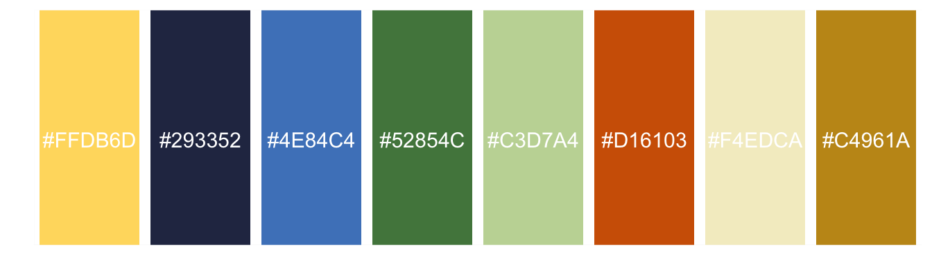
Here is a colorblind-friendly palette:
# The palette with grey:
cbp1 <- c("#999999", "#E69F00", "#56B4E9", "#009E73",
          "#F0E442", "#0072B2", "#D55E00", "#CC79A7")

show_palette(cbp1, cols=length(cbp1))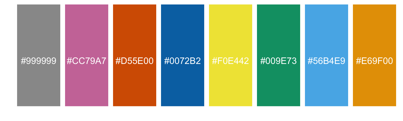
When you pass a palette that is longer than the number of levels in your factor, R will only use as many as required:
sp + scale_color_manual(values = cbp1)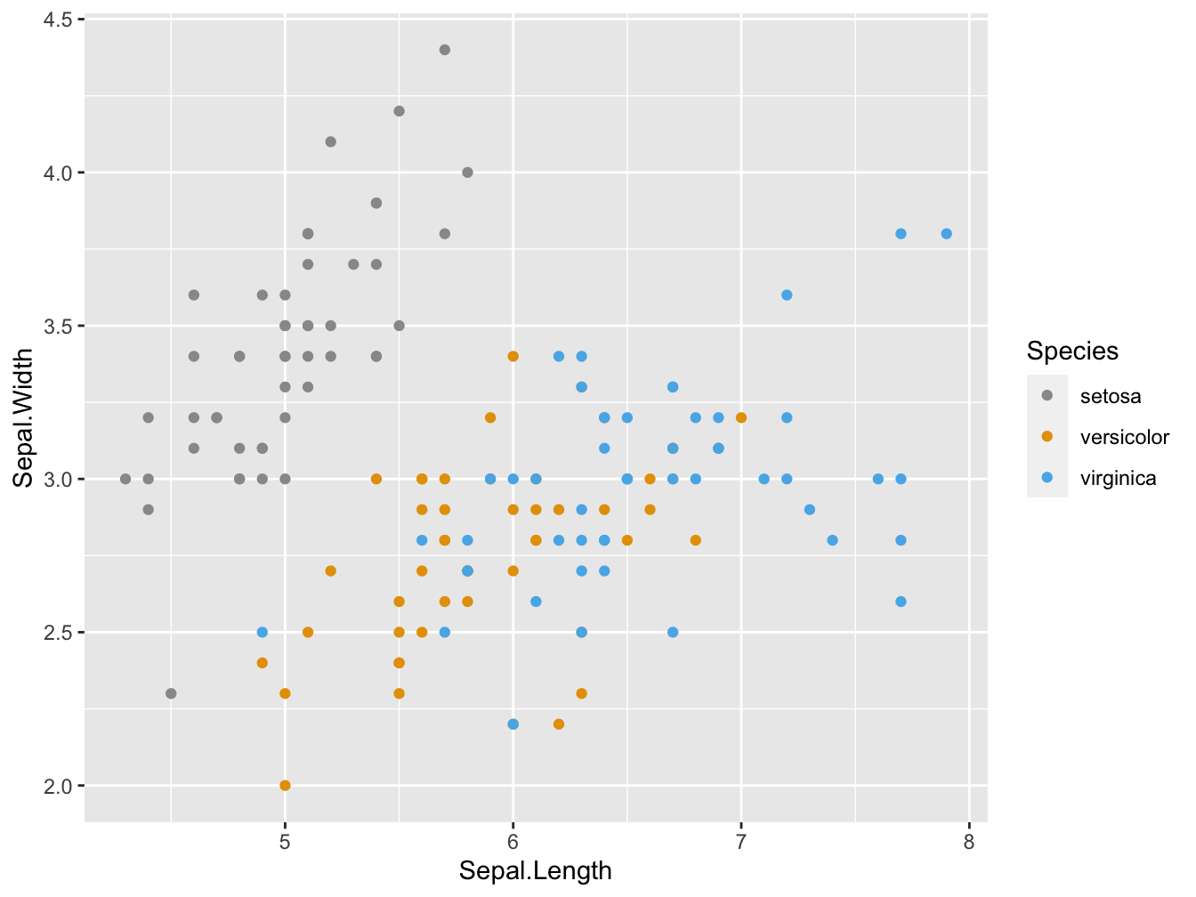
Shapes
These are the shapes available in ggplot2 (and base R as well).
shapes <- data.frame(
  shape = c(0:19, 22, 21, 24, 23, 20),
  x = 0:24 %/% 5,
  y = -(0:24 %% 5)
)
ggplot(shapes, aes(x, y)) +
  geom_point(aes(shape = shape), size = 5, fill = "red") +
  geom_text(aes(label = shape), hjust = 0, nudge_x = 0.15) +
  scale_shape_identity() +
  #expand_limits(x = 4.1) +
  theme_void()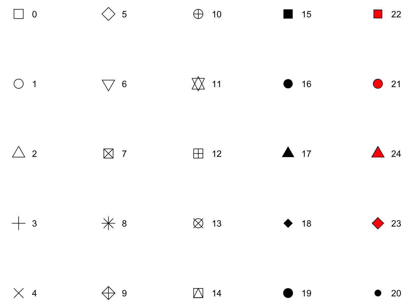
Warning: do not clutter your plot with too many dimensions/aesthetics!
Lines
Geoms that draw lines have a “linetype” parameter.
Legal values are the strings “blank”, “solid”, “dashed”, “dotted”, “dotdash”, “longdash”, and “twodash”. Alternatively, the numbers 0 to 6 can be used (0 for “blank”, 1 for “solid”, …).
You can set line type to a constant value. For this you use the linetype geom parameter. For instance, geom_line(data=d, mapping=aes(x=x, y=y), linetype=3) sets the line type of all lines in that layer to 3, which corresponds to a dotted line), but you can also use it dynamically.
Here is an example where the female and male deaths in the UK for 72 successive months are plotted. The linetype = sex aesthetic could as well have been defined within the global ggplot call. It may be a bit more logical to specify it where it applies to the geom.
deaths <- data.frame(
month = rep(1:72, times = 2),
sex = rep(factor(c("m", "f")), each = 72),
deaths = c(mdeaths, fdeaths)
)
ggplot(data = deaths, mapping = aes(x = month, y = deaths)) +
geom_line(aes(linetype = sex))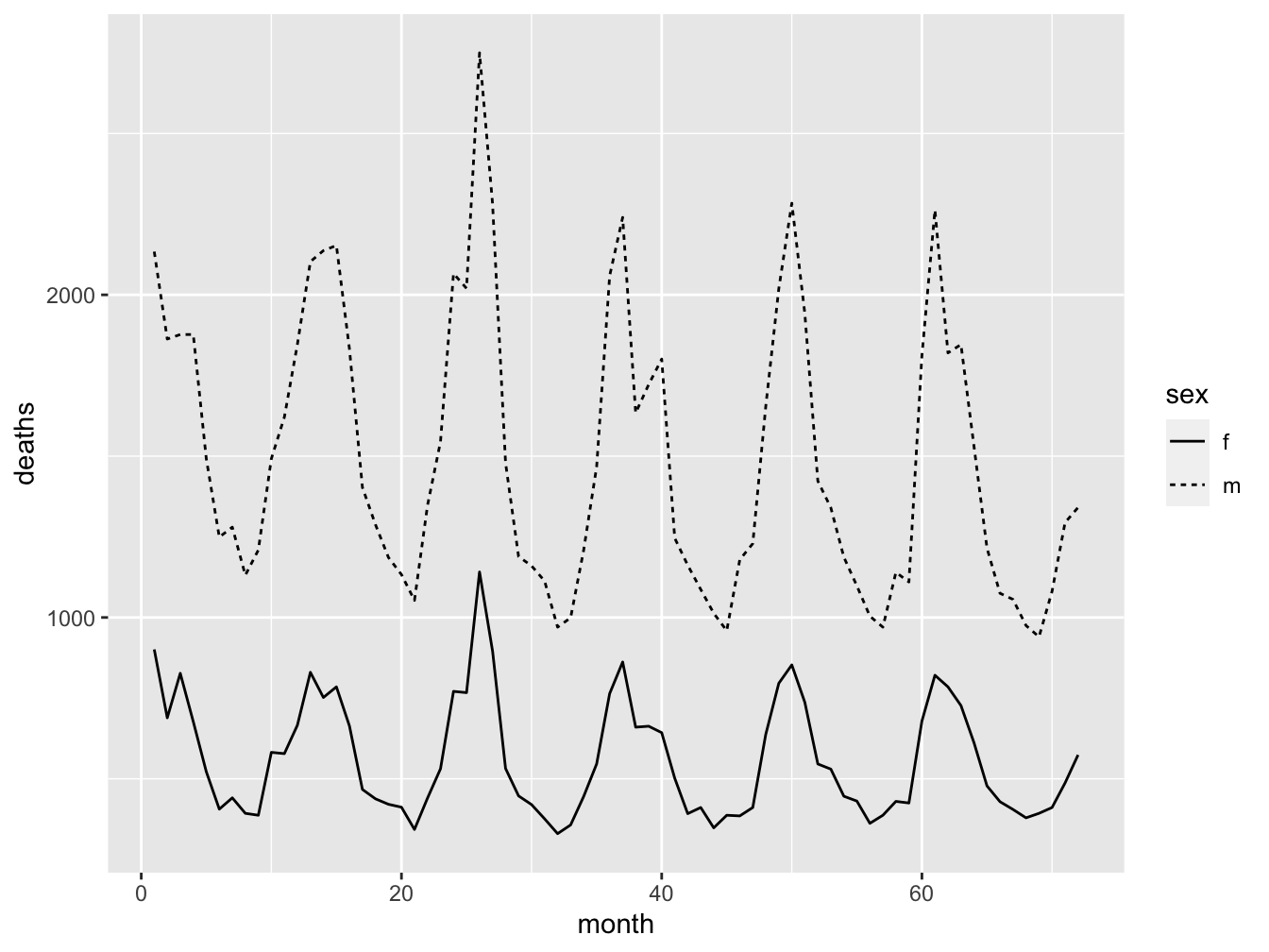 When you want to add lines of same type, color and width, you can use the
 group= argument in geom_line(). In the next example, all the chickens on the same diet get the same colour:
ggplot(data = ChickWeight,
       mapping = aes(x = Time, y = weight, color = Diet)) +
    geom_line(aes(group=Chick)) +
    theme_classic()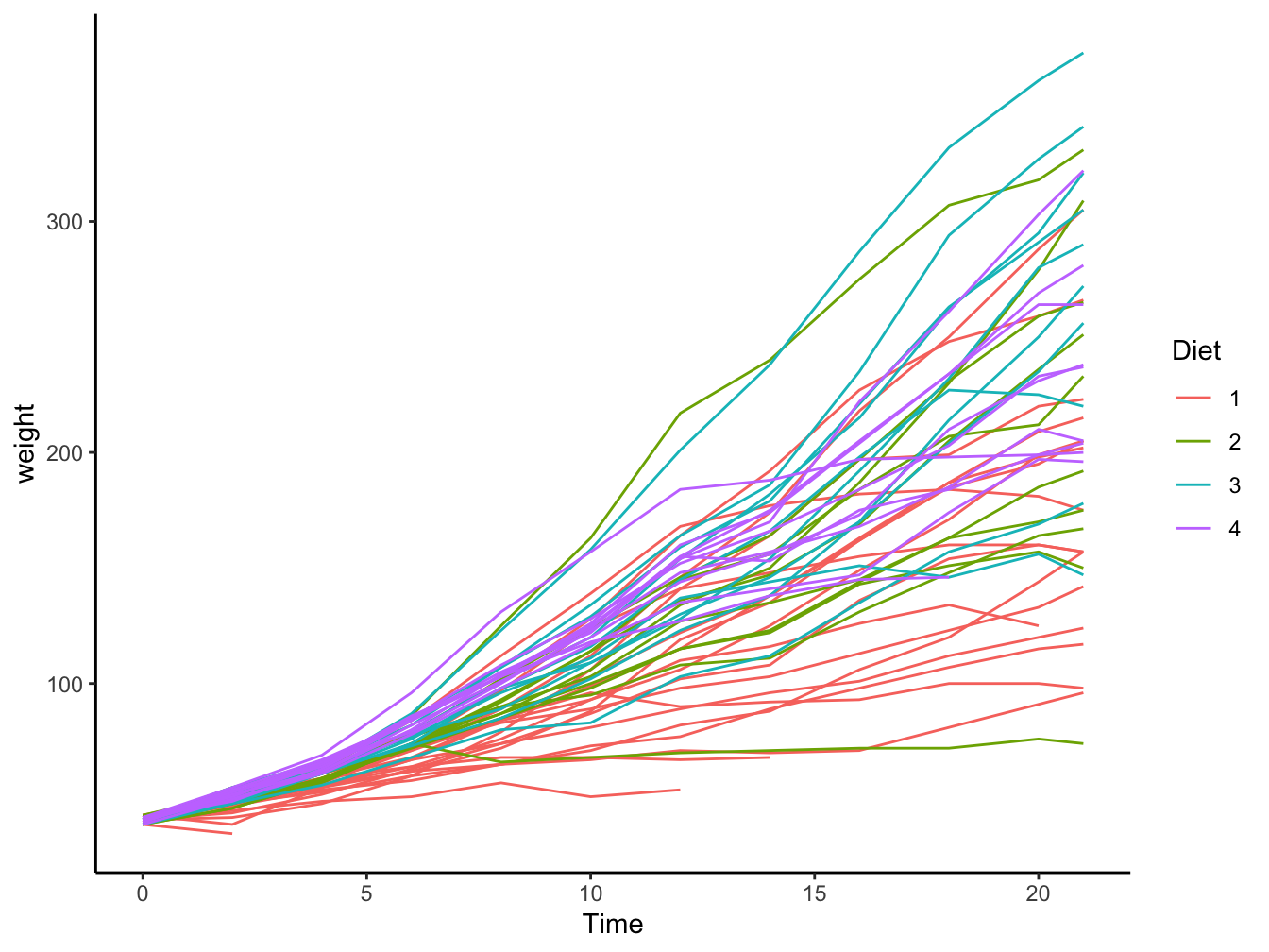
Size
The size of the plotting symbol can also be used as an extra dimension in your visualization. Here is an example showing the solar radiation of the airquality data as third dimension.
ggplot(data = airqual,
       mapping = aes(x = Wind, y = Ozone, size = Solar.R)) +
    geom_point(color = "red", alpha = 0.5) +
labs(size = "Solar radiation (Lang)") 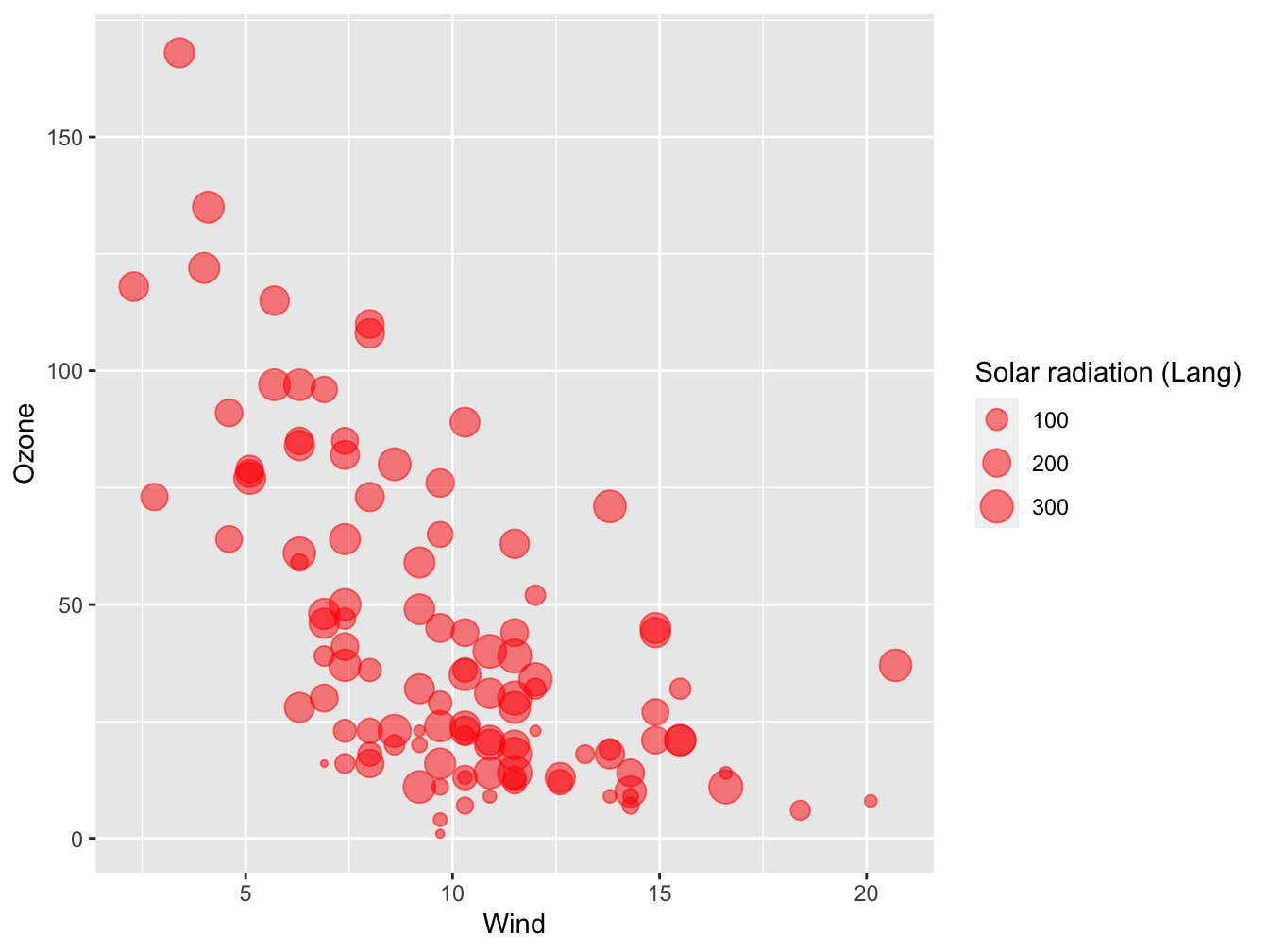
5.4 Geometries
What are geometries
Geometries are the ways data can be visually represented. Boxplot, scatterplot and histogram are a few examples. There are many geoms available in ggplot2; type geom_ in the console and you will get a listing. Even more are available outside the ggplot2 package. Here we’ll only explore the most used geoms in science.
Boxplot
Boxplot is one of the most-used data visualizations. It displays the 5-number summary containing from bottom to top: minimum, first quartile, median (= second quartile), third quartile, maximum. Outliers, usually defined as more than 1.5 * IQR from the median, are displayed as separate points. Some color was added in the example below.
dr_plot <- ggplot(dose_response_tidy, aes(x = dose, y = response))
dr_plot + geom_boxplot(fill='#E69F00')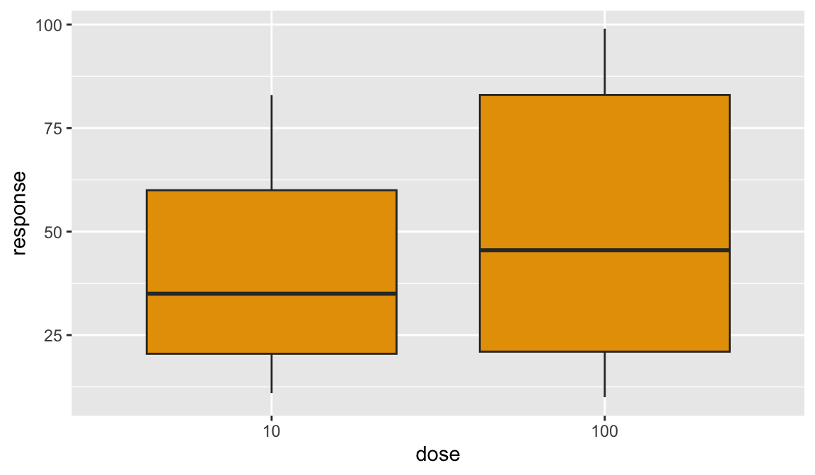
Jitter
Jitter is a good alternative to boxplot when you have small sample sizes, or discrete measurements with many exact copies, resulting in much overlap. Use the width and height attributes to adjust the jittering.
dr_plot + geom_jitter(width = 0.1, height = 0)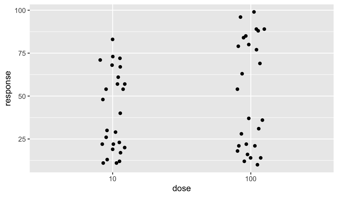
Note that vertical jitter was set to zero because the y-axis values are already in a continuous scale. You should use vertical jittering only when these have discreet values that otherwise overlap too much.
Below, a split over the sexes is added. Suddenly, a dramatic dosage effect becomes apparent that was smoothed out when the two sexes were combined.
dr_plot + geom_jitter(width = 0.1, height = 0, aes(colour = sex))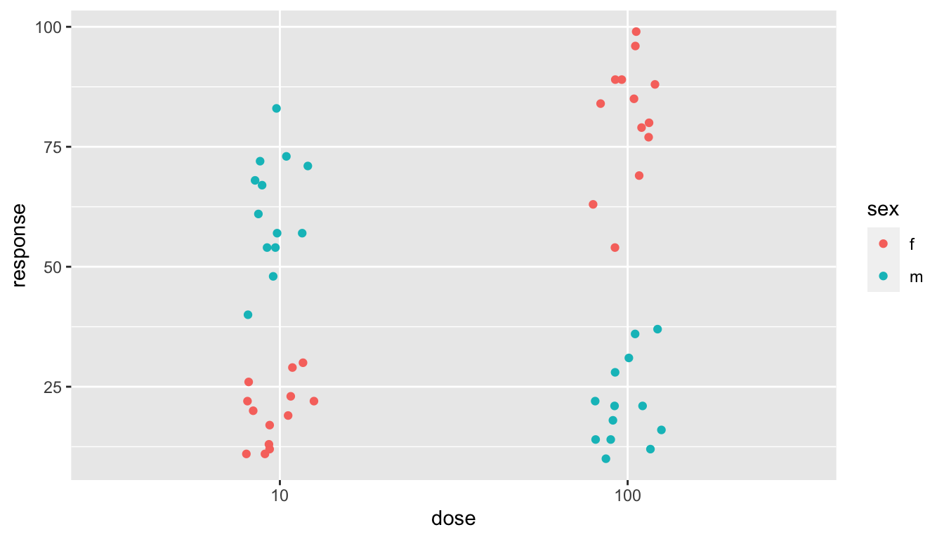
Alternatively, use a grid of plots to emphasize the contrast further.
dr_plot +
    geom_jitter(width = 0.1, height = 0, aes(colour = sex)) +
    facet_wrap( . ~ sex)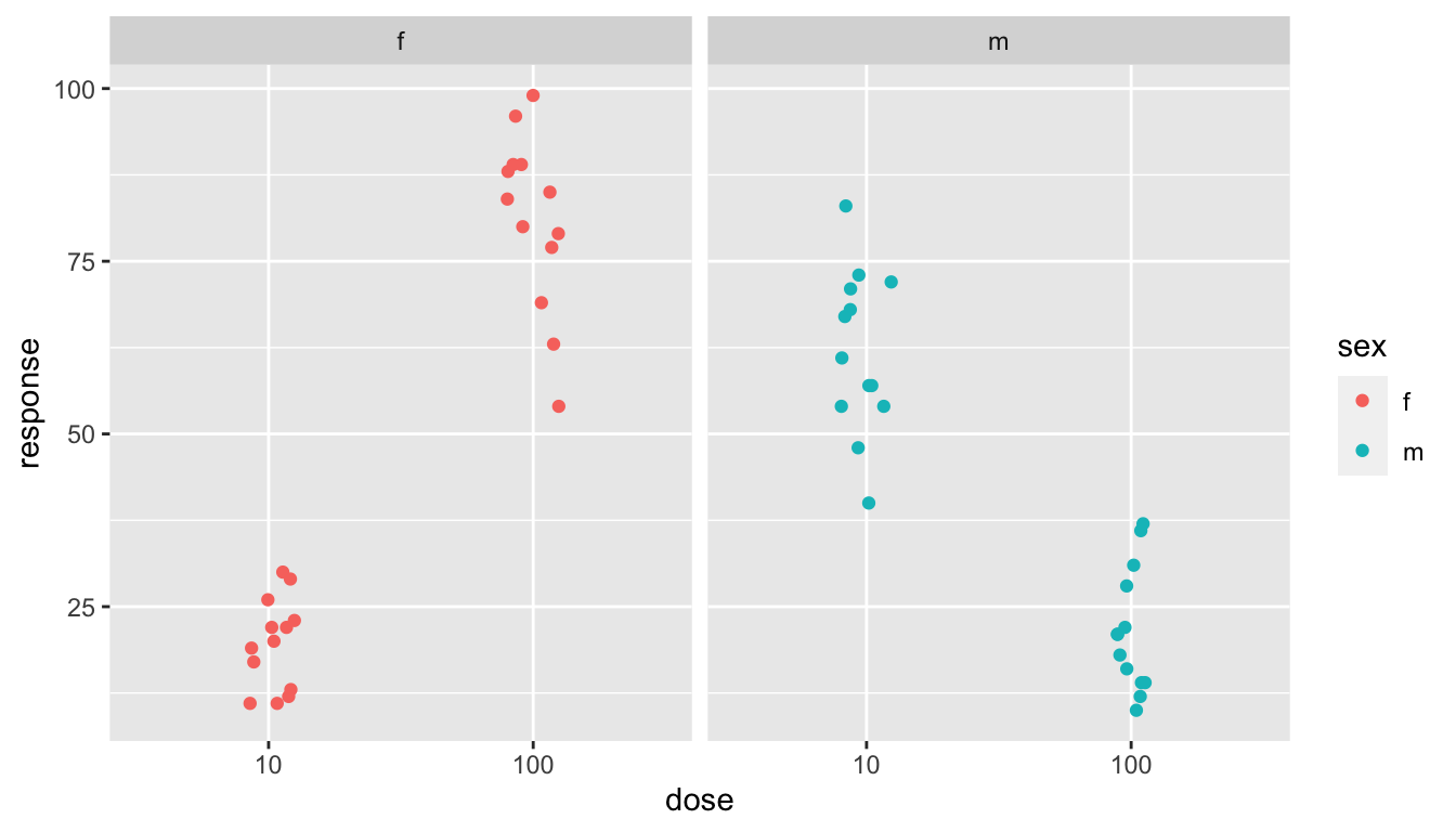
Plot overlays: boxplot + jitter
This example shows how you can overlay plots on top of each other as much as you like. The order in which you define the layers is the order in which they are stacked on top of each other in the graph. You could use this as a feature:
library(gridExtra) ##
## Attaching package: 'gridExtra'## The following object is masked from 'package:dplyr':
##
## combine
dr_plot <- ggplot(dose_response_tidy, aes(x = dose, y = response))
p1 <- dr_plot +
geom_boxplot(fill='#E69F00') +
geom_jitter(width = 0.1, height = 0, size = 2, alpha = 0.4)
p2 <- dr_plot +
geom_jitter(width = 0.1, height = 0, size = 2, alpha = 0.6) +
geom_boxplot(fill='#E69F00')
grid.arrange(p1, p2, nrow = 1) #create a panel of plots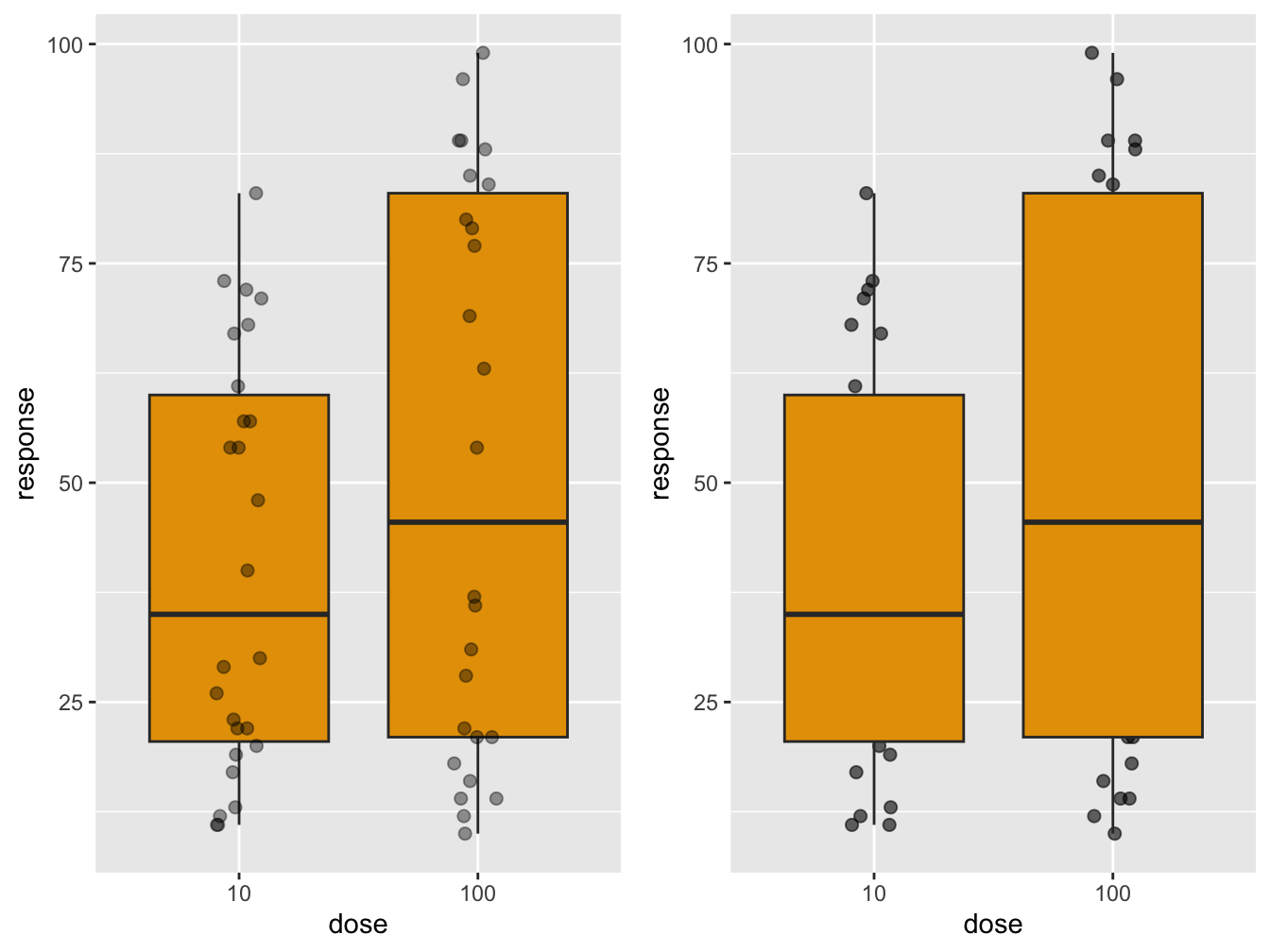 The
The gridExtra package is discussed in a more complex setting below, in section “Advanced plotting aspects”.
Plot overlays: smooth + ribbon
Here is another pair of examples of overlays of different geoms. In the first, the original datapoints are included.
ggplot(mpg, aes(displ, hwy)) +
    geom_point(alpha = 0.4) +
    geom_smooth(se = FALSE, color = "darkgreen", method = "loess", formula = "y ~ x") +
    geom_ribbon(aes(ymin = 0,
                    ymax = predict(loess(hwy ~ displ))),
                alpha = 0.3, fill = 'green')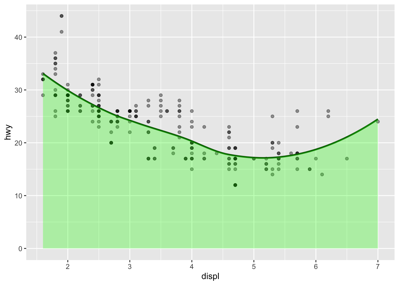
Note that the method = "loess", formula = "y ~ x" arguments to geom_smooth() are the defaults. However, if omitted they trigger a message (\geom_smooth()` using method = ‘loess’ and formula ‘y ~ x’`) that I do not like in my output.
In this second example, the data points are omitted altogether, making the plot focus solely on global trend.
ggplot(mpg, aes(displ, hwy)) +
    geom_smooth(se = FALSE, color = "darkgreen") +
    geom_ribbon(aes(ymin = 10,
                    ymax = predict(loess(hwy ~ displ))),
                alpha = 0.3, fill = 'green') +
    ylim(10, max(mpg$hwy))
## `geom_smooth()` using method = 'loess' and formula = 'y ~ x'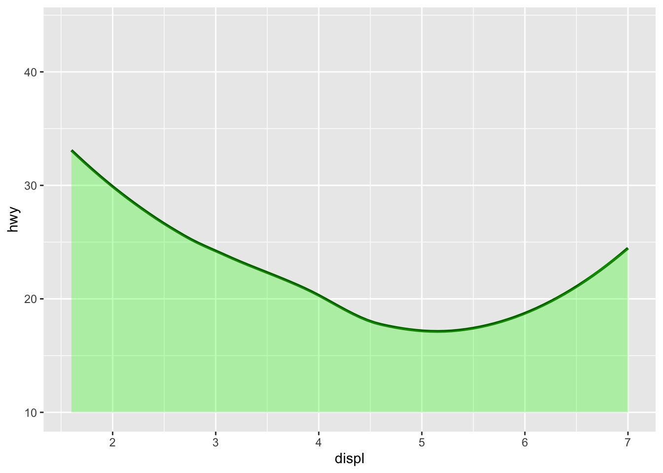
Scatterplot: Points
The geom_point() function is used to create the good old scatterplot of which we have seen several examples already.
Line plots
When points can be logically connected it may be a good idea to use a line to visualize trends, as we have seen in the deaths plot in section Aesthetics.
If you want both lines and points you need to overlay them. In this example I take it a bit further bu adding the dimension ‘activity’ to the points geom only. This is a typical case for geom_line since the measurements of the two beavers were taken sequentially, for that particular beaver.
b1_start <- beaver1[1, "time"] / 60
b2_start <- beaver1[2, "time"] / 60

suppressMessages(library(dplyr))
#uses dplyr (later this course)
beaverA <- beaver1 %>% mutate(time_h = seq(from = b1_start,
                                           to = b1_start + (nrow(beaver1)*10)/60,
                                           length.out = nrow(beaver1)))
beaverB <- beaver2 %>% mutate(time_h = seq(from = b2_start,
                                           to = b2_start + (nrow(beaver2)*10)/60,
                                           length.out = nrow(beaver2)))
beavers_all <- bind_rows(beaverA, beaverB) %>%
    mutate(beaver = c(rep("1", nrow(beaverA)), rep("2", nrow(beaverB))),
           activity = factor(activ, levels = c(0, 1), labels = c("inactive", "active")))

ggplot(data = beavers_all, aes(x = time_h, y = temp)) +
    geom_line(aes(linetype = beaver)) +
    geom_point(aes(color = activity)) +
    xlab("time (h)") +
    ylab(expression('Temperature ('*~degree*C*')'))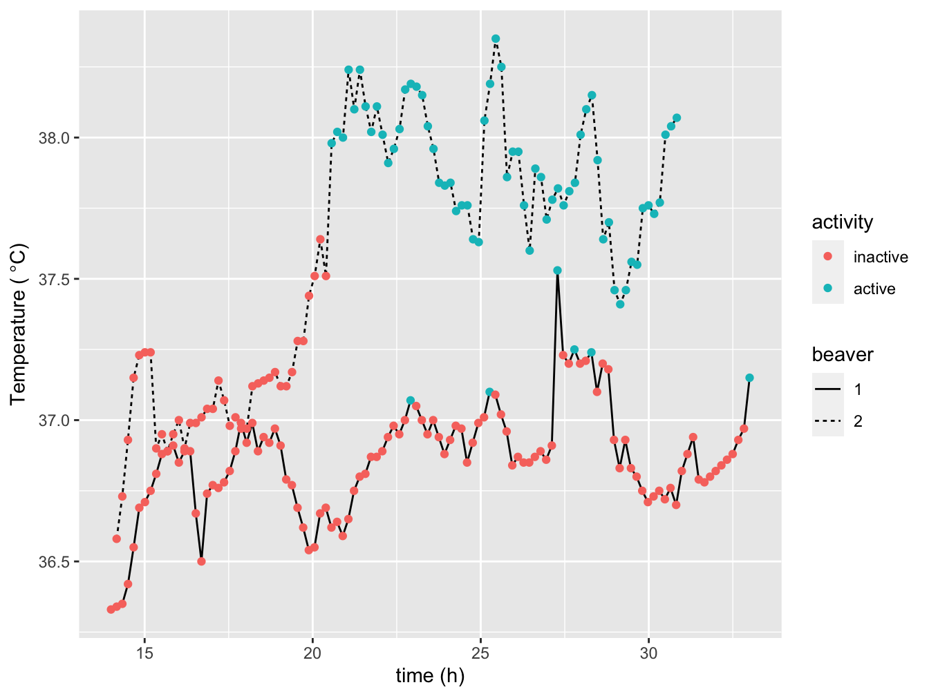
Histograms
A histogram is a means to visualize the distribution of a dataset, as are boxplot (geom_boxplot()), violin plot (geom_violin()) and density plot (geom_freqpoly()).
Here we look at the eruption intervals of the “faithful” geyser. A binwidth argument is used to adjust the number of bins. Alternative use the bins argument.
ggplot(data=faithful, mapping = aes(x = waiting)) +
    geom_histogram(binwidth = 3)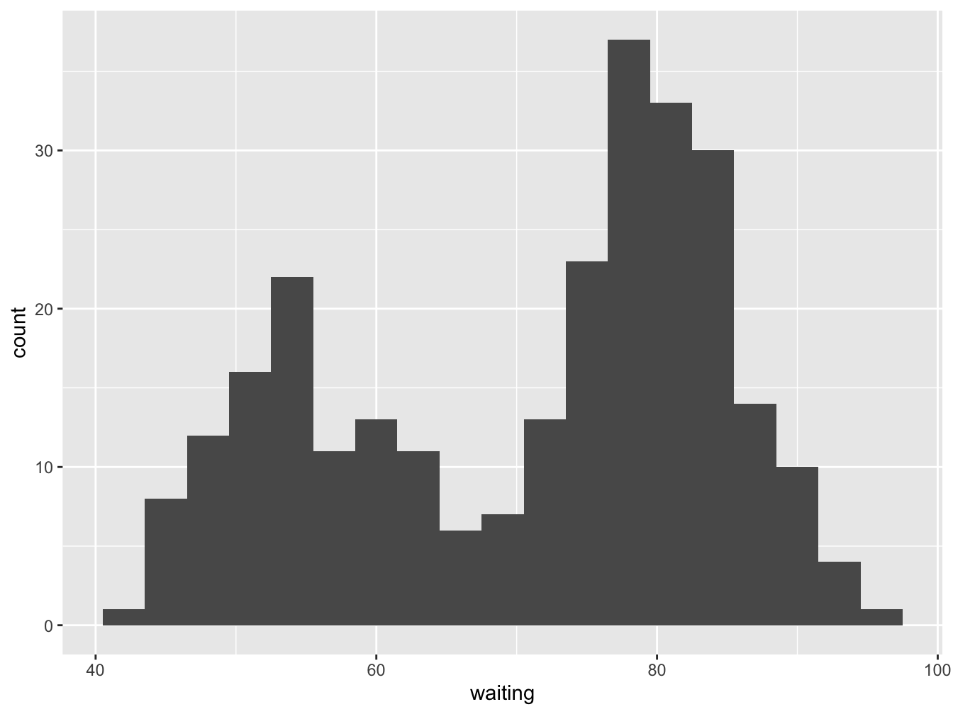
There are some statistics available to adjust what is shown on the y axis. The default that is used by geom_histogram is stat(count), so if you don’t specify anything this will be used. But if you want it scaled to a maximum of 1, use stat(count / max(count)). The stat() function is a flag to ggplot2 that you want to use calculated aesthetics produced by the statistic.You can use any transformation of the statistic, e.g. y = stat(log2(count)).
ggplot(data=faithful, mapping = aes(x = waiting)) +
    geom_histogram(binwidth = 3, aes(y = stat(count / max(count)))) +
    ylab(label = "normalized proportion")
## Warning: `stat(count / max(count))` was deprecated in ggplot2 3.4.0.
## ℹ Please use `after_stat(count / max(count))` instead.
## This warning is displayed once every 8 hours.
## Call `lifecycle::last_lifecycle_warnings()` to see where this warning was generated.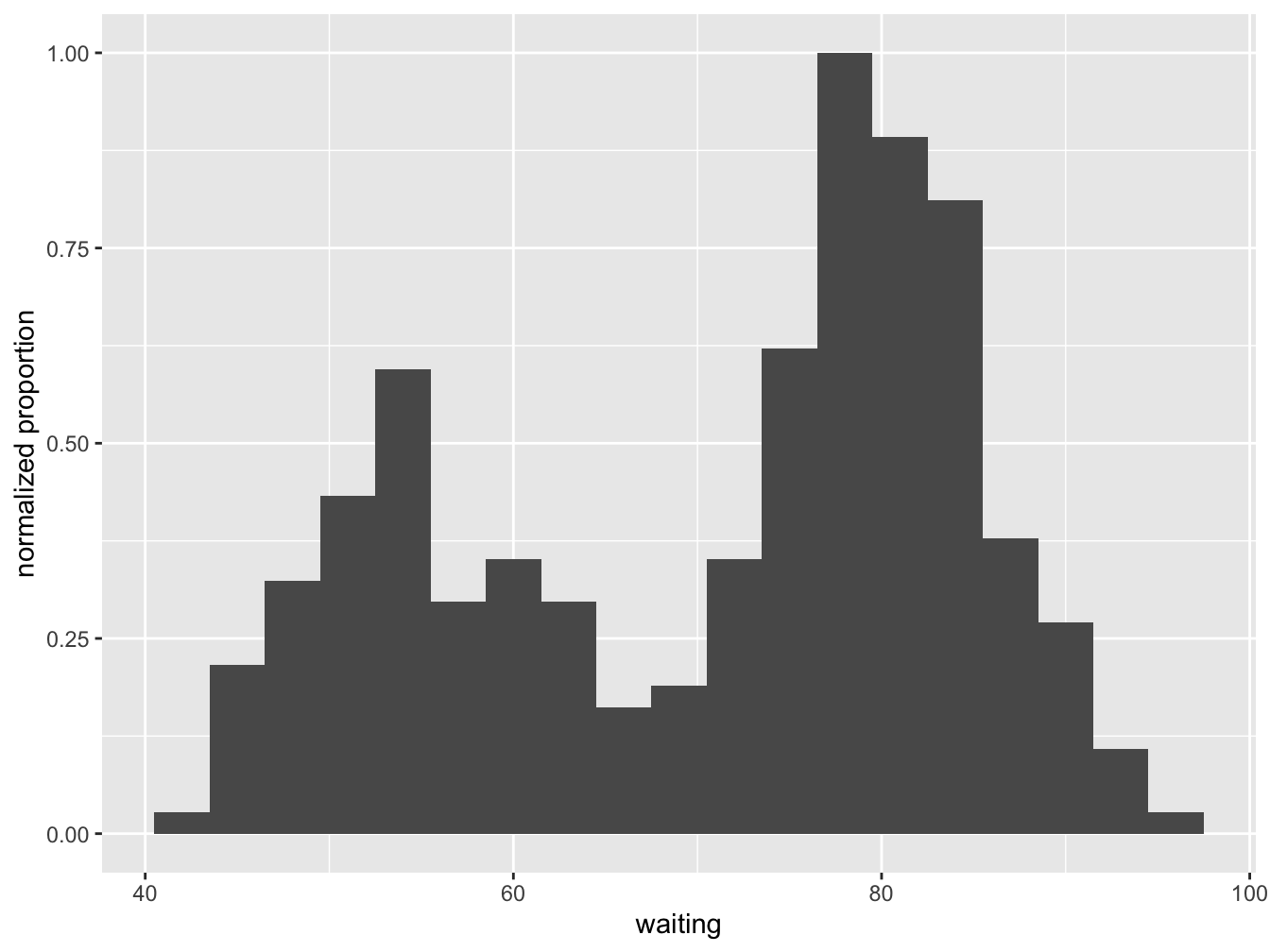
Alternatively, if you want percentages, you can use y = stat(count / sum(count) * 100).
ggplot(data=faithful, mapping = aes(x = waiting)) +
    geom_histogram(binwidth = 3, mapping = aes(y = stat(count / sum(count) * 100))) +
    ylab(label = "%")
Violin plot
A violin plot is a compact display of a continuous distribution. It is a blend of geom_boxplot() and geom_density(): a violin plot is a mirrored density plot displayed in the same way as a boxplot. It is not seen as often as should be. An example best explains.
ggplot(data=airqual, mapping = aes(x = Month, y = Temp, fill = Month)) +
    geom_violin() + theme(legend.position = "none")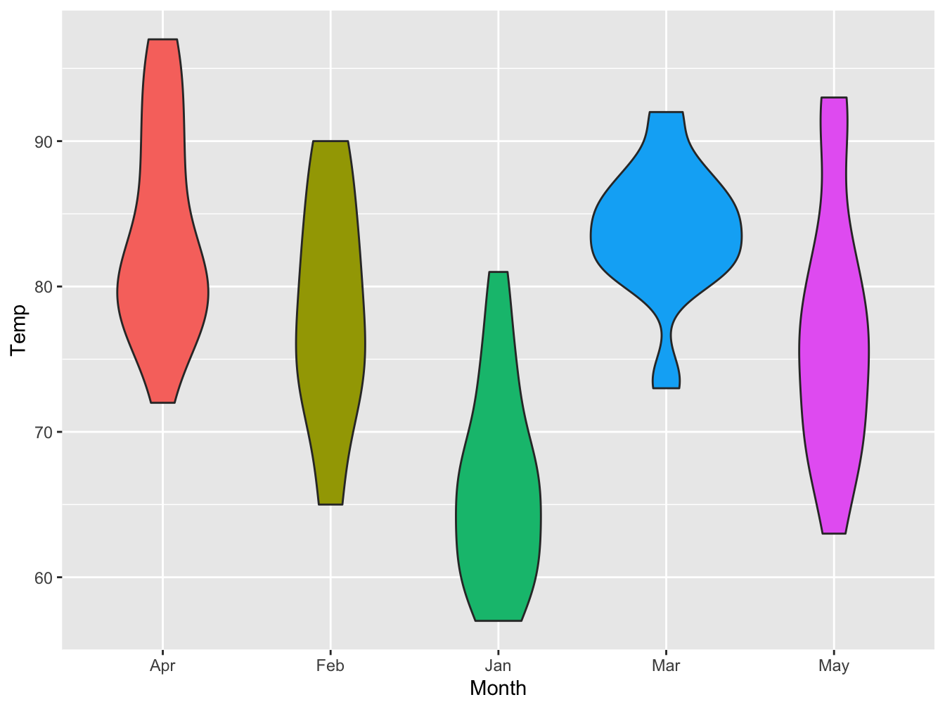
Barplot
The bar plot is similar to a histogram in appearance, but quite different in intent. Where a histogram visualizes the density of a continuous variable, a bar plot tries to visualize the counts (or weights) of distinct groups.
If you don’t provide a weight aesthetic, geom_bar will count all occurrences of the different values in the provided x-axis variable. Here is an example.
ggplot(data = esoph,
       mapping = aes(x = alcgp)) +
    geom_bar(fill = "darkgreen") +
    theme_classic()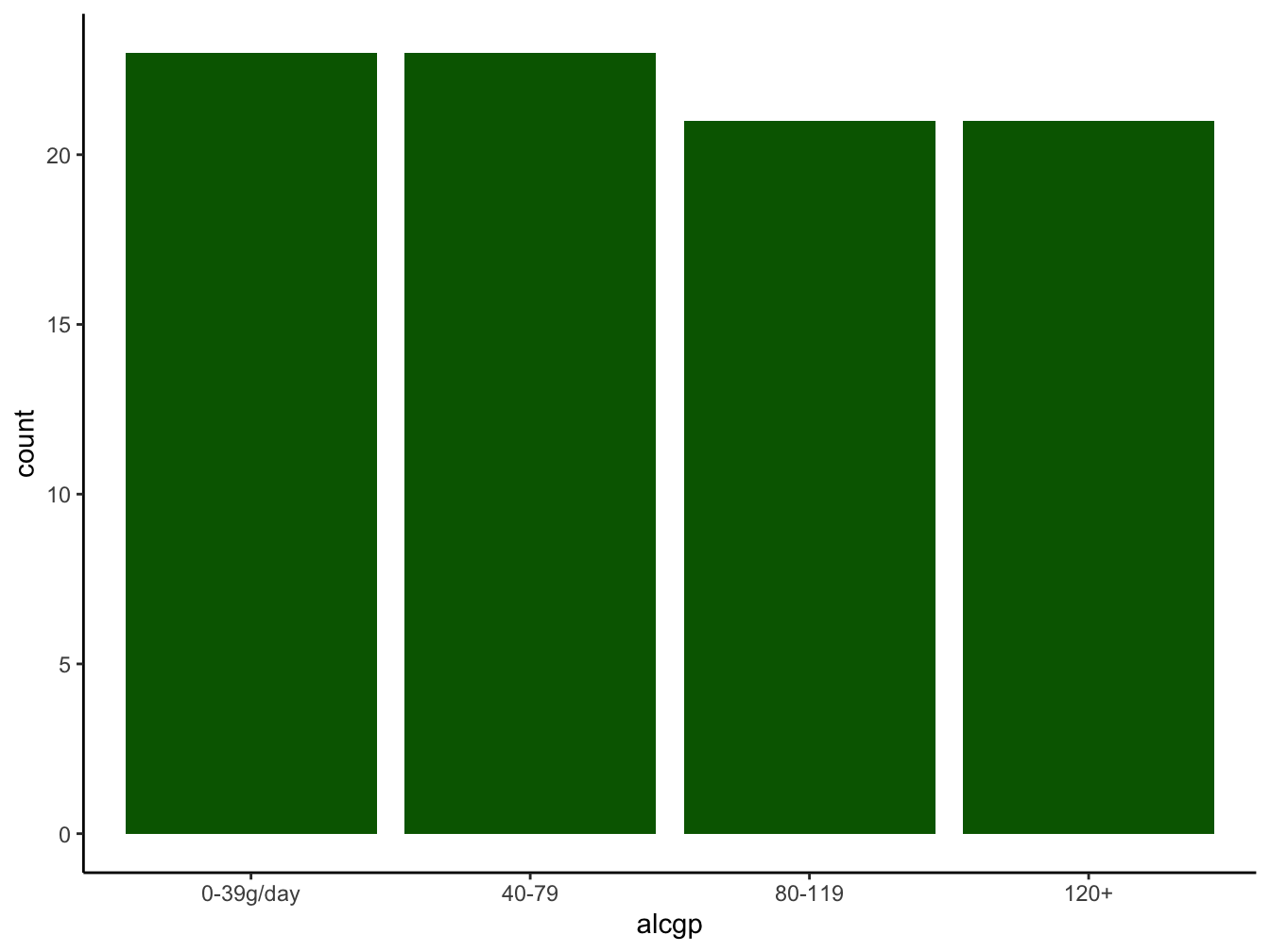
You can provide a weight argument In that case the counts will be replaced by the literal value found in that variable.
Here is a small example where the ten subjects of the sleep dataset have been charted (the x axis), and the extra column provided the height of the bar, split over the two groups. I used the position argument to get side-by-side bars instead of stacked on top of each other.
ggplot(data = sleep, mapping = aes(ID)) +
geom_bar(aes(weight = extra, fill = group),
position = position_dodge(width=0.7),
alpha = 0.6, color = "black") +
scale_fill_manual(values = c("darkblue", "red")) +
labs(x = "student ID", y = "increase in sleep (h)", fill = "Drug") +
theme_classic()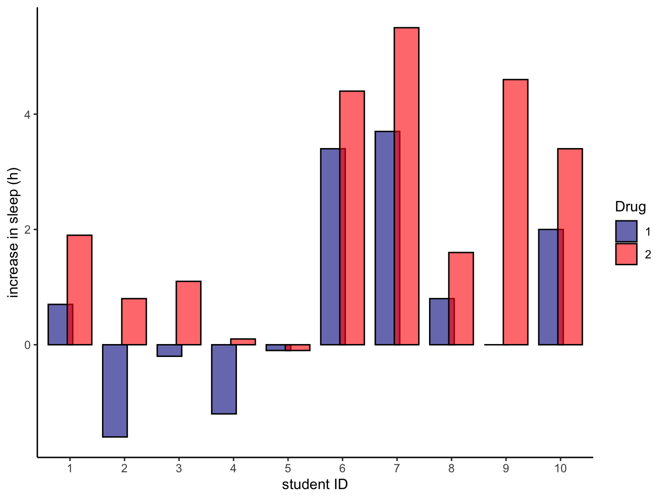 The
The position = argument could have been "dodge" for simple side-by-side plotting of the bars.
Overview of the main geoms
There are many geoms and even more outside the ggplot2 package. Here is a small overview of some of them.
| function. | description |
|---|---|
| geom_abline() | Add reference lines to a plot, either horizontal, vertical, or diagonal |
| geom_bar() | A bar plot makes the height of the bar proportional to the number of cases in each group |
| geom_density() | Computes and draws kernel density estimate, which is a smoothed version of the histogram |
| geom_line() | Connects the observations in order of the variable on the x axis |
| geom_path() | Connects the observations in the order in which they appear in the data |
| geom_qq() | geom_qq and stat_qq produce quantile-quantile plots |
| geom_smooth() | Aids the eye in seeing patterns in the presence of overplotting |
| geom_violin() | A violin plot is a compact display of a continuous distribution. It is a blend of geom_boxplot() and geom_density() |
If you want to know them all, simply type ?geom_ and select the one that looks like the thing you want, or go to the tidyverse ggplot2 reference page.
5.5 Faceting
Faceting is the process of splitting into multiple plots with exactly the same coordinate system where each plot show a subset of the data. It can be applied to any geom. The figure above could be improved slightly with this technique.
ggplot(data = airqual, mapping = aes(x = Solar.R, y = Ozone)) +
    geom_smooth(aes(linetype = Month), method = "lm", formula = y ~ x) +
    geom_point(aes(color = Month), alpha = 0.7) +
    facet_wrap(. ~ Month)