12 Package ggplot2 revisited
This chapter deals with more advanced aspects of plotting with ggplot.
12.1 Dedicated plots
12.1.1 Binning geoms for too many points
Sometimes there are simply too many data points for a scatter plot to be intelligible, even with minimum point size and maximum transparency. In that case you will need to do some binning of the points, a form of data reduction.
For instance, this will not work:
size <- 10000
sim_data <- tibble(x = rnorm(size, 100, 10),
                   y = x + rnorm(x, mean = 5, 5))
ggplot(data = sim_data, mapping = aes(x, y)) +
    geom_point() +
    theme_classic()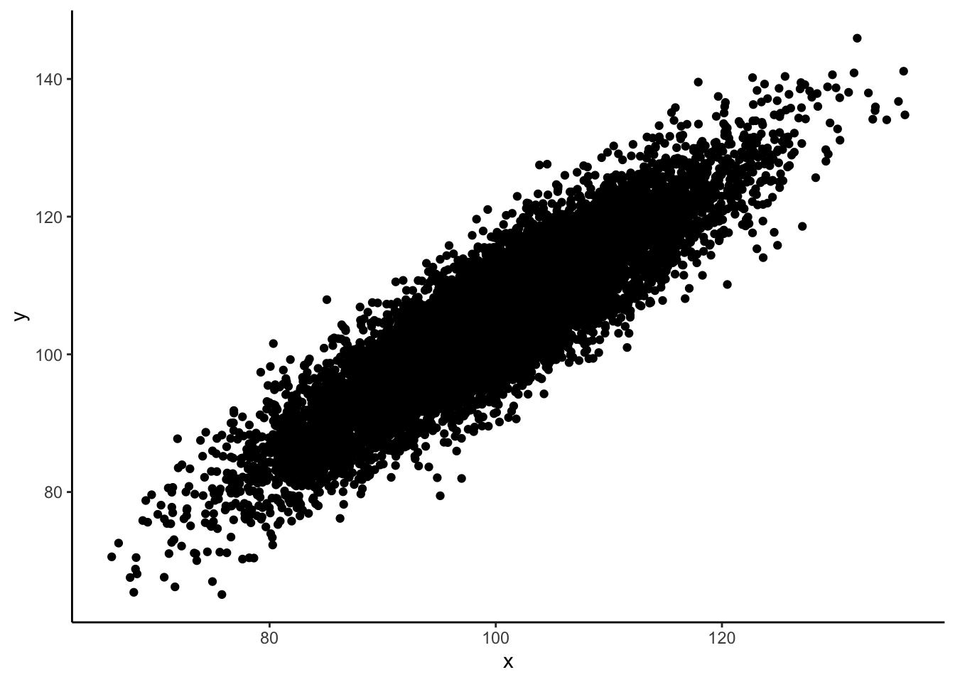
In such cases some binning comes in handy. There are several available:
-
geom_hex(): hexagonal heatmap -
geom_bin_2d(): rectangular heatmap -
geom_density_2d()andgeom_density_2d_filled(): two-dimensional density
Here is a geom_hex() example with a custom color scale:
ggplot(data = sim_data, mapping = aes(x, y)) +
    geom_hex() +
    scale_fill_gradient(low = "white", high = "red") +
    theme_classic()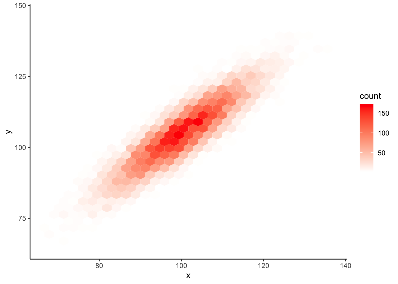
12.1.2 Multiple y-axis values for a single x-axis value
When you have multiple measurements for a single x-axis point there are already several options available to you:
Since this is growth data I caried out a log2-transformation on the weight variable
- geom_line(): Multiple lines; these tend to get cluttered really quick
ggplot(data = ChickWeight,
mapping = aes(x = Time, y = weight, color = Diet)) +
geom_line(aes(group=Chick)) +
scale_y_log10() +
theme_classic()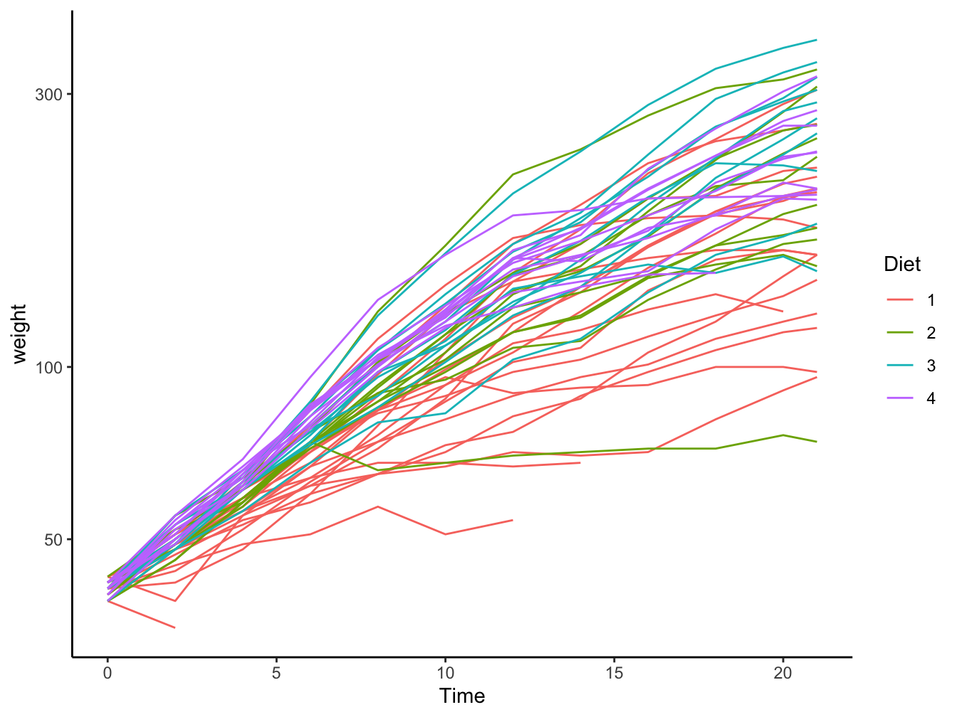 -
- geom_point() or geom_jitter(): Tend to lead away from observing patterns
ggplot(data = ChickWeight,
       mapping = aes(x = Time, y = weight, color = Diet)) +
    geom_point() +
    scale_y_log10() +
    theme_classic()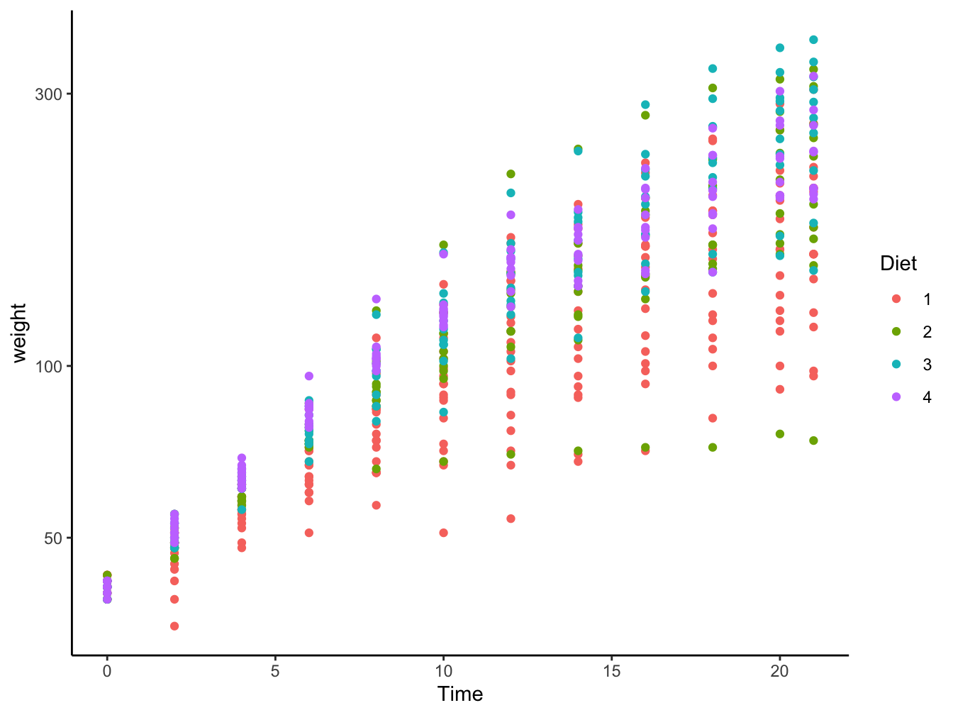
-
geom_boxplot(): Multiple boxplots are already better but also get cluttered.
ggplot(data = ChickWeight,
mapping = aes(x = factor(Time), y = weight, fill = Diet)) +
geom_boxplot() +
scale_y_log10() +
theme_classic()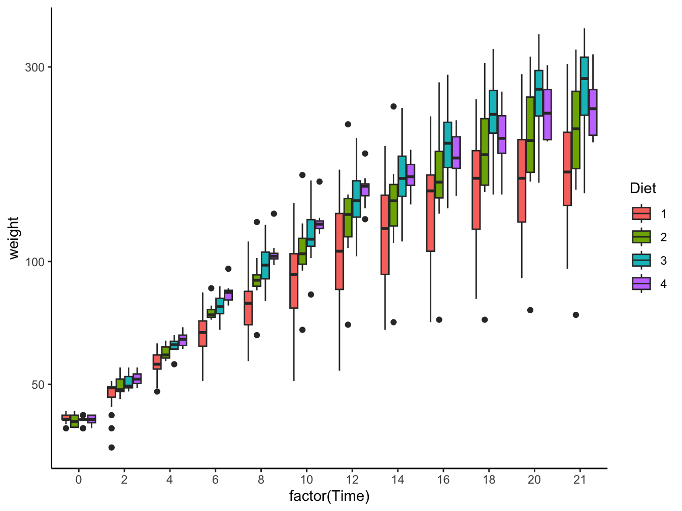 -
- geom_violin(): Multiple violin plots; only when sufficient data are present
ggplot(data = ChickWeight,
       mapping = aes(x = factor(Time), y = weight, fill = Diet)) +
    geom_violin() +
    scale_y_log10() +
    theme_classic()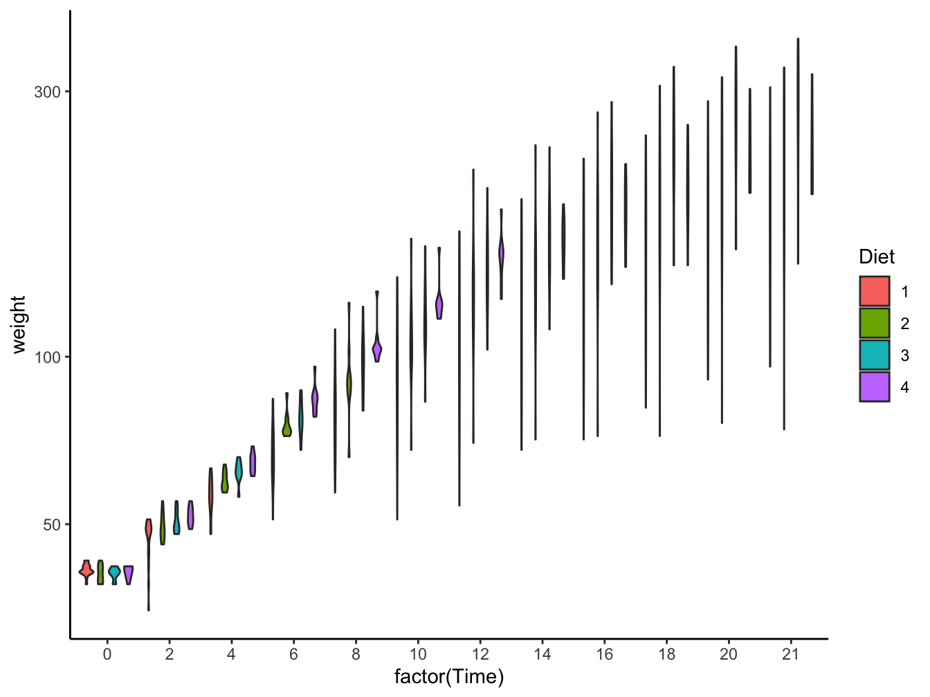
-
geom_errorbar()and related (geom_linerange(),geom_crossbar()andgeom_pointrange()): Sometimes the best solution for more focus on the data patterns. Here, I added some shift on the x-axis (Time) in order to prevent the points and error bars to overlap.
ChickWeight %>%
    group_by(Diet, Time) %>%
    summarize(mean = mean(weight),
              min = min(weight),
              max = max(weight),
              .groups = "drop") %>%
    mutate(Time = Time + 0.20 * as.numeric(Diet)) %>% # shift to prevent overlap
    ggplot(mapping = aes(x = Time, y = mean, color = Diet)) +
        geom_point(size = 2) +
        geom_errorbar(aes(ymin = min, ymax = max), width = 0.2, linewidth = 0.3) +
        scale_y_log10() +
        theme_classic()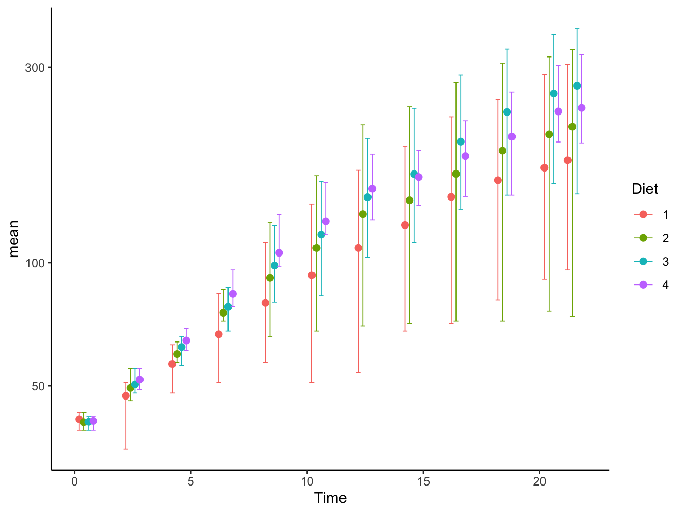
12.1.3 Multivariate Categorical Data
Visualizing multivariate categorical data requires another approach. Scatter- and line plots and histograms are all unsuitable for factor data. Here are some plotting examples that work well for categorical data. Copied and adapted from STHDA site.
The first example deals with the builtin dataset HairEyeColor. It is a contingency table and a table object so it must be converted into a dataframe before use.
hair_eye_col_df <- as.data.frame(HairEyeColor)
head(hair_eye_col_df)
## Hair Eye Sex Freq
## 1 Black Brown Male 32
## 2 Brown Brown Male 53
## 3 Red Brown Male 10
## 4 Blond Brown Male 3
## 5 Black Blue Male 11
## 6 Brown Blue Male 50Bar plots of contingency tables
ggplot(hair_eye_col_df, aes(x = Hair, y = Freq)) +
    geom_bar(aes(fill = Eye),
           stat = "identity",
           color = "white",
           position = position_dodge(0.7)) + #causes overlapping bars
facet_wrap(~ Sex) 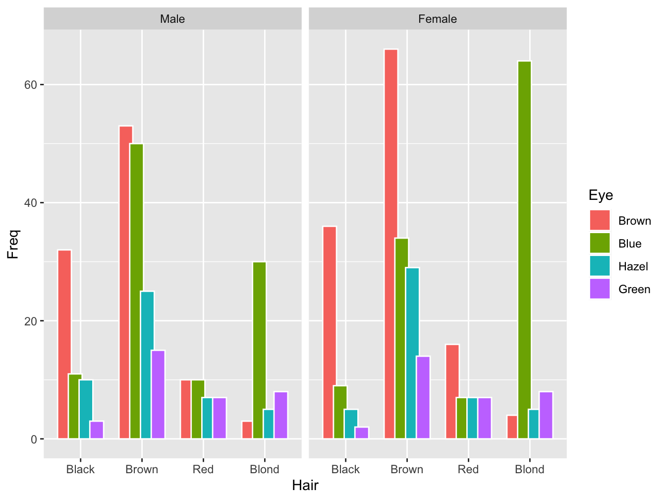
Balloon plot
Here is a dataset called housetasks that contains data on who does what tasks within the household.
(housetasks <- read.delim(
  system.file("demo-data/housetasks.txt", package = "ggpubr"),
  row.names = 1))
## Wife Alternating Husband Jointly
## Laundry 156 14 2 4
## Main_meal 124 20 5 4
## Dinner 77 11 7 13
## Breakfeast 82 36 15 7
## Tidying 53 11 1 57
## Dishes 32 24 4 53
## Shopping 33 23 9 55
## Official 12 46 23 15
## Driving 10 51 75 3
## Finances 13 13 21 66
## Insurance 8 1 53 77
## Repairs 0 3 160 2
## Holidays 0 1 6 153A balloon plot is an excellent way to visualize this kind of data. The function ggballoonplot() is part of the ggpubr package (“‘ggplot2’ Based Publication Ready Plots”). Have a look at this page for a nice review of its possibilities.
ggpubr::ggballoonplot(housetasks, fill = "value")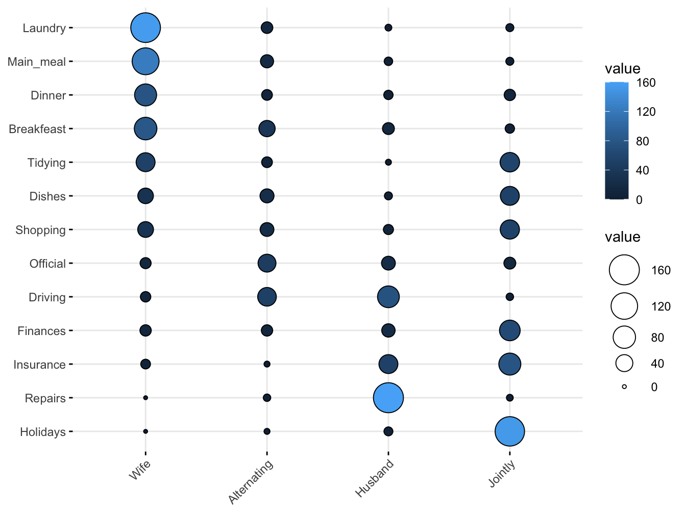
As you can see the counts map to both size and color. Balloon plots can also be faceted.
ggpubr::ggballoonplot(hair_eye_col_df, x = "Hair", y = "Eye", size = "Freq",
              fill = "Freq", facet.by = "Sex",
              ggtheme = theme_bw()) +
  scale_fill_viridis_c(option = "C")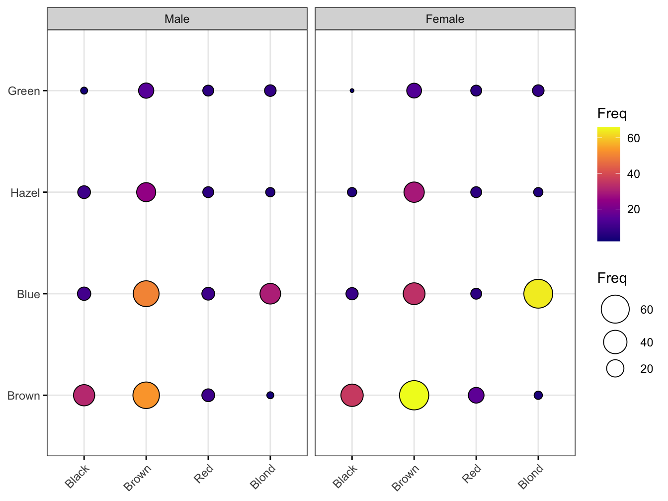
12.1.4 The corrplot::corrplot() function
R package corrplot provides a visualization interface to correlation matrices. It has many parameters. Here is a simple example with the airquality dataset
## corrplot 0.92 loaded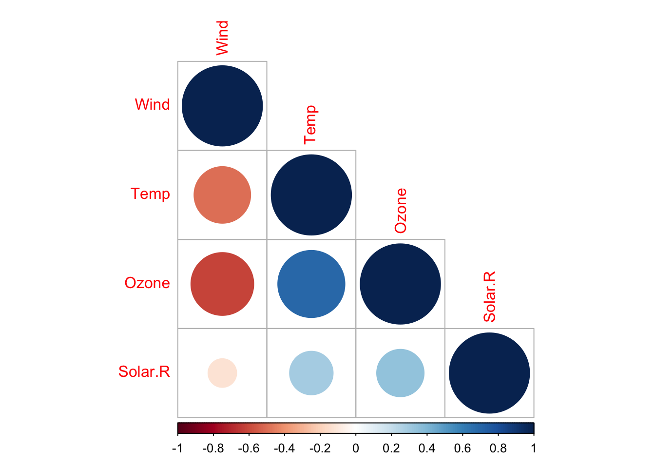
Look at the docs for more details.
12.1.5 The GGally::ggPairs() function
The ggpairs() function of the GGally package allows you to build a scatterplot matrix just like the base R pairs() function.
Scatterplots of each pair of numeric variable are drawn on the left part of the figure. Pearson correlation is displayed on the right. Variable distribution is available on the diagonal.
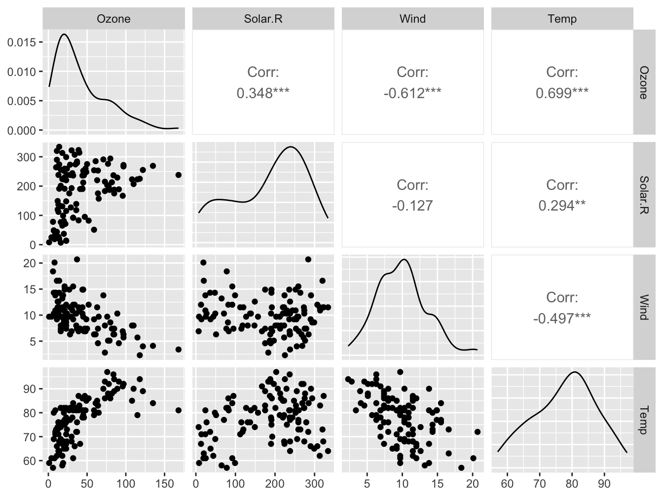
Look at https://www.r-graph-gallery.com/199-correlation-matrix-with-ggally.html for more examples.
12.1.6 Marginal plots using ggExtra::ggMarginal()
You can use ggMarginal() to add marginal distributions to the X and Y axis of a ggplot2 scatterplot.
It can be done using histogram, boxplot or density plot using the ggExtra package
library(ggExtra)
airquality <- airquality %>%
    mutate(Month_f = factor(month.abb[Month]))

# base plot
p <- ggplot(airquality, aes(x=Temp, y=Ozone, color=Month_f)) +
      geom_point() +
      theme(legend.position="none")

p1 <- ggMarginal(p, type="histogram")
p2 <- ggMarginal(p, type="density")
p3 <- ggMarginal(p, type="boxplot")

gridExtra::grid.arrange(p1, p2, p3, nrow = 1)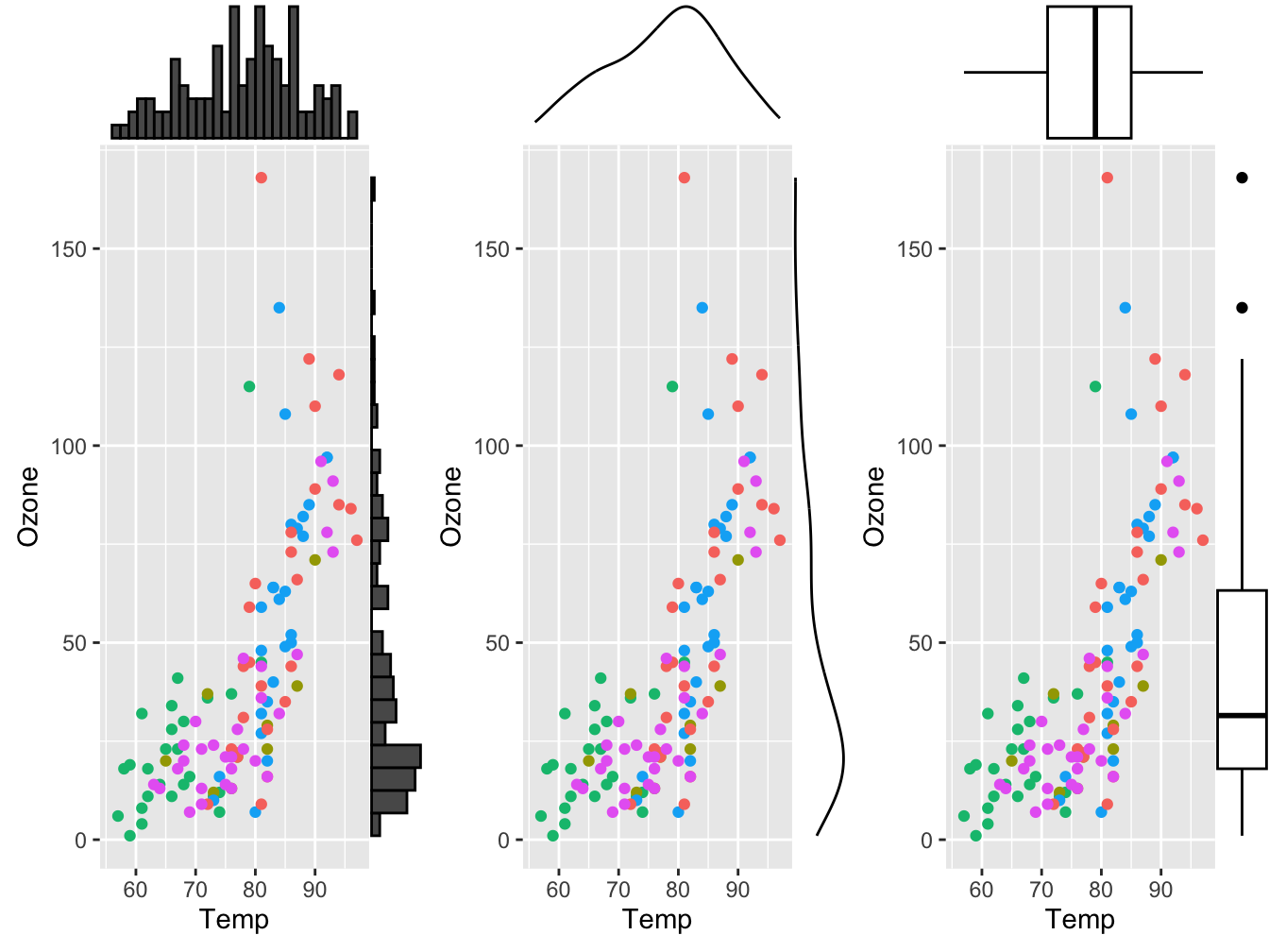
See https://www.r-graph-gallery.com/277-marginal-histogram-for-ggplot2.html for more details.
12.2 Advanced plotting aspects
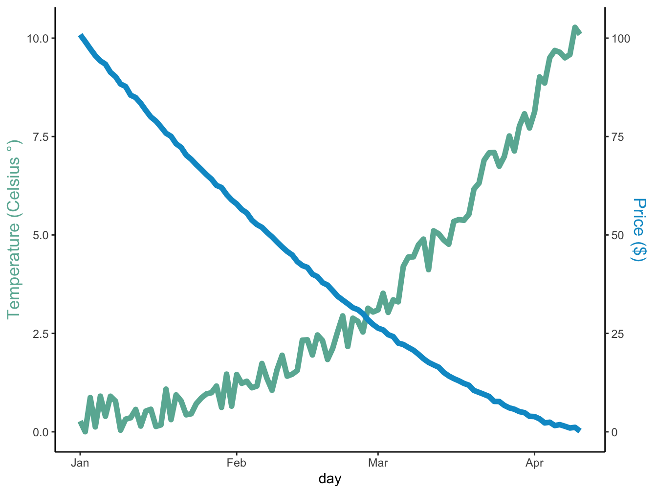
12.2.1 Secondary y-axis
Adding a second y-axis series is surprisingle non-intuitive in ggplot. Here is a minimal example I found on the R Graph Gallery:
# Build dummy data
data <- data.frame(
  day = as.Date("2023-01-01") + 0:99,
  temperature = runif(100) + seq(1,100)^2.5 / 10000,
  price = runif(100) + seq(100,1)^1.5 / 10
)

# Value used to transform the data of the second axis
coeff <- 10

temp_color <- "#69b3a2"
price_color <- "deepskyblue3"
ggplot(data = data, mapping = aes(x=day)) +
  geom_line(mapping = aes(y = temperature), linewidth = 2, color = temp_color) +
  geom_line(mapping = aes(y=price / coeff), linewidth = 2, color = price_color) +
  scale_y_continuous(
    # Features of the first axis
    name = "Temperature (Celsius °)",
    # Add a second axis and specify its features
    sec.axis = sec_axis(~ . * coeff, name = "Price ($)")
  ) +
  theme_classic() +
  theme(
    axis.title.y = element_text(color = temp_color, size=13),
    axis.title.y.right = element_text(color = price_color, size=13)
  )
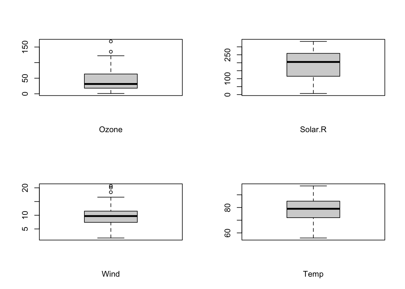
12.2.2 Plot panels from for loops using gridExtra::grid.arrange()
Sometimes you may wish to create a panel of plots using a for loop, similarly to the use of par(mfrow = c(rows, cols)) in base R. There are a few caveats to this seemingly simple notion.
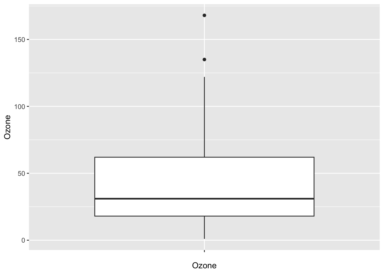
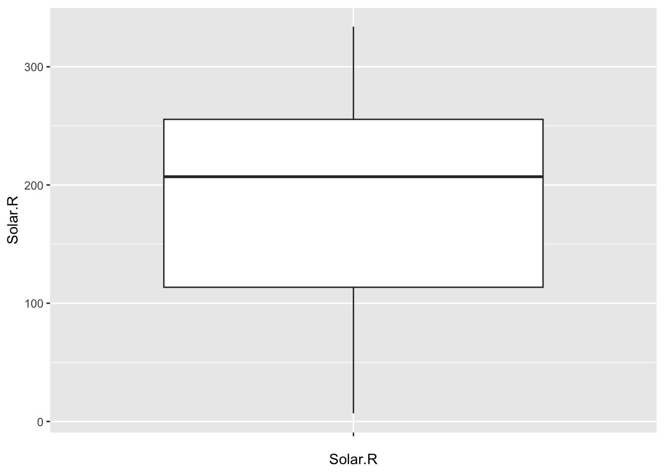
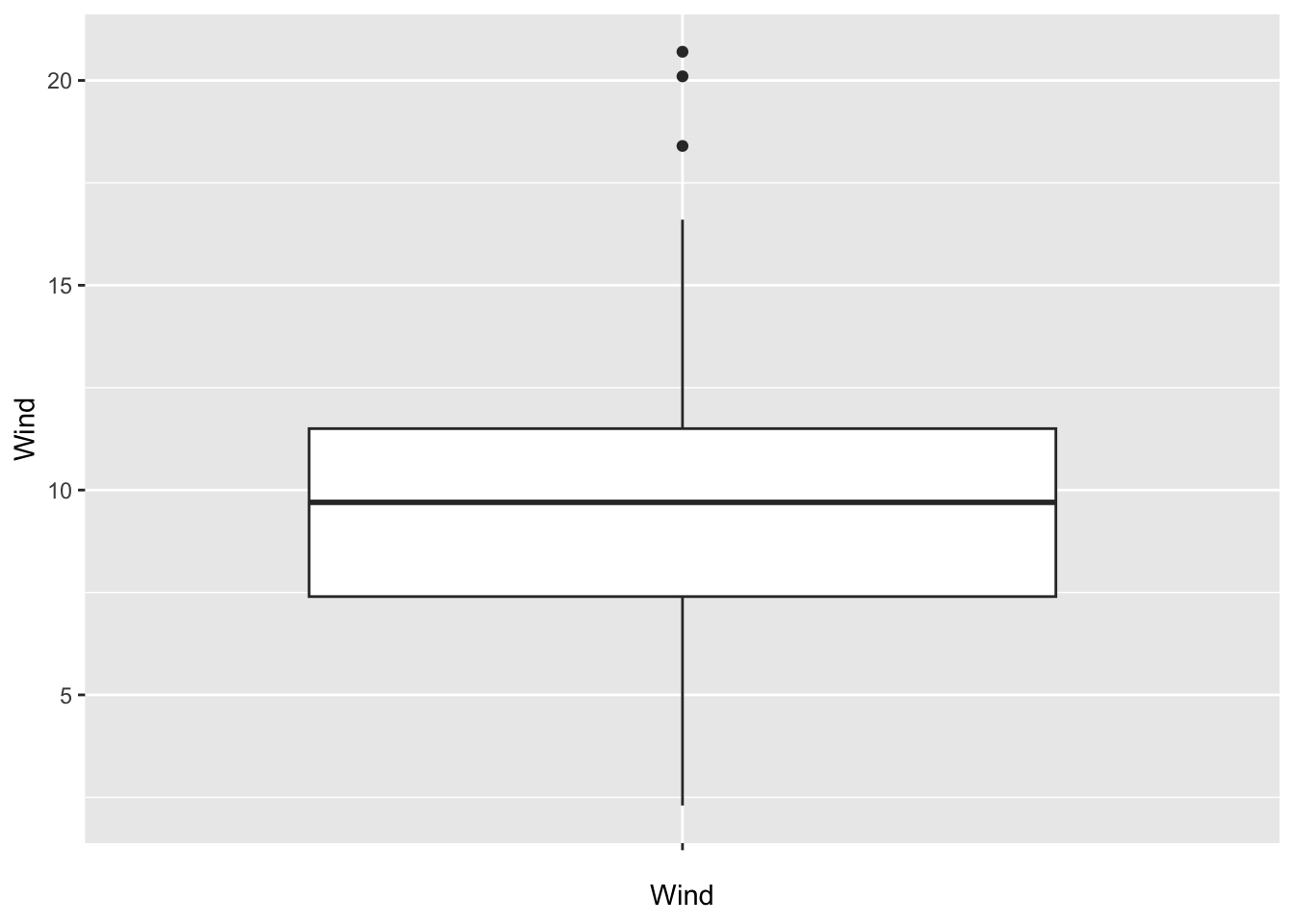
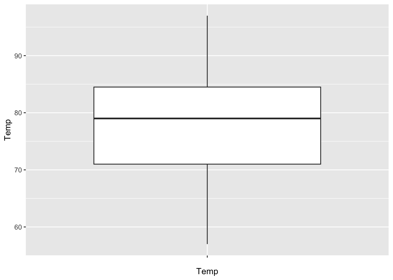
For instance, to create a set of boxplots for a few columns of the airquality dataset, you would do something like this in base R:
# set the number of rows and columns
par(mfrow = c(2, 2))

# iterate the column names
for (n in names(airquality[, 1:4])) {
    boxplot(airquality[, n],
            xlab = n)
}
When you naively migrate this structure to a ggplot setting, it will become something like this.
par(mfrow = c(2, 2))

for (n in names(airquality[, 1:4])) {
    plt <- ggplot(data = airquality,
                  mapping = aes(y = n)) +
        geom_boxplot() +
        xlab(n)
    print(plt)
}
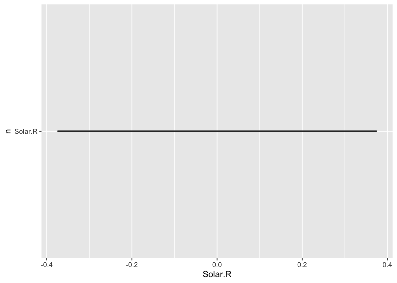
This is surely not the plot you would have expected: a single straight line, and no panel of plots. It turns out you can not use variables as selectors in aes().
Until recently, you needed to use aes_string() for that purpose; see below (not evaluated):
par(mfrow = c(2, 2))

for (name in names(airquality[, 1:4])) {
    plt <- ggplot(data = na.omit(airquality),
                  mapping = aes_string(x = factor(""), y = name)) +
        geom_boxplot() +
        xlab(NULL) +
        xlab(name)
    print(plt)
}

par(mfrow = c(1, 1))
However, since ggplot2 version 3.0.0. you need to use a different technique.
You can do it using the !! operator on the variable after call to sym(). This will unquote and evaluate variable in the surrounding environment.
Here is a recent version.
par(mfrow = c(2, 2))

for (name in names(airquality[, 1:4])) {
    plt <- ggplot(data = na.omit(airquality),
                  mapping = aes(x = factor(""), y = !!sym(name))) +
        geom_boxplot() +
        xlab(NULL) +
        xlab(name)
    print(plt)
}
Also note that if you omit the print(plt) call this outputs nothing, which is really quite confusing. You need to explicitely print the plot, not implicitly as you normally can.
This works as required except for the panel-of-plots part. The mfrow option to par() does not work with ggplot2. This can be fixed through the use of the gridExtra package.
library(gridExtra)

# a list to store the plots
my_plots <- list()

#use of indices instead of names is important!
for (i in 1:4) {
    n <- names(airquality)[i]
    plt <- ggplot(data = airquality_no_na,
                  mapping = aes(y = !!sym(n))) +
        geom_boxplot() +
        xlab(n)
    my_plots[[i]] <- plt   # has to be integer, not name!
}
grid.arrange(grobs = my_plots, nrow = 2)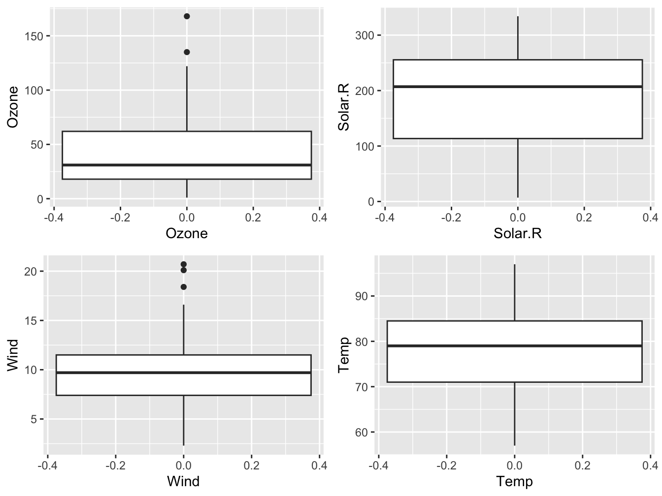
#OR: use do.call() to process the list in grid.arrange
#do.call(grid.arrange, c(my_plots, nrow = 2))
So the rules for usage of a for-loop to create a panel of plots:
- use
aes_string()to specify your columns - store the plots in a list
- use
grid.arrange()to create the panel, wrapped in thedo.call()function.
12.2.3 Plot adjustments
This section describes aspects that fall outside the standard realm of plot construction.
Scales, Coordinates and Annotations
Scales and Coordinates are used to adjust the way your data is mapped and displayed. Here, a log10 scale is applied to the y axis using scale_y_log10() and the x axis is reversed (from high to low values instead of low to high) using scale_x_reverse().
ggplot(data = cars, mapping = aes(x = speed, y = dist)) +
    geom_point() +
    scale_y_log10() +
scale_x_reverse() 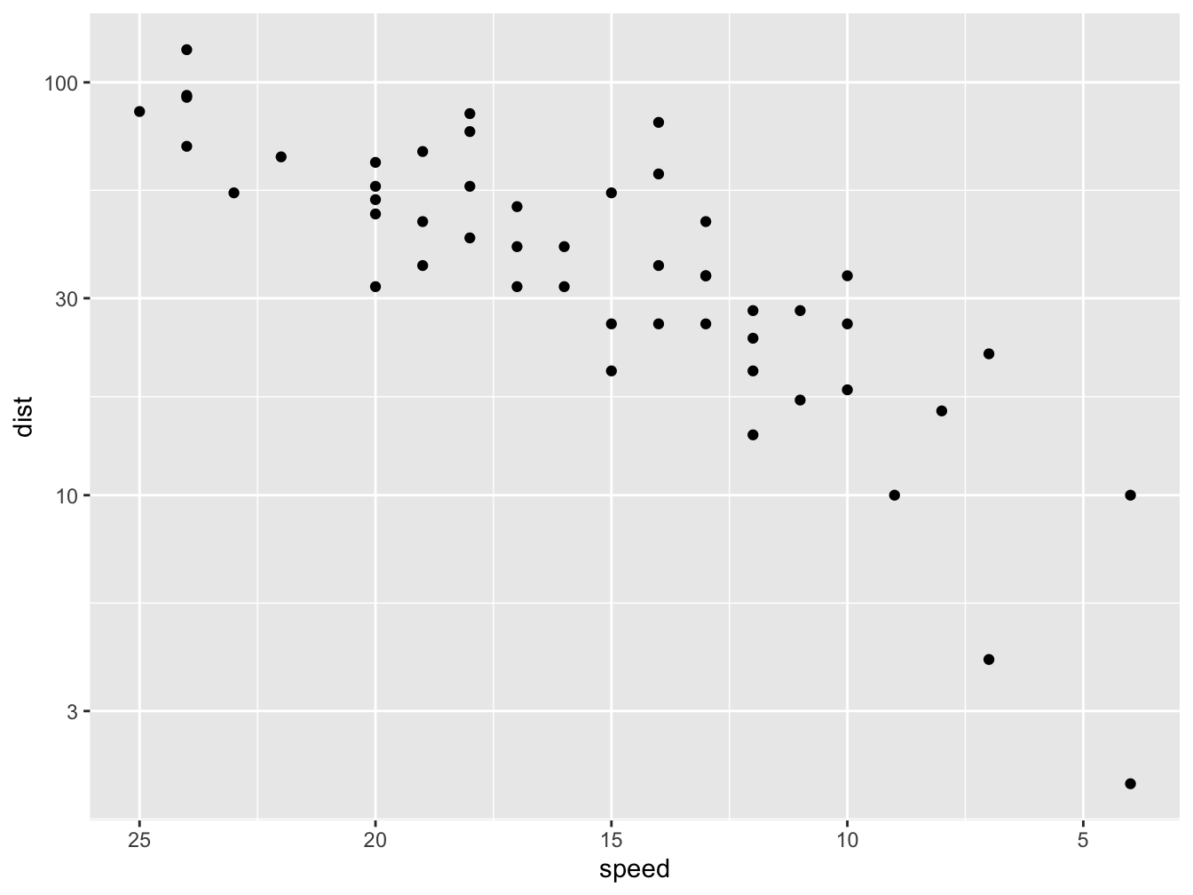
In other contexts, such as geographic information analysis, the scale is extremely important.
The default coordinate system in ggplot2 is coord_cartesian(). In the plot below, a different coordinate system is used.
# function to compute standard error of mean
se <- function(x) sqrt(var(x)/length(x))

DF <- data.frame(variable = as.factor(1:10), value = log2(2:11))

ggplot(DF, aes(variable, value, fill = variable)) +
    geom_bar(width = 1, stat = "identity", color = "white") +
    geom_errorbar(aes(ymin = value - se(value),
                      ymax = value + se(value),
                      color = variable),
                      width = .2) +
    scale_y_continuous(breaks = 0:nlevels(DF$variable)) +
coord_polar() 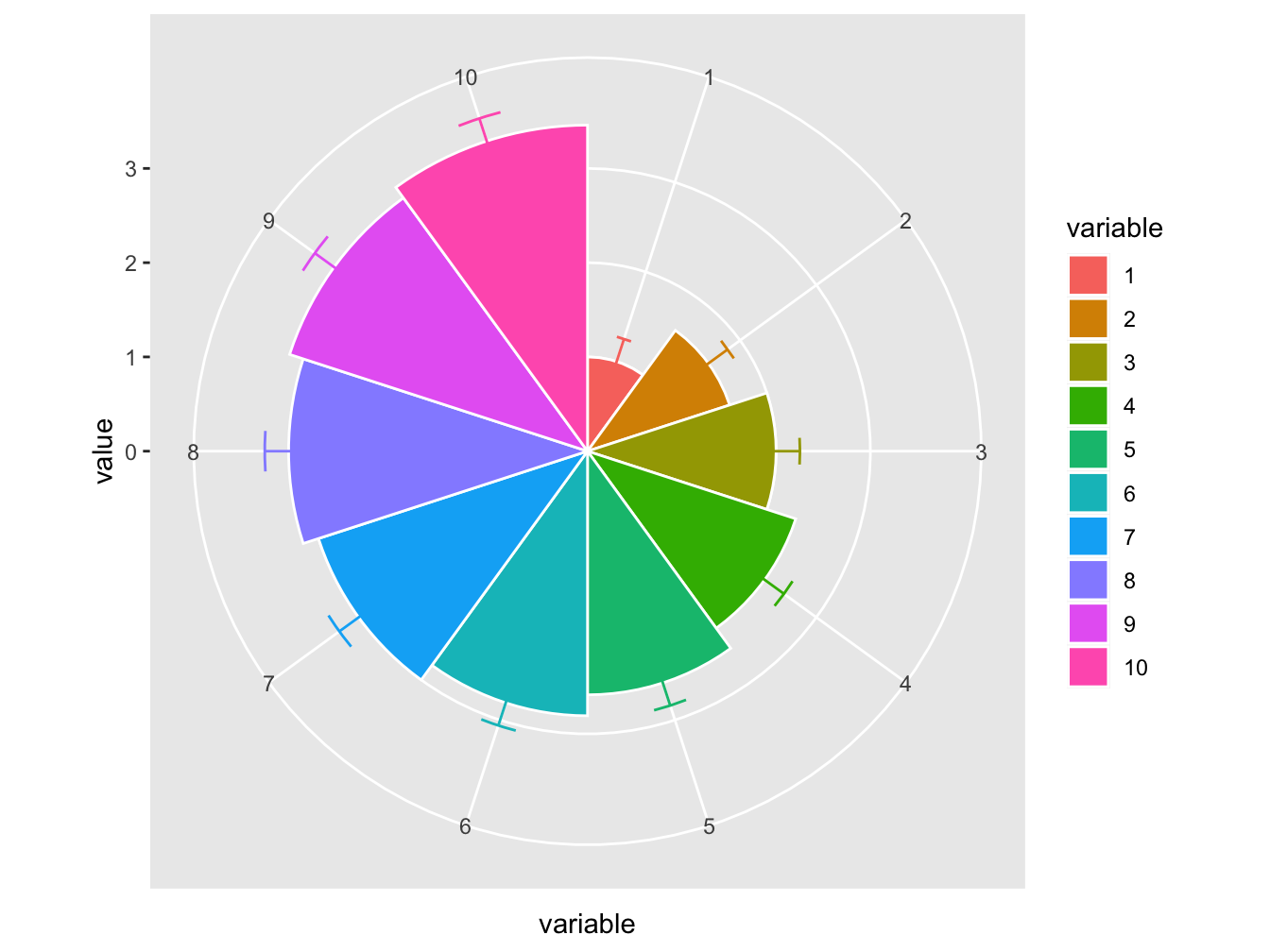
Themes
The theme is used to make changes to the overall appearance of the plot. Two approaches exist. The simplest one is selecting a specific theme and make some minor adjustments at most. Here are is the minimal theme where the text sizes have been modified somewhat.
ggplot(data = airquality, mapping=aes(x=Temp, y=Ozone)) +
  geom_point(mapping = aes(color = Month_f)) +
  geom_smooth(method = "loess", formula = y ~ x) +
  xlab(expression("Temperature " (degree~F))) +
  ylab("Ozone (ppb)") +
  labs(color = "Month") +
  theme_minimal(base_size = 14)
## Warning: Removed 37 rows containing non-finite values (`stat_smooth()`).## Warning: Removed 37 rows containing missing values (`geom_point()`).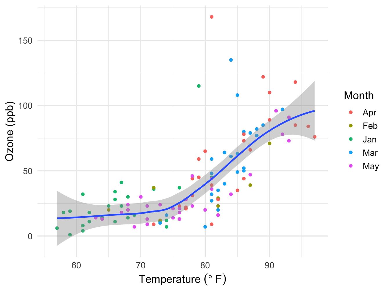
Note that if the color = Month_f aesthetic would have been put in the main ggplot call, the smoother would have been split over the Month groups.
Alternatively, the theme can be specified completely, as show below.
ggplot(data = na.omit(airquality), mapping = aes(x = Temp, y = Ozone)) +
  geom_point(mapping = aes(color = Month_f)) +
  geom_smooth(method = "loess") +
  xlab("Temperature (F)") +
  ylab("Ozone (ppb)") +
  labs(color = "Month") +
  theme(axis.text.x = element_text(size = 12, colour = "blue", face = "bold"),
        axis.text.y = element_text(size = 12, colour = "red", face = "bold"),
        axis.title.x = element_text(size = 16, colour = "blue", face = "bold.italic"),
        axis.title.y = element_text(size = 14, colour = "red", face = "bold.italic"),
        axis.line = element_line(colour = "darkblue", size = 1, linetype = "solid"),
        panel.background = element_rect(fill = "lightblue", size = 0.5, linetype = "solid"),
        panel.grid.minor = element_blank())
## Warning: The `size` argument of `element_line()` is deprecated as of ggplot2 3.4.0.
## ℹ Please use the `linewidth` argument instead.
## This warning is displayed once every 8 hours.
## Call `lifecycle::last_lifecycle_warnings()` to see where this warning was generated.## Warning: The `size` argument of `element_rect()` is deprecated as of ggplot2 3.4.0.
## ℹ Please use the `linewidth` argument instead.
## This warning is displayed once every 8 hours.
## Call `lifecycle::last_lifecycle_warnings()` to see where this warning was generated.## `geom_smooth()` using formula = 'y ~ x'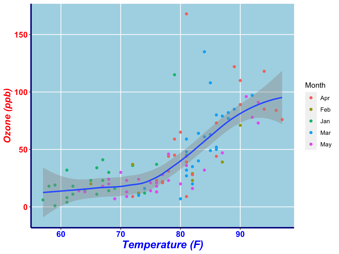
As you can see, there are element_text(), element_line() and element_rect() functions to specify these types of plot elements. The element_blank() function can be used in various theme aspects to prevent it from being displayed.
Adjust or set global theme
You can specify within your document or R session that a certain theme should be used throughout. You can do this by using the theme_set(), theme_update() and theme_replace() functions, or with the esoteric %+replace% operator. Type ?theme_set to find out more.
Annotation
A final layer that can be added one containing annotations. Annotations are elements that are added manually to the plot. This can be a text label, a fictitious data point, a shaded box or an arrow indicating a region of interest.
In the annotate() method, you specify the geom you wish to add (e.g. “text”, “point”)
The panel below demonstrates a few.
(outlier <- airquality[!is.na(airquality$Ozone) & airquality$Ozone > 150, ])## Ozone Solar.R Wind Temp Month Day bar Temp_factor Month_f
## 117 168 238 3.4 81 August 25 1 high Apr
ggplot(data = na.omit(airquality), mapping = aes(x = Temp, y = Ozone)) +
  annotate("rect", xmin = 72, xmax = 77, ymin = 0, ymax = 50,
           alpha = 0.1, color = "blue", fill = "blue") +
  annotate("point", x = outlier$Temp, y = outlier$Ozone,
           color = "darkred", size = 4, alpha = 0.3) +
  geom_point(mapping = aes(color = Month_f)) +
  geom_smooth(method = "loess", formula = y ~ x) +
  xlab("Temperature (F)") +
  ylab("Ozone (ppb)") +
  annotate("text", x = outlier$Temp, y = outlier$Ozone -5, label = "Outlier") +
  annotate("segment", x = outlier$Temp + 5, xend = outlier$Temp + 1,
           y = outlier$Ozone + 4, yend = outlier$Ozone,
           color = "darkred", size = 2, arrow = arrow())
## Warning: Using `size` aesthetic for lines was deprecated in ggplot2 3.4.0.
## ℹ Please use `linewidth` instead.
## This warning is displayed once every 8 hours.
## Call `lifecycle::last_lifecycle_warnings()` to see where this warning was generated.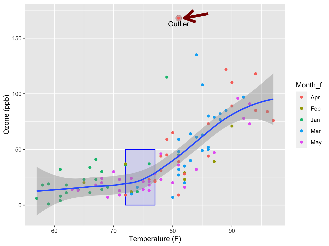
Note there is a geom_rectangle() as well, but as I have discovered after much sorrow, it behaves quite unexpectedly when using the alpha = argument on its fill color. For annotation purposes you should always use the annotate() function.
12.3 Developing a custom visualization
12.3.1 An experimental PTSD treatment
This chapter shows the iterative process of building a visualization where both the audience and the data story are taken into consideration.
The story revolves around data that was collected in a research effort investigating the effect of some treatment of subjects with PTSD (Post-traumatic stress disorder). Only one variable of that dataset is shown here, a stress score.
Since the group size was very low, and there was no control group, statistical analysis was not really feasible.
But the question was: is there an indication of positive effect and a reason to continue the investigations? An attempt was made by developing a visualization to answer this question.
The data
The collected data was a distress score collected at three time points: 0 months (null measure, T0), 3 months (T1) and 12 months (T2) through questionnaires.
| Clientcode | T0 | T1 | T2 |
|---|---|---|---|
| 1 | 2.60 | 2.44 | 2.16 |
| 2 | 1.84 | 1.72 | 1.52 |
| 3 | 2.04 | 2.12 | 1.32 |
| 4 | 2.60 | 1.48 | 2.08 |
| 5 | 2.08 | 1.04 | 2.04 |
| 6 | 2.20 | 1.84 | 2.04 |
| 7 | 2.08 | 1.80 | 1.44 |
| 9 | 2.28 | 2.04 | 1.96 |
| 10 | 3.16 | 1.68 | 2.12 |
| 11 | 2.60 | 2.04 | 2.44 |
| 12 | 2.28 | 2.16 | 2.04 |
| 13 | 1.76 | 1.88 | 1.68 |
| 14 | 2.12 | 1.24 | 1.04 |
| 15 | 1.96 | 1.32 | 2.04 |
| 16 | 2.12 | 1.40 | 1.68 |
| 17 | 2.64 | 2.40 | 2.12 |
| 18 | 2.64 | 1.64 | 1.44 |
| 19 | 1.52 | 1.60 | 1.72 |
| 20 | 1.84 | 1.68 | 1.16 |
| 21 | 1.44 | 1.68 | 1.40 |
| 22 | 2.88 | 2.00 | 1.28 |
| 23 | 2.08 | 2.12 | 2.64 |
| 24 | 1.80 | 1.32 | 1.72 |
| 25 | 1.88 | 1.56 | 1.68 |
| 26 | 2.84 | 2.36 | 1.80 |
| 27 | 2.32 | 1.80 | 2.20 |
| 28 | 1.76 | 1.56 | 1.92 |
| 29 | 2.36 | 1.60 | 1.72 |
| 30 | 1.80 | 1.20 | 1.32 |
| 31 | 2.36 | 1.96 | 2.28 |
| 32 | 2.56 | 2.56 | 2.52 |
| 33 | 1.72 | 1.16 | 1.40 |
| 34 | 2.32 | 2.00 | 2.36 |
You can see this is a really small dataset.
Choose a visualization
Before starting the visualization, several aspects should be considered:
- The audience:
- people do not want to read lots of numbers in a table
- in this case no knowledge of statistics (and this is usually the case)
- people do not want to read lots of numbers in a table
- The data:
- here, small sample size is an issue
- this dataset has connected measurements (timeseries-like)
For this dataset I chose a jitterplot as basis because it is well suited for small samples. A boxplot tends to be indicative of information that simply is not there with small datasets. Moreover, a boxplot has a certain complexity that people who are not schooled in statistics have problems with.
Tidy the data
To work with ggplot2, a tidy (“long”) version of the data is required. In the next chapter this will be dealt with in detail. Here the T0, T1 and T2 columns are gathered into a single column because they actually represent a single variable: Time. All measured stress values, also a single variable, are gathered into a single column as well. This causes a flattening of the data (less columns, more rows).
distress_data_tidy <- pivot_longer(data = distress_data,
                                   cols = c(T0, T1, T2),
                                   names_to = "Timepoint",
                                   values_to = "Stress")

distress_data_tidy$Timepoint <- factor(distress_data_tidy$Timepoint, ordered = T)
knitr::kable(head(distress_data_tidy, n = 10), caption = "Tidied data")| Clientcode | Timepoint | Stress |
|---|---|---|
| 1 | T0 | 2.60 |
| 1 | T1 | 2.44 |
| 1 | T2 | 2.16 |
| 2 | T0 | 1.84 |
| 2 | T1 | 1.72 |
| 2 | T2 | 1.52 |
| 3 | T0 | 2.04 |
| 3 | T1 | 2.12 |
| 3 | T2 | 1.32 |
| 4 | T0 | 2.60 |
A first version
This is the first version of the visualization. The jitter has been created with geom_jitter. The plot symbols have been made transparent to keep overlapping points visible. The plot symbols have been made bigger to support embedding in (PowerPoint) presentations. A little horizontal jitter was introduced to have less overlap of the symbols, but not too much - the discrete time points still stand out well. Vertical jitter omitted since the data are already measured in a continuous scale. A typical use case for vertical jitter is when you have discrete (and few) y-axis measurements.
ggplot(distress_data_tidy, aes(x=Timepoint, y=Stress)) +
    geom_jitter(width = 0.1, size = 2, alpha = 0.6)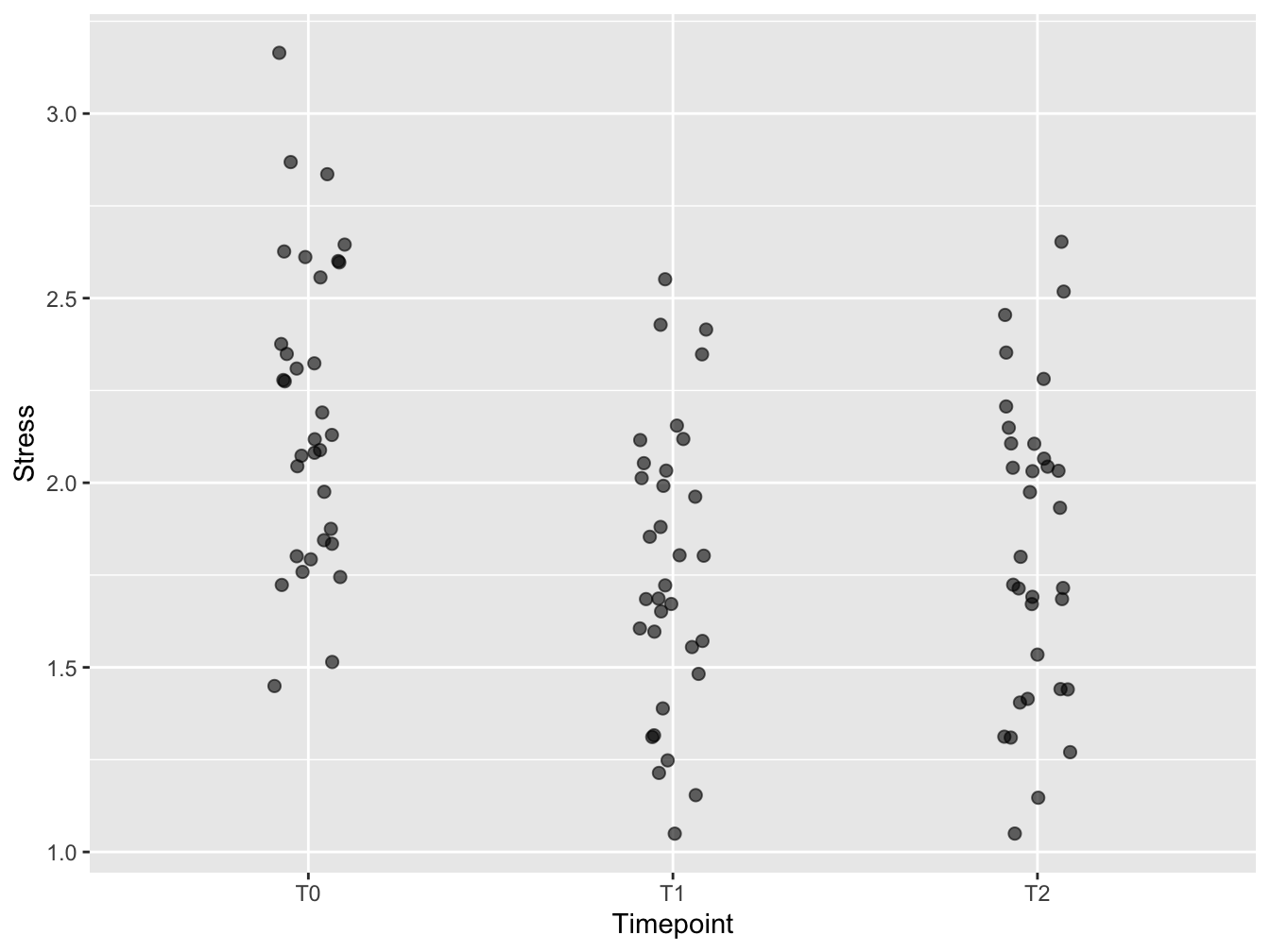
Figure 12.1: A first attempt
Add mean and SD
To emphasize the trend in the timeseries, means and standard deviations from the mean were added using stat_summary(). Always be aware of the orders of layers of your plot! Here, the stat_summary was placed “below” the plot symbols. Again, size was increased for enhanced visibility in presentations. Why not the median? Because of the audience! Everybody knows what a mean is, but few know what a median is - especially at management level.
mean_sd <- function(x) {
  c(y = mean(x), ymin = (mean(x) - sd(x)), ymax = (mean(x) + sd(x)))
}

ggplot(distress_data_tidy, aes(x = Timepoint, y = Stress)) +
    stat_summary(fun.data = mean_sd, color = "darkred", size = 1.5) +
    geom_jitter(width = 0.1, size = 2, alpha = 0.6)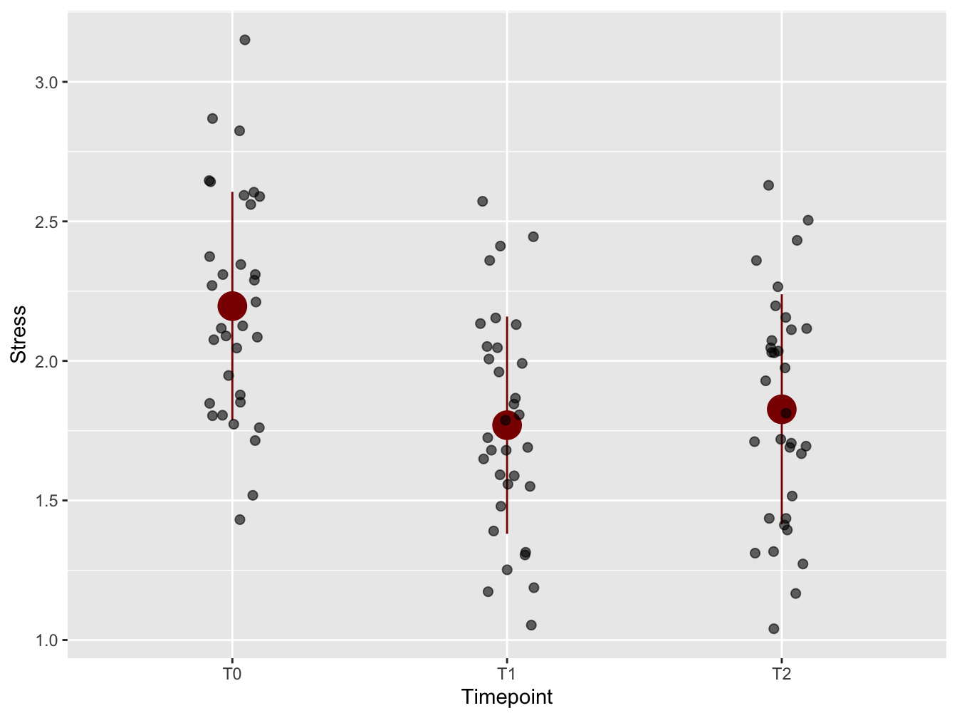
Figure 12.2: With mean and standard deviation
Emphasize worst cases
To emphasize the development of subjects who were in the worst shape at the onset of the research (T0), the top 25% with respect to distress score at T0 were highlighted.
distress_data$high_at_T0 <- ifelse(distress_data$T0 > quantile(distress_data$T0, 0.75), "Q4", "Q1-Q3")

distress_data_tidy <- gather(distress_data,
                        key=Timepoint,
                        value=Stress, "T0", "T1", "T2")
distress_data_tidy$Timepoint <- factor(distress_data_tidy$Timepoint, ordered = T)
knitr::kable(head(distress_data))| Clientcode | T0 | T1 | T2 | high_at_T0 |
|---|---|---|---|---|
| 1 | 2.60 | 2.44 | 2.16 | Q4 |
| 2 | 1.84 | 1.72 | 1.52 | Q1-Q3 |
| 3 | 2.04 | 2.12 | 1.32 | Q1-Q3 |
| 4 | 2.60 | 1.48 | 2.08 | Q4 |
| 5 | 2.08 | 1.04 | 2.04 | Q1-Q3 |
| 6 | 2.20 | 1.84 | 2.04 | Q1-Q3 |
The color is added using aes(color = high_at_T0) within the geom_jitter() call.
p <- ggplot(distress_data_tidy, aes(x=Timepoint, y=Stress)) +
    stat_summary(fun.data=mean_sd, color = "darkred", size = 1.5) +
    geom_jitter(width = 0.1, size = 2, alpha = 0.6, aes(color = high_at_T0))
p
12.3.2 Last tweaks: fonts and legend
The plot is more or less ready. Now is the time to adjust the plot “theme”.
p + theme_minimal(base_size = 14) +
    theme(legend.position = "top") +
    labs(color="Group")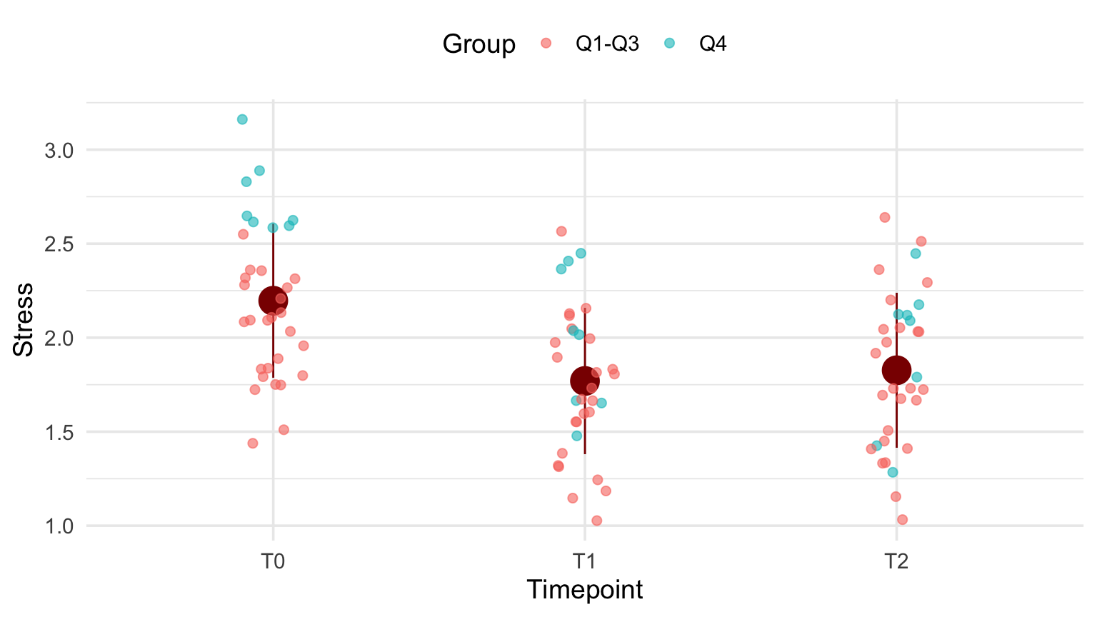
12.3.3 The code
Here is the code used for data preparation:
distress_data$high_at_T0 <- ifelse(
    distress_data$T0 > quantile(distress_data$T0, 0.75), "Q4", "Q1-Q3")

distress_data_tidy <- gather(distress_data,
                        key=Timepoint,
                        value=Stress, "T0", "T1", "T2")
distress_data_tidy$Timepoint <- factor(distress_data_tidy$Timepoint,
                                       ordered = T)

mean_sd <- function(x) {
  c(y = mean(x), ymin=(mean(x)-sd(x)), ymax=(mean(x)+sd(x)))
}
This is the final code for the plot
ggplot(distress_data_tidy, aes(x=Timepoint, y=Stress)) +
    stat_summary(fun.data=mean_sd, color = "darkred", size = 1.5) +
    geom_jitter(width = 0.1,
                size = 2,
                alpha = 0.6,
                aes(color = high_at_T0)) +
    labs(color="Group") +
    theme_minimal(base_size = 14) +
    theme(legend.position = "top") +
    labs(color="Group")