18 Exercises
This chapter only contains exercises, where subsections correspond to the previous chapters. The solutions of tehse exercises are in the next chapter, which also has a numbering parallel to this one.
To work on the exercises it is best to download this chapter as separate RMarkdown file and work on that. You can download it here. Before commencing you should put in a new Markdown YAML header at the top of the file, with at least these contents:
---
title: "Exercise solutions DAVuR1"
author: "<YOUR NAME>"
---
Alternatively, create either an RMarkdown Notebook (File → New File → R Notebook) or an RMarkdown document (File → New File → R Markdown… → choose Document as type and give it a title). A Notebook has the advantage that you can toggle the visibility of the code, but it has fewer output options (no pdf or Word).
This is a link to an R cheat sheet that you could use for selecting the right base R function for a task.
The exercises have been marked with a difficulty level, from 1 to five “stars” (❋ to ❋❋❋❋❋). Since I am a big fan of intellectual challenge I have included quite some exercises that transcend the mastery level required at the final assessment. For your peace of mind; if you are able to solve three-star exercises you are really good to go! Note that the one-star exercises at the beginning are not really the same difficulty as the ones at the end of the chapter.
Most of the datasets referred to from within the exercises can be found via a direct link provided, or in the Github repository with the URL https://github.com/MichielNoback/datasets. This is a direct link. You can download individual datasets from this page, or download the entire repository at once. To download, use the “clone or download” pull down button (green button). If you want to be a pro, use git to clone it…
18.1 Getting started
18.1.1 Install the tools
Level: ❋
Install these tools on your own PC or laptop, in this order:
- R itself https://cran.r-project.org/bin/windows/base/
- RStudio https://rstudio.com/products/rstudio/download/ (choose the free version of course)
- [Optionally] If you want to generate pdf documents you should also install a Latex version: MikTeX or TinyTex for Windows or MacTeX on MacOS. If you want to keep things simple I suggest you stick to HTML and MS Word output for now (Word can also export to PDF).
18.2 The toolbox
18.2.1 Customize RStudio
Level: ❋
In RStudio, go to Tools → Global Options.
- Under General, Uncheck the option “Restore .RData into workspace at startup”. This is an evil option that should be removed from the app.
- Under Appearance, select some options such as the Theme.
- Under Pane Layout, customize how the panes are organized to your liking.
- Under Spelling, install the Dutch spell checker.
18.2.2 Resumé
Level: ❋❋
Create an R Markdown document called Resumé.md and create your Curriculum Vitae using Markdown syntax. Use the R Markdown Reference Guide or Cheat Sheet provided in RStudio (via Help menu), or this Markdown Cheatsheet. You don’t need R for your resumé so markdown alone is enough.
18.3 Basic R
18.3.1 Math in the console
Level: ❋
In the console, calculate the following:
A
\(31 + 11\)
B
\(66 - 24\)
C
\(\frac{126}{3}\)
D
\(12^2\)
E
\(\sqrt{256}\)
F
\(\frac{3*(4+\sqrt{8})}{5^3}\)
18.3.2 Functions (I)
A [❋]
View the help page for paste(). There are two variants of this function. Which? And what is the difference between them? Use both variants to generate exactly this message "welcome to R" from these arguments: "welcome ", "to ", "R"
B [❋]
What does the abs function do? What is returned by abs(-20) and what is abs(20)?
C [❋]
What does the c function do? What is the difference in returned value (result) of c() when you combine either 1, 3 and "a" as arguments, or 1, 2 and 3? Use the function class() to answer this.
Experiment with other usages of c(): try out different types and try other vectors as argument to the function.
D [❋]
What does the function install.packages() do? Use it to install the package RColorBrewer. We’ll have a look at this package later on.
E [❋]
Type ?round in the console. There are several functions related to rounding numbers. Give this vector:
numberz <- c(-1.33, -1.55239, 0.4432, 0.5000001, 1.98765)generate these -exact- outputs using one of the listed functions:
[1] -1 -1  1  1  2
[1] -1 -1  0  0  1
[1] -1.330 -1.552  0.443  0.500  1.988
[1] -2 -2  0  0  1
F [❋]
Using the on the website provided cheat sheet, find the String manipulation function that will convert this vector of author names
names <- c("William Shakespeare", "Agatha Christie", "J. K. Rowling")into this:
[[1]]
[1] "William"     "Shakespeare"

[[2]]
[1] "Agatha"   "Christie"

[[3]]
[1] "J."      "K."      "Rowling"
(The output type is a list, a data type that we’ll see later on)
G [❋]
Using the on the website provided cheat sheet, find the data selection function that will accept this vector of bird names and returns a vector with all duplicates removed.
birds <- c("robin", "wagtail", "blackbird", "robin", "blackbird", "buzzard")18.3.3 Variables
Level: [❋]
Create three variables with the given values - x=20, y=10 and z=3. Next, calculate the following with these variables:
A. \(x+y\)
B. \(x^z\)
C. \(q = x \times y \times z\)
D. \(\sqrt{q}\)
E. \(\frac{q}{\pi}\) (pi is simply pi in R)
F. \(\log_{10}{(x \times y)}\)
18.3.4 Vectors
Circles
The circumference of a circle is \(2\pi\cdot r\), its surface \(4\pi \cdot r^2\) and its volume \(4/3 \pi\cdot r^3\). Given this vector of circle radiuses,
radiuses <- c(0, 1, 2, pi, 4)A [❋]
Calculate their circumference.
B [❋]
Calculate their surface.
C [❋]
Calculate their volume.
Creating vectors
Create the following vectors, as efficiently as possible. The functions rep(), seq(), paste0() and the colon operator : can be used, in any (nested) combination.
A [❋][1] 1 2 5 1 2 5
B [❋][1] 9 9 9 8 8 8 7 7 7 6 6 6 5 5 5
C [❋][1] 1 1 1 4 4 4 9 9 9 1 1 1 4 4 4 9 9 9
D [❋❋][1] "1a" "2b" "3c" "4d" "5e" "1a" "2b" "3c" "4d" "5e"
E [❋❋][1] "0z" "0.2y" "0.4x" "0.6w" "0.8v" "1u"
F [❋❋][1] "505" "404" "303" "202" "101" "000"
G [❋❋][1] "0.5A5.0" "0.4B4.0" "0.3C3.0" "0.2D2.0" "0.1E1.0"
18.4 Complex datatypes
18.4.1 Creating factors
A [❋] Given this vector:
animal_risk <- c(2, 4, 1, 1, 2, 4, 1, 4, 1, 1, 2, 1)and these possible levels: 1: harmless 2: risky 3: dangerous 4: deadly
Create a factor from this data where the levels have order.
B [❋❋]
Given this simulated data set of wealth distribution. The letters represent the following labels: “a” = “poor”, “b” = “middle class”, “c” = “wealthy” and “c” = “rich”:
set.seed(1234)
wealth_male <- sample(x = letters[1:4],
                 size = 1000,
                 replace= TRUE,
                 prob = c(0.7, 0.17, 0.12, 0.01))
wealth_female <- sample(x = letters[1:4],
                 size = 1000,
                 replace= TRUE,
                 prob = c(0.8, 0.15, 0.497, 0.003))
First study the code that generates this data. You are allowed to modify it to your world view :-).
Convert the two vectors in ordered factors.
Next, combine these two factors into a single one. Finally, report the percentage of its individual levels. Hint: use table() and prop.table().
18.4.2 List actions
Given the list below,
(house_admin <- list(John = list(cooking = c("Sunday", "Wednesday"),
                                 tasks = c("vacuuming", "fridge"),
                                 rent = 350),
                     Rose = list(cooking = c("Monday", "Tuesday"),
                                 tasks = "toilet",
                                 rent = 425),
                     Mike = list(cooking = c("Thursday", "Friday"),
                                 tasks = c("bathroom", "mopping"),
                                 rent = 450)))
## $John
## $John$cooking
## [1] "Sunday" "Wednesday"
##
## $John$tasks
## [1] "vacuuming" "fridge"
##
## $John$rent
## [1] 350
##
##
## $Rose
## $Rose$cooking
## [1] "Monday" "Tuesday"
##
## $Rose$tasks
## [1] "toilet"
##
## $Rose$rent
## [1] 425
##
##
## $Mike
## $Mike$cooking
## [1] "Thursday" "Friday"
##
## $Mike$tasks
## [1] "bathroom" "mopping"
##
## $Mike$rent
## [1] 450figure out single statements to get -exactly- the given outputs. Often there are more possibilities. Can you find them all?
A [❋]
$John
$John$cooking
[1] "Sunday"    "Wednesday"

$John$tasks
[1] "vacuuming" "fridge"

$John$rent
[1] 350
B [❋]
$cooking
[1] "Monday"  "Tuesday"

$tasks
[1] "toilet"

$rent
[1] 425
C [❋]
$John
$John$cooking
[1] "Sunday"    "Wednesday"

$John$tasks
[1] "vacuuming" "fridge"

$John$rent
[1] 350


$Rose
$Rose$cooking
[1] "Monday"  "Tuesday"

$Rose$tasks
[1] "toilet"

$Rose$rent
[1] 425
D [❋]
[1] "Thursday" "Friday" E [❋]
[1] "fridge"18.4.3 Named vectors
Almost all programming languages know the (hash)map / dictionary data structure storing so-called “key-and-value” pairs. They make it possible to “look up” the value belonging to a “key”. That is where the term dictionary comes from. A dictionary holds keys (the words) and their meaning (values). R does not have a dictionary type but you could make a dict-like structure using a vector with named elements. Here follows an example.
If I wanted to create and use a DNA codon translation table, and use it to translate a piece of DNA, I could do something like what is shown below (there are only 4 of the 64 codons included to keep it simple). See if you can figure out what is going on there
## define codon table as named vector
codons <- c("Gly", "Pro", "Lys", "Ser")
names(codons) <- c("GGA", "CCU", "AAA", "AGU")

print(codons)
## GGA CCU AAA AGU
## "Gly" "Pro" "Lys" "Ser"
## the DNA to translate
my_DNA <- "GGACCUAAAAGU"
my_prot <- ""
## iterate the DNA and take only every third position
for (i in seq(1, nchar(my_DNA), by=3)) {
    codon <- substr(my_DNA, i, i+2);
    my_prot <- paste(my_prot, codons[codon])
}
print(my_prot)
## [1] " Gly Pro Lys Ser"A [❋❋]
Make a modified copy of this code chunk in such a way that no spaces are present between the amino acid residues and that single-letter codes of amino acids are used instead of three-letter codes.
B [❋❋❋]
Below is a vector called nuc_weights. It holds the weights for the nucleotides A, C, G and U respectively. Convert it into a named vector. Then use a similar for code block as above to iterate my_DNA from the above code chunk to calculate its molecular weight.
nuc_weights <- c(491.2, 467.2, 507.2, 482.2)18.4.4 Lowry
The Lowry method is a widely used spectroscopic method to quantify protein amounts in solutions. Here are some real Lowry results for the quantification of proteins: The calibration curve is made using BSA (bovine serum albumin) as a standard. The concentrations are in mg/ml:
bsa_conc <- c(0, 0, 0.025, 0.025, 0.075, 0.075, 0.125, 0.125)Note that the duplo measurements are all put into one vector, in subsequent pairs of values. We’ll deal with that later.
These are the measured absorption values at 750 nm (again for the duplo measurements):
OD750 <- c(0.063, 0.033, 0.16, 0.181, 0.346, 0.352, 0.491, 0.488)A [❋]
Combine these two vectors in a dataframe and assign to a variable with name dilution. Do not add column names yet!
B [❋]
Now add the appropriate column names: prot_conc and absorption.
C [❋]
You forgot to include the last data points (again these are duplos):
Generate a data frame assigned to the variable df_temp from these data points. This time, add the appropriate column names with creation of the data frame. Be sure you use exactly the same column names.
D [❋]
Now add the second data frame df_temp to your first data frame, with name dilution, and assign it to the name dilution (thus overwriting the original variable):
E [❋❋]
Generate a new dataframe from the variable dilution, now with the duplo measurements side-by-side. So, instead of 2 you will now have 4 columns. Follow these steps to get there:
- First create a dataframe
evenby selecting all even-numbered rows.
- Then create a dataframe
oddby selecting the odd-numbered rows.
- Finally, combine
evenandoddinto one and assign it to the variabledilution_duplo.
Hint: use subsetting with TRUE and FALSE and vector cycling.
F [❋❋]
The result will be a dataframe with two columns named prot_conc and two columns named absorption. Delete the second column named prot_conc (this is an exact copy after all!) and rename the column names to prot_conc, abs1 and abs2.
G [❋❋]
Calculate the mean of the two abs measurements and add it as a column named mean_abs:
18.4.5 Island surfaces
The build in dataset named islands is a named numeric vector holding the areas in thousands of square miles of the landmasses which exceed 10,000 square miles.
A [❋❋]
Convert it into a dataframe named islands_df with two columns: Island and Surface. If the resulting dataframe has rownames you should remove these. So this is not correct:
> islands_df
                           Island  Area
Africa                     Africa 11506
Antarctica             Antarctica  5500
Asia                         Asia 16988
but this is:
> islands_df
             Island  Area
1            Africa 11506
2        Antarctica  5500
3              Asia 16988
B [❋❋]
Use the function order() to select the top 3 landmasses.
18.4.6 USArrests
The USArrests dataset is also one of the datasets included in the datasets package. It has info on the fifty states for these variables:
Murder arrests (per 100,000)
Assault arrests (per 100,000)
UrbanPop Percent urban population
Rape arrests (per 100,000)
We’ll explore this dataset for a few questions.
A [❋]
Select the row for Montana without using the row number directly.
B [❋❋]
Select the row with the highest Rape rate.
C [❋❋]
Select the row(s) where the Assault rate is less than ten times the Murder rate.
D [❋❋]
Convert the UrbanPop column into a factor, UrbanPop_f and attach it to the dataframe.
Use these cutoffs: “low”: < 60; “mid”: 60 <= 80; “high”: >= 80.
Next, tabulate this split.
18.4.7 File reading practice
Level: ❋❋
The files in this online folder on github directory contain some (simulated) gene-array data. The dataset contains a selection of induced transcripts after some stimulus. The columns represent:
- the mRNA entry
- fold induction after some stimulus
- the protein entry number
- protein length in number of amino acids of the corresponding NP entry
- the protein family the protein belongs to
- the predicted cellular localization
Whatever the contents of a file, you always need to address (some of) these questions:
- Are there comment lines at the top?
- Is there a header line with column names?
- What is the column separator?
- Are there quotes around character data?
- How are missing values encoded?
- How are numeric values encoded?
- What is the type in each column?
Also: read the help for the read.table function carefully.
Read the contents of each file in the file_reading directory into a dataframe object and assign it to the variable name df. There are 15 different files to practice your file loading skills.
You don’t need to download them manually; simply use this:
read.table(file = "https://raw.githubusercontent.com/MichielNoback/davur_ebook/main/data/file_reading/file01.txt",
           #more arguments
           )
Replace the file number as needed.
18.5 Basics of the ggplot2 package
Plotting rules
With all plots, take care to adhere to the rules regarding titles and other decorations. Tip: the site Quick-R has nice detailed information with examples on the different plot types and their configuration. Especially the section on plotting is helpful for these assignments.
18.5.1 Trees
Level: ❋❋
With the trees dataset from the datasets package, create a scatter plot according to these constraints.
- x-axis: Height
- y-axis: Girth
- size of plot symbol: Volume
- color of plot symbol: darkgreen
- a smoother without error margins
NB: Where you specify aesthetics matters here!
As extra practice you could convert the values to the metric system first.
18.5.2 Insect Sprays
The datasets package that is shipped with R has a dataset called ?. Type ?InsectSprays to get information on it.
A [❋]
Create a boxplot, splitting on the spray type.
B [❋❋]
Create a jitter plot, splitting on the spray type. Have zero jittering on the y-axis and as little as possible on the x-axis. use the alpha parameter and try to find a nice plot symbol.
[Extra: Give each spray a different plot color]
18.5.3 Pharmacokinetics
The Theoph dataset contains pharmacokinetics of theophylline, the anti-asthmatic drug theophylline. Twelve subjects were given oral doses of theophylline, then serum concentrations were measured at 11 time points over the next 25 hours.
A [❋❋]
Create a line plot of the concentration over time. The different subjects should get different linetype and the Dose should be represented by color.
B [❋❋]
As you will see, this figure is not very informative any more. Can you improve using other aesthetics? Hint: use group = Subject within the aes of geom_line().
18.5.4 USArrests (II)
A [❋❋]
With the USArrests dataset, create a scatterplot of Murder depending on Assault. The points should be darkgreen. Add correct x- and y-axis labels.
Add a linear regression line without error margins, as a thick red line.
B [❋❋]
Create a histogram of the Assault variable and overlay it with a density plot in darkblue.
Use aes(y=..density..) in the histogram layer to get a density histogram instead of a count histogram.
18.5.5 Orchard Sprays
A [❋❋]
The OrchardSprays dataset represents an experiment that was conducted to assess the potency of various constituents of orchard sprays in repelling honeybees, using a Latin square design.
Type ?OrchardSprays to see the details of this experiment.
Create a box plot of the decrease variable depending on the treatment variable. Add an overlay of the actual points using a jitter plot (in darkred, with jittering only in horizontal direction).
B [❋❋]
Create a violin plot of the same data, colorized by treatment.
18.5.6 Diauxic growth
In 1941, Jacques Monod discovered the phenomenon of diauxic growth in bacteria (e.g. E. coli), resulting from the preference for some carbon substrate over others, causing catabolite repression of pathways of less preferred substrates. See The Wikipedia page for details.
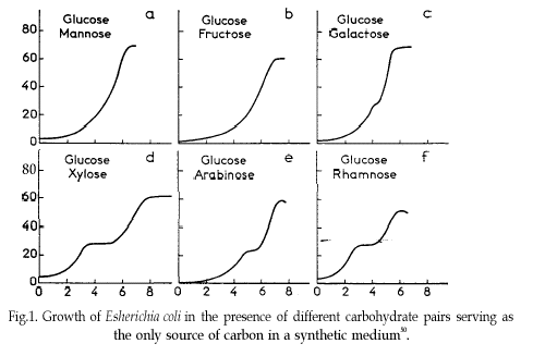
Some of the data used to generate the figure in that original publication are in this course’s data repository (https://github.com/MichielNoback/datasets/diauxic_growth). A direct link to the data file is https://raw.githubusercontent.com/MichielNoback/datasets/master/diauxic_growth/monod_diauxic_growth.csv.
A [❋❋]
Download the file, load it and attach to variable diauxic. Next, tidy this data into long format so you have three columns left: Time, Substrate and OD.
B [❋]
Convert the newly created Substrate variable into a factor with nicer labels, i.e. better suited for human reading
C [❋❋]
Create a line plot with all four growth curves within a single panel. use stat_smooth() and its span = parameter to have a line-and-point visualization.
D [❋❋❋]
Create a multi-panel plot like the one from the original publication.
18.5.7 Virginia Death Rates
The datasets package that is shipped with R has a dataset (a matrix) called VADeaths. Type ?VADeaths to get information on it. First you should convert this matrix into a tibble (a kind of data frame) and the rownames into a real variable using the chunk below (study it so you understand what happens here):
library(dplyr)
## %>% is used to pipe results from one operation to the other, just like '|' in Linux.
virginia_death_rates <- as_tibble(VADeaths)
virginia_death_rates <- virginia_death_rates %>%
    mutate("Age Group" = factor(rownames(virginia_death_rates), ordered = TRUE)) %>%
    select(`Age Group`, everything()) #reorder the columns
A [❋❋❋]
Pivot this table to long (tidy) format. This should generate a dataframe with four columns: Age Group, Habitat, Gender and DeathRate.
B [❋❋]
Create a bar chart with the age groups on the x-axis and Rural/Urban and Male/Female using side-by-side bars.
18.5.8 Global temperature
Maybe you have seen this picture of the world temperature over the past 120 years in the media:

We are going to work with this data as well.
The global temperature data are located in folder global_temperature (see the Data Repo).
There are two data series in file https://raw.githubusercontent.com/MichielNoback/datasets/master/global_temperature/annual.csv.
Study the readme file in the same folder to find out more about these datasets.
18.5.8.1 Create a scatter-and-line-plot
Level: [❋❋]
Create a scatter-and-line graph of both series in a single plot. Annotate well with labels and title. Optionally, add a smoother without error boundaries.
18.5.8.2 Re-create the heatmap
Level: [❋❋❋❋]
You should try to reproduce the above picture by using the geom_tile() function. Hint: use scale_fill_gradient2(low = "blue", mid = "white", high = "red") and pass 1 as value for y in the mapping function. The theme() function with element_blank() can be used for extra tweaking.
18.5.8.3 Extra practice
Level: [❋❋]
As extra practice, you could try to answer these questions as well:
- what is the warmest year?
- what is the warmest year that both timelines agree upon?
- which was the coldest decade?
- what is the 30-year moving average of the temperature?
The is also a monthly temperature file. Many explorations can be carried out on that one as well.
18.5.9 Investigate new visualization
Level: [❋❋❋]
Go to the R graph Gallery and browse the different sections. Then select one visualization to study in-depth (excluding the ones already demonstrated in this eBook). Work out an example with one of the datasets from either the built-in datasets of R or the Datasets Repo of this course. You can also choose another dataset. For instance, Kaggle (https://www.kaggle.com/) and the UCI Machine Learning Repository (https://archive.ics.uci.edu/ml/) have very interesting datasets.
Present this visualization in class, addressing these topics:
- What is this visualization named?
- What is its purpose; when is it appropriate to use?
- Why does it appeal to you?
- Show an example with the R code, explain difficulties and point out caveats.
18.6 Functions (II)
18.7 Flow control and scripting
This section serves you some exercises that will help you improve your function-writing skills.
18.7.1 Illegal reproductions
As an exercise, you will re-invent the wheel here for some statistical functions.
The mean
Level: ❋❋
Create a function, my_mean(), that duplicates the R function mean(), i.e. calculates and returns the mean of a vector of numbers, without actually using mean().
Standard deviation
Level: ❋❋❋
Create a function, my_sd(), that duplicates the R function sd(), i.e. calculates and returns the standard deviation of a vector of numbers, without actually using sd().
Maximum
Level: ❋❋❋
Suppose we have some random numbers:
The use of set.seed() assures that the generated random numbers will always be the same, for everyone who runs it, every time.
Use a for loop and if/else flow control to find the largest number in my_nums.
Do not use the build in max() or sort() functions.
Put this in a function with the name my_max and demonstrate its use.
You may use the build-in max() function to verify your result.
18.7.2 Various other functions
18.7.2.1 Find match locations
Level: ❋❋❋
Create a function that will report the match locations some value in a given vector. Name it where_is_it().
Use only for() and if/else to get to your solution, no functions except c().
So, this snippet should return the given expected reult
x <- c("Pro", "Glu", "Lys", "Pro", "Ser")
where_is_it(x, "Pro")
##expected:
#[1] 1 4
Odd and even
Level: ❋❋❋
Create a function, count_odd_even(), that counts the number of even and odd numbers in an input vector.
It should return the result as a named vector.
Do not make use of R base functions.
Add column compared to mean
Level: ❋❋❋
Create a function that accepts as input:
- a dataframe
- a column name. This column name should refer to a numeric column
The function should return a copy of this dataframe with an extra column attached. The column with name ‘compared_to_mean’ should have values “greater” (greater than mean) or “less” (less than or equal to the mean) when compared to the indicated column. Apply a check to the users’ input and stop with an appropriate error message if something is not right (not a dataframe, column does not exist, not a numeric column).
Interquantile ranges
Level: ❋❋❋
Create a function that will calculate a custom “interquantile range”. The function should accept three arguments: a numeric vector, a lower quantile and an upper quantile. It should return the difference (range) between these two quantile values. The lower quantile should default to 0 and the higher to 1, thus returning max(x) minus min(x). The function therefore has this “signature”:
interquantile_range <- function(x, lower = 0, higher = 100) {}Perform some tests on the arguments to make a robust method: are all arguments numeric?
To test you method, you can compare interquantile_range(some_vector, 0.25, 0.75) with IQR(some_vector) - they should be the same.
Vector distance
Level: ❋❋❋
Create a function, distance(p, q), that will calculate and return the Euclidean distance between two vectors of equal length. A numeric vector can be seen as a point in multidimensional space. Euclidean distance is defined as
\[d(p, q) = \sqrt{\sum_{i = 1}^{n}(q_i-p_i)^2}\]
Where p and q are the two vectors and n the length of the two vectors.
You should first perform a check whether the two vectors are of equal length and both of type numeric or integer. If not, the function should abort with an appropriate error message.
Other distance measures
Level: [❋❋❋]- ❋❋❋❋
Extend the function of the previous assignment in such a way that a third argument is accepted, method =, which defaults to “euclidean”. Other possible distance measures are “Manhattan” (same as “city block” and “taxicab”) and [Challenge] Pearson correlation.
Look up the equations for these in Wikipedia or some other place.
G/C percentage
Level: ❋❋❋❋
Create a function, GC_perc(), that calculates and returns the GC percentage of a DNA or RNA sequence. Accept as input a sequence and a flag -strict- indicating whether other characters are accepted than core DNA/RNA (GATUC). If strict = FALSE, the percentage of other characters should be reported using a warning() call. If strict = TRUE, the function should terminate with an error message. Use stop() for this. strict should default to TRUE. NOTE, usage of strict can complicate things, so start with the core functionality!
You can use strsplit() or substr() to get hold of individual sequence characters.
18.8 Tidying dataframes using package tidyr
18.8.1 Small examples
The data folder of this eBook contains three small csv files that need tidying. Read them from file and convert them into tidy format, with data columns as clean as possible (e.g. not “creatine_T0” but “T0”).
A [❋]
Tidy file untidy1.csv.
B❋
Tidy file untidy2.csv.
C [❋❋]
Tidy file untidy3.csv.
18.8.2 Lung cancer
The R datasets package has three related timeseries datasets relating to lung cancer deaths. These are ldeaths, mdeaths and fdeaths for total, male and female deaths respectively.
For convenience, the original timeseries can be converted to a dataframe using the chunk below.
lung_cancer_deaths <- data.frame(year = rep(1974:1979, each = 12),
                     month = rep(month.abb, times = 6),
                     male = as.integer(mdeaths),
                     female = as.integer(fdeaths),
                     total = as.integer(ldeaths))

#check
#sum(lung_cancer_deaths$male_deaths + lung_cancer_deaths$female_deaths == lung_cancer_deaths$total_deaths) == nrow(lung_cancer_deaths)
A [❋❋]
This is not a datset in “tidy” format. Can you make it tidy?
B [❋❋❋]
Create a line plot showing the monthly mortality of male, female and totals. Do you see trends and/or outliers and if so, can you explain these?
Note: you can create a date column by combining year and month into one column. Check out the as.Date() function; use as day the number 1.
C ❋❋❋ Create a boxplot panel of the three types: female, male and total. Are there outliers? If so, can you figure out when this occurred, and why?
18.9 Old school data mangling
In this section you will encounter some exercises revolving around the different flavors of apply.
18.9.1 Whale selenium
On the course website under Resources you will find a link to file whale_selenium.txt. You could download it into your working directory manually or use download.file() to obtain it. However, there is a third way to get its contents without actually downloading it as a local copy. You can read it directly using read.table() as shown here.
whale_sel_url <- "https://raw.githubusercontent.com/MichielNoback/davur1/gh-pages/exercises/data/whale_selenium.txt"
whale_selenium <- read.table(whale_sel_url,
    header = T,
    row.names = 1)
Note: when you are going to load a file many times it is probably better to store a local copy.
A [❋]
Report the means of both columns using apply().
B [❋]
Report the standard deviation of both columns, using apply()
C [❋❋]
Report the standard error of the mean of both columns, using apply() The SEM is calculated as \[\frac{sd}{\sqrt{n}}\] where \(sd\) is the sample standard deviation and \(n\) the number of measurements. You should create the function calculating this statistic yourself.
D [❋❋]
Using apply(), calculate the ratio of \(Se_{tooth} / Se_{liver}\) and attach it to the whale_selenium dataframe as column ratio. Create a histogram of this ratio.
E [❋❋]
Using print() and paste(), report the mean and the standard deviation of the ratio column, but do this with an inline expression, e.g. an expression embedded in the R markdown paragraph text.
18.9.2 Urine properties
The urine specimens dataset contains a readme.txt file and a data file (urine.csv; direct link: “https://raw.githubusercontent.com/MichielNoback/datasets/master/urine/urine.csv”). Study the readme to get an idea of the data. Download the file like this:
urine_file_name <- "urine.csv"
url <- paste0("https://raw.githubusercontent.com/MichielNoback/datasets/master/urine/", urine_file_name)
local_name <- paste0("../", urine_file_name) #specifiy your own folder!
download.file(url = url, destfile = local_name)
A [❋❋]
Load the data into a dataframe with name urine.
B [❋❋]
Convert the column r into a factor with two levels: yes and no, and give it a better name: ox_crystals.
C [❋❋❋]
Using apply(), report the mean and standard deviation of the numeric columns only. Give these with only two decimal digits. Use a named vector so you get this output:
     gravity   ph   osmo  cond   urea calc
mean    1.02 6.03 615.04 20.90 266.41 4.14
sd      0.01 0.72 238.25  7.95 131.25 3.26
D [❋❋]
Using aggregate, report the mean of the numeric columns, but split over the ox_crystals variable levels. Which variables seem most likely candidates for a relation with oxalate crystal formation.
18.10 Data mangling with dplyr
18.10.1 Global temperature revisited
We’re going to look at another version of the data. The file can be found here. This is some info on the data:
Global-mean monthly, seasonal, and annual means, 1880-present. This dataset was downlaoded on june 15, 2023 from https://data.giss.nasa.gov/gistemp/
The file contains monthly Global and Hemispheric Monthly Means and Zonal Annual Means.
Columns:
Year, - year
Jan,Feb,Mar,Apr,May,Jun,Jul,Aug,Sep,Oct,Nov,Dec - individual months
J-D - whole year (jan-Dec)
D-N - Dec-Nov (?)
DJF - winter
MAM - spring
JJA - summer
SON - fall
(see Readme in the repo)
A [❋]
Load the data.
B [❋❋]
Which years have a negative anomaly below -0.40 for the summer season? Report only the years, as a vector, and use only dplyr function(s).
C [❋❋]
Which have been the coldest five years after 1880?
Which were the warmest five years after 1880?
For both, give year and temperature anomaly (annual), and combine these ten rows into a single dataframe.
D [❋❋]
From the rows where the spring season is more than 0.2 higher than the summer season, select Year, spring and summer.
E [❋❋❋]
Select the years from 1970. Group the dataset in decades and report the per-decade average temperature anomaly for the four seasons and globally.
Create a bar plot from this result: split on color with season (side-by-side) and decade on the x-axis.
F [❋❋❋❋]
Which is the single warmest month? Give the year, that specific month and the whole year average.
This one is surprisingly difficult. Use filter(if_any()).
18.10.2 Pigs
Have a look at the readme of this dataset.
The datafile is located here.
You should try some visualizations as well!
A [❋]
Load the data.
B [❋❋]
Select only the week 12 data for pigs on vitamin E dose 200 mg and copper dose 175 mg/kg feed. Select columns Pig, Litter, Feed and Weight and order the pigs by weight (high to low).
C [❋❋]
Print the experimental setup (all combinations of variables Vitamin E and Copper)
D [❋❋❋]
Summarize the average end weights for the different vitamin E doses, and add the number of pigs in each group.
E [❋❋❋]
Calculate the relative percentual weight gain between all timepoints for each pig, i.e., the percent difference in subsequent timepoints. For instance, a gain from 40 to 50 is an increase of 25%.
Extra: Create a violin plot for this difference, split over vitamin E dose and copper.
F [❋❋❋]
Create a wide data representation, with the time points as columns, one row per pig.
18.10.3 Population numbers
The population folder of the datasets repo contains two files. One of them, EDU_DEM.....csv contains population data for all countries of the world (where data is available). We’re going to mangle and explore this data a bit.
Besides the following exercises there are many, many other questions you could ask yourself about this dataset, and visualizations to be created. For insyance, how about countries and age groups, years with maximum growth, etc. Explore and practice!
Again, You should try some more visualizations as well.
A [❋]
Load the data.
Start by loading the data into a dataframe called population.
Since it is a bit large, I suggest you first download it to a local location.
B [❋❋]
Clean up. There are quite some uninformative variables - variables with only one value or with only NA.
Find out which variables are uninformative and remove these from the dataframe.
C [❋❋❋]
With the dataframe you now have, create a report in wide format for the total population numbers over the available years. So, the years now get their own column and each country has a single row.
D [❋❋❋❋]
Next, present the same format (wide), but now with the “population change” instead of the total population.
E [❋❋❋]
Create a bar plot of the population numbers of the countries of Western Europe across the available years, split by gender.
F [❋❋❋❋]
Which three countries have shown the fastest relative growth rate, measured as percentage change over the the whole of the available time period (2005-2017) relative to its start, over the entire population, for both sexes combined?
Extra practice: Do the same for the different age groups.
18.11 Text processing with regex
18.11.1 Restriction enzymes
A [❋❋]
The restriction enzyme PacI has the recognition sequence “TTAATTAA”. Define (at least) three alternative regex patterns that will catch these sites.
B [❋❋]
The restriction enzyme SfiI has the recognition sequence “GGCCNNNNNGGCC”. Define (at least) three alternative regex patterns that will catch these sites.
18.11.2 Prosite Patterns
A [❋❋]
The Prosite pattern PS00211 (ABC-transporter-1; https://prosite.expasy.org/PS00211) has the pattern:
“[LIVMFYC]-[SA]-[SAPGLVFYKQH]-G-[DENQMW]-[KRQASPCLIMFW]-[KRNQSTAVM]-[KRACLVM]-[LIVMFYPAN]-{PHY}-[LIVMFW]-[SAGCLIVP]-{FYWHP}-{KRHP}-[LIVMFYWSTA].”
Translate it into a regex pattern. Info on the syntax is here: https://prosite.expasy.org/prosuser.html#conv_pa
B [❋❋]
The Prosite pattern PS00018 (EF-hand calcium-binding domain; https://prosite.expasy.org/PS00018) has the pattern:
“D-{W}-[DNS]-{ILVFYW}-[DENSTG]-[DNQGHRK]-{GP}-[LIVMC]-[DENQSTAGC]-x(2)- [DE]-[LIVMFYW].”
Translate it into a regex pattern.
You could exercise more by simply browsing Prosite. Test your pattern by fetching the proteins referred to within the Prosite pattern details page.
18.11.3 Fasta Headers
The fasta sequence format is a very common sequence file format used in molecular biology. It looks like this (I omitted most of the actual protein sequences for better representation):
>gi|21595364|gb|AAH32336.1| FHIT protein [Homo sapiens]
MSFRFGQHLIK...ALRVYFQ
>gi|15215093|gb|AAH12662.1| Fhit protein [Mus musculus]
MSFRFGQHLIK...RVYFQA
>gi|151554847|gb|AAI47994.1| FHIT protein [Bos taurus]
MSFRFGQHLIK...LRVYFQ
As you can see there are several distinct elements within the Fasta header which is the description line above the actual sequence: one or more database identification strings, a protein description or name and an organism name. Study the format - we are going to extract some elements from these fasta headers using the stringr package. Install it if you don’t have it yet.
Here is a small example:
library(stringr)
hinfII_re <- "GA[GATC]TC"
sequences <- c("GGGAATCC", "TCGATTCGC", "ACGAGTCTA")
str_extract(string = sequences,
            pattern = hinfII_re)
## [1] "GAATC" "GATTC" "GAGTC"Function str_extract() simply extracts the exact match of your regex (shown above). On the other hand, function str_match() supports grouping capture through bounding parentheses:
phones <- c("+31-6-23415239", "+49-51-55523146", "+31-50-5956566")
phones_re <- "\\+(\\d{2})-(\\d{1,2})" #matching country codes and area codes
matches <- str_match(phones, phones_re)
matches
## [,1] [,2] [,3]
## [1,] "+31-6" "31" "6"
## [2,] "+49-51" "49" "51"
## [3,] "+31-50" "31" "50"Thus, each set of parentheses will yield a column in the returned matrix. Simply use its column index to get that result set:
matches[, 2] ##the country codes## [1] "31" "49" "31"Now, given the fasta headers in ./data/fasta_headers.txt
which you can simply load into a character vector using readLines(), extract the following.
A [❋❋❋]
- Extract all complete organism names.
- Extract all species-level organism names (omitting subspecies and strains etc).
B [❋❋❋]
Extract all first database identifiers. So in this header element >gi|224017144|gb|EEF75156.1| you should extract only gi|224017144
C [❋❋❋]
Extract all protein names/descriptions.
18.12 Package ggplot2 revisited
18.12.1 Eye colors
This exercise also presents some data mangling challenges,
Some of my first year students collected eye color data in a small research project investigating both eye color frequencies at different locations, and also to assess reliability of eye color inspection.
The data looks like this:
Identifier,sex,age,L_OK9308,R_OK9308,L_OK2193,R_OK2193,L_OK5609,R_OK5609,L_OK8705,R_OK8705
A001,M,20,blauw,blauw,blauw,blauw,blauw,blauw,blauw,blauw
A002,F,19,hazel,hazel,hazel,hazel,hazel,hazel,groen,groen
A003,F,22,bruin,bruin,bruin,bruin,bruin,bruin,bruin,bruin
Columns Identifier, sex and age are obvious. The next 8 columns represent the Left and Right eye colors obesrved for that subject by the different investigators (OK9308, OK2193, OK5609, OK8705).
A [❋❋]
Load the data from file data/eyecolor_data.csv using the readr package. take care all columns are in the correct data type using the col_types argument.
B [❋❋❋]
Recode the data so that English names are used:
bruin == brown hazel == hazel blauw == blue groen == green
Hint: use across().
C [❋❋❋❋]
Add a column majority that gives the eye color based on a majority vote of the determined colors, or NA if no majority can be established. For instance, subject A002 will get hazel.
If you do not succeed here, you can skip ahead to the next part and proceed from there.
D [❋❋❋]
Pivot this tibble so that it becomes a tidy dataset.
E [❋❋❋]
Create a balloon plot of the eye colors, split over sex and (challenge!) left/right.
This requires for you to first create a contingency table.
18.12.2 Bacterial growth
The file data/growth-exp-data.csv contains some growth data of a bacterial growth experiment that spans two consecutive days.
A [❋❋]
Read in the data using read.table.
B [❋❋]
Combine date and time into a date-time column with type S3: POSIXct.
C [❋❋❋]
Create a column elapsed_time which is the time from the start of the experiment, in hours.
Study the lubridate vignette for this.
D [❋❋❋]
Create a line plot with two y-axes; one for OD600 and one for glucose. On the x-axis the elapsed time should be plotted.